
About
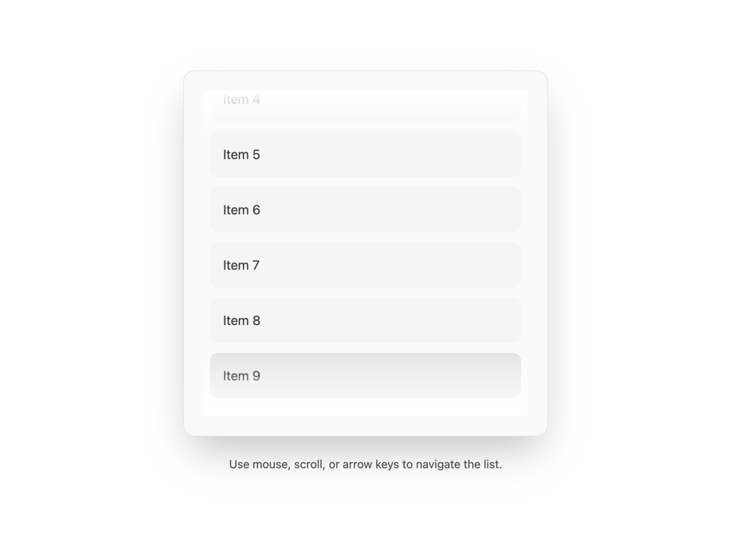
A Shadcn like animated list component
Built with React and Tailwind. Copy the prompt and paste it into Claude Code, Cursor or Lovable: your agent adds Animated List to your project and fits it to your theme.
Code
How Animated List is used: the demo's code. The component's own source comes with a free account.
Usage.tsx
import { useState, useEffect, FC } from 'react';
import { AnimatedList } from "@/components/ui/animated-list";

const DemoOne: FC = () => {
  const [isDarkMode, setIsDarkMode] = useState(true);

  useEffect(() => {
    const mediaQuery = window.matchMedia('(prefers-color-scheme: dark)');
    const handleChange = () => {
      const darkMode = mediaQuery.matches;
      setIsDarkMode(darkMode);
      document.documentElement.classList.toggle('dark', darkMode);
    };
    handleChange();
    mediaQuery.addEventListener('change', handleChange);
    return () => mediaQuery.removeEventListener('change', handleChange);
  }, []);

  const listItems = ['Item 1', 'Item 2', 'Item 3', 'Item 4', 'Item 5', 'Item 6', 'Item 7', 'Item 8', 'Item 9', 'Item 10'];

  const handleItemSelect = (item: string, index: number) => {
    console.log("Selected:", item, "at index:", index);
  };
  const showListGradients: boolean = true;
  const enableListArrowNavigation: boolean = true;
  const displayListScrollbar: boolean = true;

  const pageBgColor = isDarkMode ? "bg-black" : "bg-white";
  const listContainerBgColor = isDarkMode ? "bg-neutral-950" : "bg-neutral-50";
  const listContainerBorderColor = isDarkMode ? "border-neutral-800" : "border-neutral-200";

  const gradientThemeColor = isDarkMode ? "from-black" : "from-white";

  // For WebKit scrollbars (Tailwind classes)
  const scrollbarTrackTailwindClass = isDarkMode ? "dark:bg-neutral-800" : "bg-neutral-200"; // Or just bg-neutral-800 if dark is on html
  const scrollbarThumbTailwindClass = isDarkMode ? "dark:bg-neutral-600" : "bg-neutral-400"; // Or just bg-neutral-600

  // For Firefox scrollbar-color (actual CSS color values)
  const scrollbarThumbActualColor = isDarkMode ? "#52525b" : "#a3a3a3"; // neutral-600 and neutral-400 hex
  const scrollbarTrackActualColor = isDarkMode ? "#262626" : "#e5e5e5"; // neutral-800 and neutral-200 hex


  return (
    <div className={`flex flex-col w-full min-h-screen justify-center items-center
                   p-4 sm:p-8
                   ${pageBgColor}
                   transition-colors duration-300`}>

      <div
        className={`w-full max-w-sm sm:max-w-md p-4 sm:p-6 rounded-xl shadow-2xl
                   ${listContainerBgColor} border ${listContainerBorderColor}`}
      >
        <AnimatedList
          items={listItems}
          onItemSelect={handleItemSelect}
          showGradients={showListGradients}
          enableArrowNavigation={enableListArrowNavigation}
          displayScrollbar={displayListScrollbar}

          gradientColor={gradientThemeColor}
          // Pass Tailwind classes for WebKit
          scrollbarTrackClassName={scrollbarTrackTailwindClass}
          scrollbarThumbClassName={scrollbarThumbTailwindClass}
          // Pass actual CSS color values for Firefox
          scrollbarThumbCssColor={scrollbarThumbActualColor}
          scrollbarTrackCssColor={scrollbarTrackActualColor}
        />
      </div>

       <p className={`text-center text-sm mt-6 ${isDarkMode ? 'text-neutral-400' : 'text-neutral-600'}`}>
        Use mouse, scroll, or arrow keys to navigate the list.
      </p>
    </div>
  );
};

export { DemoOne };
Dependencies
More by deleted
View all

Splash Cursor
1.3K
Star Border
728
Tilted Scroll
433
Waves Background
362
Squares Background
326
Prism
218
Grid Motion
183
Circular Gallery
173