
About
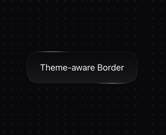
A button component with an animated star border effect featuring a subtle animated gradient border that moves across the edges. It automatically adapts to light/dark themes with appropriate opacity levels. Features: • Theme-aware styling • Animated gradient borders • Polymorphic component support • Customizable animation speed • Configurable colors
Built with React and Tailwind. Copy the prompt and paste it into Claude Code, Cursor or Lovable: your agent adds Star Border to your project and fits it to your theme.
Code
How Star Border is used: the demo's code. The component's own source comes with a free account.
Usage.tsx
import { cn } from "@/lib/utils"
import { StarBorder } from "@/components/ui/star-border"

export function StarBorderDemo() {
  return (
    <div className="space-y-8">
      <StarBorder>
        Theme-aware Border
      </StarBorder>
    </div>
  )
}More by deleted
View all

Splash Cursor
1.3K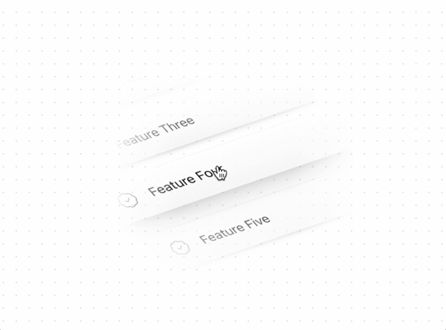
Tilted Scroll
433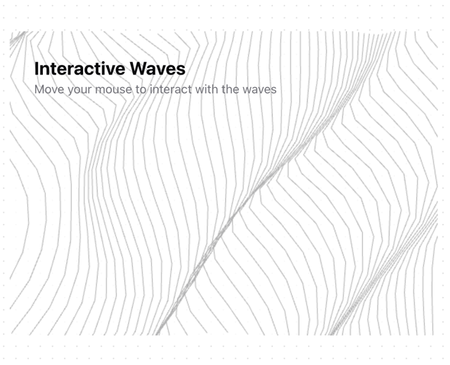
Waves Background
362
Squares Background
326
Prism
218
Grid Motion
183
Circular Gallery
173
Bounce Cards
143
More in Buttons
View all

Button
14
Texture Button
92
Button
34

Button
64
Button Save
46

Button Group
3

Button


Notification Button
103

