
About
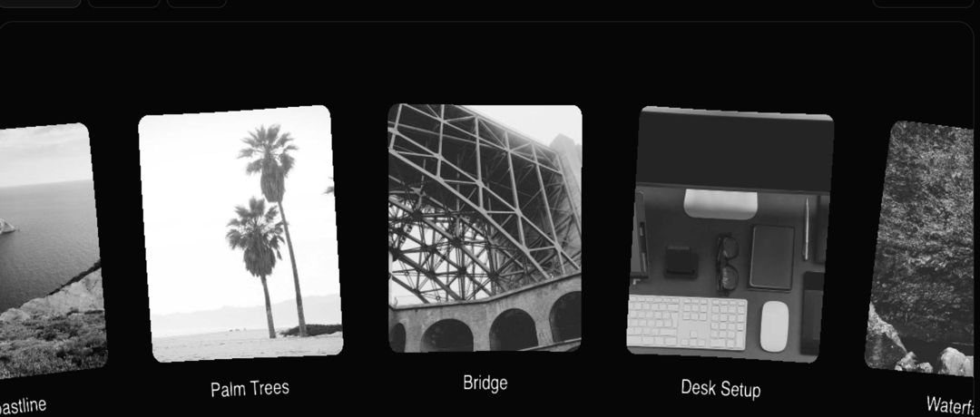
Here is image circular gallery collage
Built with React and Tailwind. Copy the prompt and paste it into Claude Code, Cursor or Lovable: your agent adds Circular Gallery to your project and fits it to your theme.
Code
How Circular Gallery is used: the demo's code. The component's own source comes with a free account.
Usage.tsx
import { Component } from "@/components/ui/circular-gallery";

const demoItems = [
  {
    image: `https://cdn.21st.dev/assets/mirror/e9/e9f40fde089106509f8f0618d109f54f6d684390f843e8d1a6b5059e81453caf.jpg`,
    text: "Bridge",
  },
  {
    image: `https://cdn.21st.dev/assets/mirror/07/07b4e801248a3aea53329b56e50ff0bf4500ee0e603742000db362557ccd609f.jpg`,
    text: "Desk Setup",
  },
  {
    image: `https://cdn.21st.dev/assets/mirror/ef/ef490a9710d011911f365ff14eaa1ba7cca5d8f327c67df6e2d8796abdd0afb0.jpg`,
    text: "Waterfall",
  },
  {
    image: `https://cdn.21st.dev/assets/mirror/98/980d919a5154a9d98a355748381dc20fd4a5df9feb5d36ce01f6bc561e8cda1b.jpg`,
    text: "Strawberries",
  },
  {
    image: `https://cdn.21st.dev/assets/mirror/01/01d0cba6c7a56afeef2040d5d2a1dfd6a1c86fafa703e0f498f6f8794c11ef66.jpg`,
    text: "Deep Diving",
  },
  {
    image: `https://cdn.21st.dev/assets/mirror/28/28b5936e7c76019c46d2b22ac3abbd18b1a3aaa0c3962ff723e25973f59763ba.jpg`,
    text: "Train Track",
  },
  {
    image: `https://cdn.21st.dev/assets/mirror/3a/3a7a5e345bc71cb788e0a8538006dec703983b3f32412623d5a64d5b1e4cd00e.jpg`,
    text: "Santorini",
  },
  {
    image: `https://cdn.21st.dev/assets/mirror/06/065c0afc39b065e339dee3d1bbda6787882dbe81a676f54f0847cfb1c8493d7d.jpg`,
    text: "Blurry Lights",
  },
  {
    image: `https://cdn.21st.dev/assets/mirror/46/46065f54c2e5b2f6b9f178227e0383cf0a8b12daab1556be26dbfcfb1de1de82.jpg`,
    text: "New York",
  },
  {
    image: `https://cdn.21st.dev/assets/mirror/99/99bc6663facf0eb98396f8b78d274cd58d78817db2ff9c89d3c16729bf9ae5fd.jpg`,
    text: "Good Boy",
  },
  {
    image: `https://cdn.21st.dev/assets/mirror/40/4020b7c8c9171f12a7747c0850d854cbd16aab16b4d17d8bfce841dc7fdacd8e.jpg`,
    text: "Coastline",
  },
  {
    image: `https://cdn.21st.dev/assets/mirror/99/99321a58b63bf661e414cde2a66ae72d10f7af24d5b25c248a63b10106c43d13.jpg`,
    text: "Palm Trees",
  },
];

const DemoOne = () => {
  return (
    <div className="flex w-full h-screen justify-center items-center bg-black">
      <div
        className="w-full max-w-screen-xl mx-auto h-[80vh] overflow-hidden relative bg-black border-none shadow-none"
      >
        <Component
          items={demoItems}
          bend={3}
          textColor="#ffffff"
          borderRadius={0.05}
        />
      </div>
    </div>
  );
};

export { DemoOne };
Dependencies
More by deleted
View all

Splash Cursor
1.3K
Star Border
728
Tilted Scroll
433
Waves Background
362
Squares Background
326
Prism
218
Grid Motion
183
Bounce Cards
143
More in Galleries
View all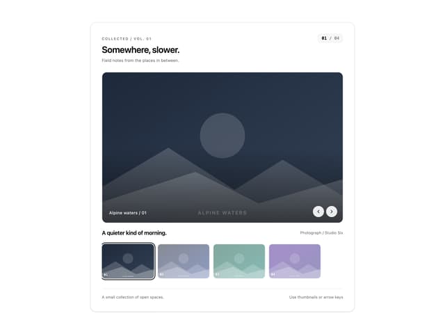
Thumbnail image viewer
39

Animated Gallery
1.4K
Editorial Collage Hero
425

Hero Section 6
878

Elastic Gallery
899
3D Parallax Unfurling Gallery
970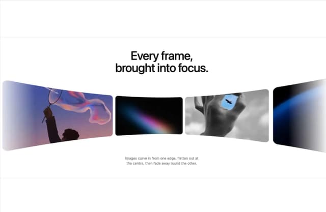

Tilted Grid Hero
1.4K
Layout Grid
821


