
About
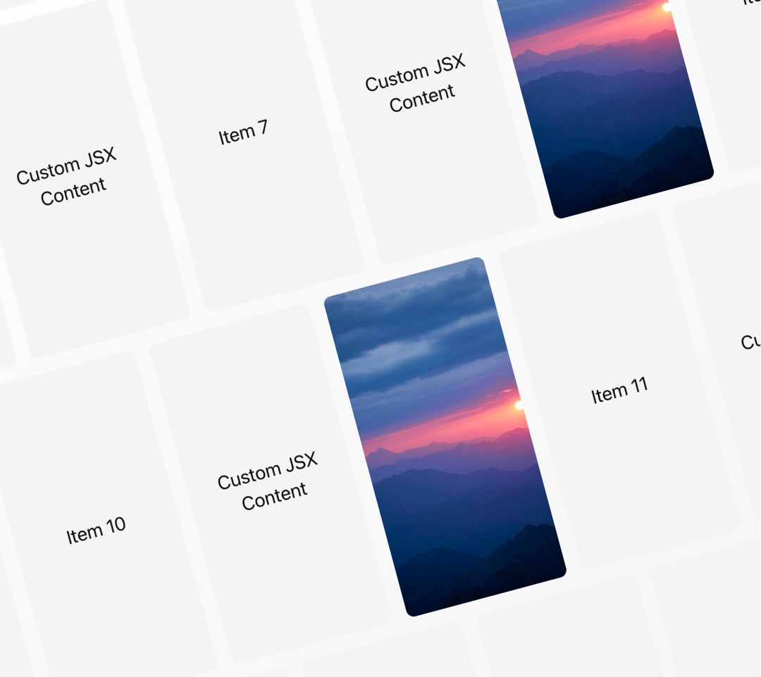
An interactive grid component with mouse-driven parallax effects. It features smooth animations, support for mixed content types, and a responsive layout. Features: • Mouse-driven parallax animation • Support for text, JSX elements, and images • Customizable gradient background • Responsive grid layout • Smooth GSAP animations • Theme-aware styling • Mixed content support • Performance optimized • Accessible markup • Interactive hover states
Built with React and Tailwind. Copy the prompt and paste it into Claude Code, Cursor or Lovable: your agent adds Grid Motion to your project and fits it to your theme.
Code
How Grid Motion is used: the demo's code. The component's own source comes with a free account.
Usage.tsx
import { GridMotion } from "@/components/ui/grid-motion"

export function GridMotionDemo() {
  const items = [
    'Item 1',
    <div key='jsx-item-1'>Custom JSX Content</div>,
    'https://cdn.21st.dev/assets/mirror/9b/9b9261d01ff3efa5c8ef756599880d22b471de57a142b1015f6fa6ca1ddf5e28.jpg',
    'Item 2',
    <div key='jsx-item-2'>Custom JSX Content</div>,
    'Item 4',
    <div key='jsx-item-2'>Custom JSX Content</div>,
    'https://cdn.21st.dev/assets/mirror/9b/9b9261d01ff3efa5c8ef756599880d22b471de57a142b1015f6fa6ca1ddf5e28.jpg',
    'Item 5',
    <div key='jsx-item-2'>Custom JSX Content</div>,
    'Item 7',
    <div key='jsx-item-2'>Custom JSX Content</div>,
    'https://cdn.21st.dev/assets/mirror/9b/9b9261d01ff3efa5c8ef756599880d22b471de57a142b1015f6fa6ca1ddf5e28.jpg',
    'Item 8',
    <div key='jsx-item-2'>Custom JSX Content</div>,
    'Item 10',
    <div key='jsx-item-3'>Custom JSX Content</div>,
    'https://cdn.21st.dev/assets/mirror/9b/9b9261d01ff3efa5c8ef756599880d22b471de57a142b1015f6fa6ca1ddf5e28.jpg',
    'Item 11',
    <div key='jsx-item-2'>Custom JSX Content</div>,
    'Item 13',
    <div key='jsx-item-4'>Custom JSX Content</div>,
    'https://cdn.21st.dev/assets/mirror/9b/9b9261d01ff3efa5c8ef756599880d22b471de57a142b1015f6fa6ca1ddf5e28.jpg',
    'Item 14',
];

  return (
    <div className="space-y-8">
      {/* Default grid with system-generated items */}
      <div className="h-screen w-full bg-gradient-to-br from-background to-muted">
        <GridMotion />
      </div>

      {/* Custom grid with rich content */}
      <div className="h-screen w-full bg-gradient-to-br from-background to-muted">
        <GridMotion
          items={items}
          gradientColor="hsl(var(--brand))"
          className="relative z-10 backdrop-blur-sm"
        />
      </div>

      {/* Minimal grid with dark theme */}
      <div className="h-screen w-full bg-black">
        <GridMotion
          items={items.slice(0, 14)}
          gradientColor="hsl(var(--brand-foreground))"
          className="opacity-75"
        />
      </div>
    </div>
  )
}
Dependencies
More by deleted
View all

Splash Cursor
1.3K
Star Border
728
Tilted Scroll
433
Waves Background
362
Squares Background
326
Prism
218
Circular Gallery
173
Bounce Cards
143
More in Galleries
View all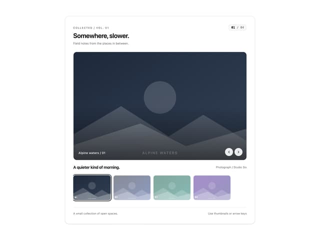
Thumbnail image viewer
39

Animated Gallery
1.4K
Editorial Collage Hero
425

Hero Section 6
878

Elastic Gallery
899
3D Parallax Unfurling Gallery
970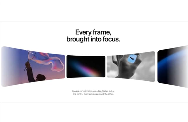

Tilted Grid Hero
1.4K
Layout Grid
821


