
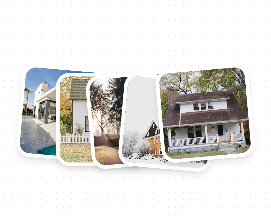
About
A dynamic card layout component with bouncing animations featuring staggered entrance effects and customizable card positioning. Built with GSAP for smooth animations, it supports both light and dark themes. Features: • GSAP-powered animations • Staggered entrance effects • Customizable positioning • Responsive design • Theme-aware styling • Lazy image loading • Configurable timing • Elastic animations
Built with React and Tailwind. Copy the prompt and paste it into Claude Code, Cursor or Lovable: your agent adds Bounce Cards to your project and fits it to your theme.
Code
How Bounce Cards is used: the demo's code. The component's own source comes with a free account.
Usage.tsx
import { BounceCards } from "@/components/ui/bounce-cards"

const images = [
  "https://cdn.21st.dev/assets/mirror/52/523f07c94b794878d2f53c761ce0aaca10f19d268911183d3213752ad72eb07f.jpg",
  "https://cdn.21st.dev/assets/mirror/fc/fcd8950cbb689dc6eeea6cd2e1a3de8ce168f5912ded8bab197b7083890cae08.jpg",
  "https://cdn.21st.dev/assets/mirror/84/848dba27d7802e51752d24ab2cc0de23e32f2131503c825c043842f1bc90c495.jpg",
  "https://cdn.21st.dev/assets/mirror/59/590ad61d81ae3677bb9a8ae2dc31ebb6faf453ac37941dfb89d505db9c3736b6.jpg",
  "https://cdn.21st.dev/assets/mirror/d5/d587f17fa785db1ce9f26c8632c5e2bf2a64279ff87bb266b87cfcf173765650.jpg"
]

const transformStyles = [
  "rotate(5deg) translate(-150px)",
  "rotate(0deg) translate(-70px)",
  "rotate(-5deg)",
  "rotate(5deg) translate(70px)",
  "rotate(-5deg) translate(150px)"
]

export function BounceCardsDemo() {
  return (
    <div className="space-y-8">
      <BounceCards
        images={images}
        containerWidth={500}
        containerHeight={500}
        animationDelay={1}
        animationStagger={0.08}
        easeType="elastic.out(1, 0.5)"
        transformStyles={transformStyles}
        className="mx-auto"
      />
    </div>
  )
}
Dependencies
More by deleted
View all

Splash Cursor
1.3K
Star Border
728
Tilted Scroll
433
Waves Background
362
Squares Background
326
Prism
218
Grid Motion
183
Circular Gallery
173
More in Cards
View all

Statistics Card 2
263
Stats cards with links
39
Card
70

Course Design Cards
1.1K
The Item one
3

Card Studio
7
Statistics Card 7
291

Item
10
