
About
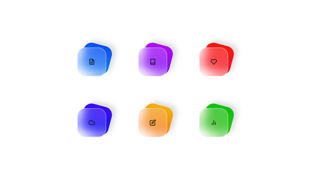
Glass icons minimalistic
Built with React and Tailwind. Copy the prompt and paste it into Claude Code, Cursor or Lovable: your agent adds Glass icons to your project and fits it to your theme.
Code
How Glass icons is used: the demo's code. The component's own source comes with a free account.
Usage.tsx
import { Component } from "@/components/ui/glass-icons"; // Correct import path for the new Component
import { FiFileText, FiBook, FiHeart, FiCloud, FiEdit, FiBarChart2 } from 'react-icons/fi'; // Import icons for the demo items

const DemoOne = () => {
  // Define the items array as provided in the original demo
  const items = [
    { icon: <FiFileText />, color: 'blue', label: 'Files' },
    { icon: <FiBook />, color: 'purple', label: 'Books' },
    { icon: <FiHeart />, color: 'red', label: 'Health' },
    { icon: <FiCloud />, color: 'indigo', label: 'Weather' },
    { icon: <FiEdit />, color: 'orange', label: 'Notes' },
    { icon: <FiBarChart2 />, color: 'green', label: 'Stats' },
  ];

  return (
    <div className="flex w-full h-screen justify-center items-center">
      {/* The outer div maintains the full screen centered layout */}
      <div style={{ height: '600px', position: 'relative' }}>
        {/* Render the GlassIcons component with the defined items and class name */}
        <Component items={items} className="custom-class" />
      </div>
    </div>
  );
};

export { DemoOne };More by deleted
View all

Splash Cursor
1.3K
Star Border
728
Tilted Scroll
433
Waves Background
362
Squares Background
326
Prism
218
Grid Motion
183
Circular Gallery
173