
About
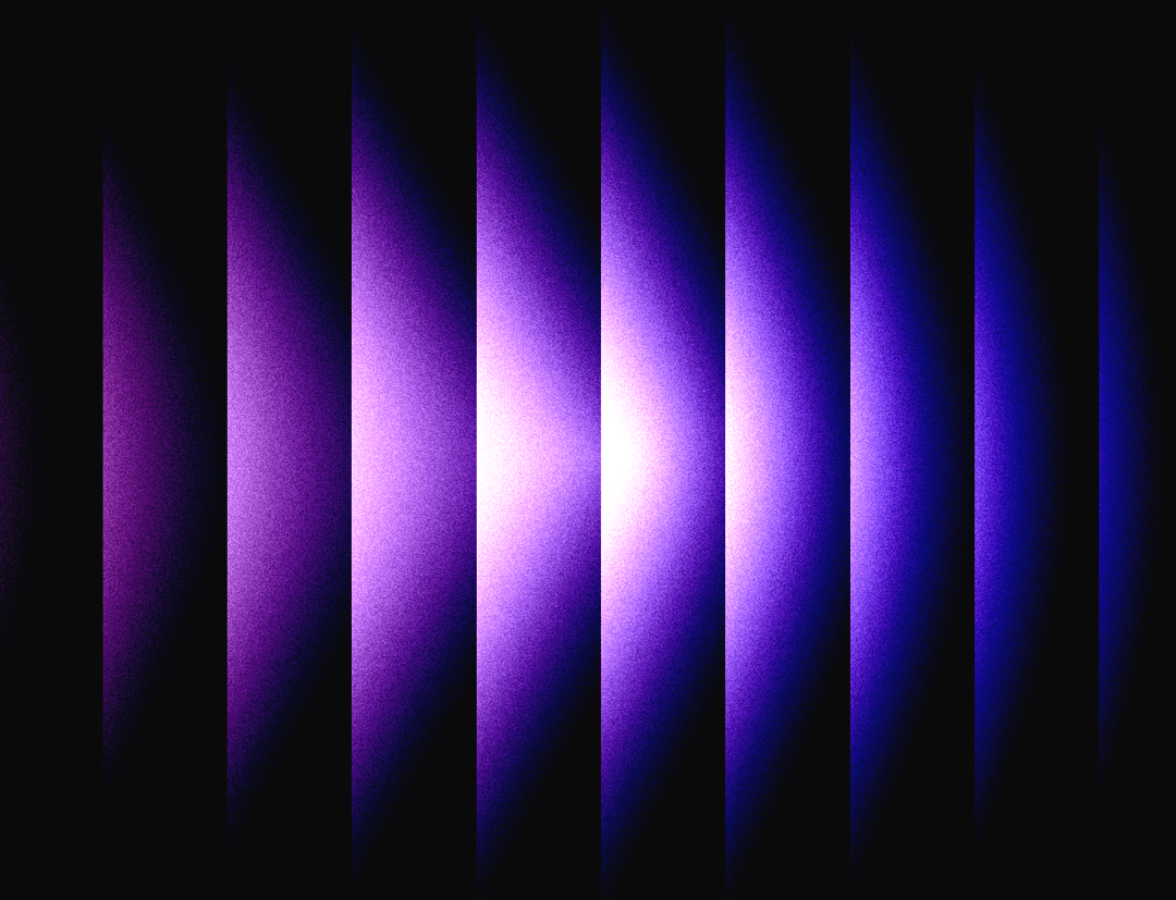
Here is Gradient Blinds component
Built with React and Tailwind. Copy the prompt and paste it into Claude Code, Cursor or Lovable: your agent adds Gradient Blinds to your project and fits it to your theme.
Code
How Gradient Blinds is used: the demo's code. The component's own source comes with a free account.
Usage.tsx
// Import name must always be `Component` per demo rules.
import Component from "@/components/ui/gradient-blinds";

export default function GradientBlindsBasic() {
  return (
    <div style={{ width: "100%", height: 600, position: "relative" }}>
      <Component
        gradientColors={["#FF9FFC", "#5227FF"]}
        angle={0}
        noise={0.3}
        blindCount={12}
        blindMinWidth={50}
        spotlightRadius={0.5}
        spotlightSoftness={1}
        spotlightOpacity={1}
        mouseDampening={0.15}
        distortAmount={0}
        shineDirection="left"
        mixBlendMode="lighten"
      />
    </div>
  );
}
Dependencies
More by deleted
View all

Splash Cursor
1.3K
Star Border
728
Tilted Scroll
433
Waves Background
362
Squares Background
326
Prism
218
Grid Motion
183
Circular Gallery
173
More in Heroes
View all

SaaS Template
2.4K

Responsive Hero Banner
2K

Hero
1.2K
Centered Hero with Image Fan
920

HeroSectionWithGradient
335
Editorial Collage Hero
425

Hero 03
314
Glass Fold
197
