
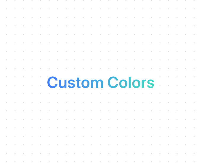
A text component that applies an animated gradient effect to text and optionally adds a gradient border. It features smooth color transitions, customizable animation speeds, and an optional animated border. Features: • Smooth gradient animations • Customizable color stops • Adjustable animation speed • Optional animated border • Responsive design • TypeScript support • Dark mode compatibility • Accessible text rendering • Custom cursor interactions • Flexible styling options
Built with React and Tailwind. Copy the prompt and paste it into Claude Code, Cursor or Lovable: your agent adds Gradient Text to your project and fits it to your theme.
Code
How Gradient Text is used: the demo's code. The component's own source comes with a free account.
Usage.tsx
import { GradientText } from "@/components/ui/gradient-text"

export function GradientTextBorderDemo() {
  return (
    <div className="space-y-8">
      {/* Basic example */}
      <GradientText
        colors={["#40ffaa", "#4079ff", "#40ffaa"]}
        animationSpeed={3}
        className="text-3xl font-semibold"
      >
        Custom Colors
      </GradientText>
    </div>
  )
}

export function GradientTextDemo() {
  return (
    <div className="space-y-8">
      {/* With border */}
      <GradientText
        colors={["#ff40aa", "#40aaff", "#ff40aa"]}
        showBorder
        className="text-2xl font-medium px-4 py-2"
      >
        With Animated Border
      </GradientText>
    </div>
  )
}More by deleted
View all

Splash Cursor
1.3K
Star Border
728
Tilted Scroll
433
Waves Background
362
Squares Background
326
Prism
218
Grid Motion
183
Circular Gallery
173
More in Text
View all

Vertical Cut Reveal Characters
103
Motion Blur Text
36

Rainbow Text Effect
47

Blur Reveal
297
Text Reveal
317

NeonRGBTextEffect
144
Glow
40
Apple Hello Effect
606
