
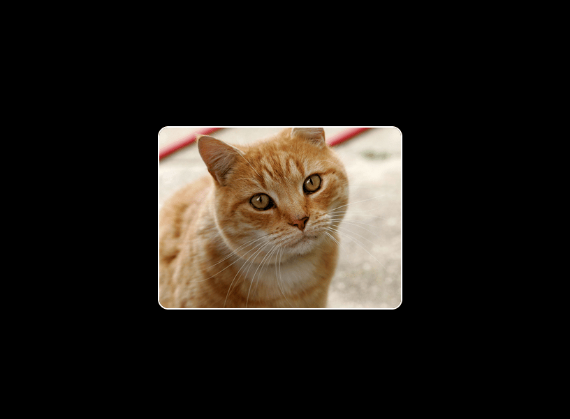
About
a beautiful pixel-transition
Built with React and Tailwind. Copy the prompt and paste it into Claude Code, Cursor or Lovable: your agent adds Pixel transition to your project and fits it to your theme.
Code
How Pixel transition is used: the demo's code. The component's own source comes with a free account.
Usage.tsx
import { PixelTransition } from "@/components/ui/pixel-transition"; // Adjust path as needed

const DemoOne = () => {
  const firstContentJsx = (
    <img
      src="https://upload.wikimedia.org/wikipedia/commons/thumb/3/3a/Cat03.jpg/1200px-Cat03.jpg"
      alt="A cute cat"
      style={{ width: "100%", height: "100%", objectFit: "cover" }}
    />
  );

  const secondContentJsx = (
    <div
      style={{
        width: "100%",
        height: "100%",
        display: "grid",
        placeItems: "center",
        backgroundColor: "#111111" // Dark background for "Meow!" text
      }}
    >
      <p style={{ fontWeight: 900, fontSize: "3rem", color: "#ffffff" }}>Meow!</p>
    </div>
  );

  return (
    <div className="flex flex-col w-full min-h-screen justify-center items-center
                   p-4
                   bg-white
                   dark:bg-black
                   transition-colors duration-300">

      <PixelTransition
        firstContent={firstContentJsx}
        secondContent={secondContentJsx}
        gridSize={12}
        pixelColor='currentColor' // Will be black on light theme, white on dark theme
        animationStepDuration={0.4}
        className="custom-pixel-card" // You can add more specific styles via this class if needed
        style={{ width: "350px" }} // Example of overriding default width
        aspectRatio="75%" // Example: 4:3 aspect ratio
      />

    </div>
  );
};

export { DemoOne };
Dependencies
More by deleted
View all

Splash Cursor
1.3K
Star Border
728
Tilted Scroll
433
Waves Background
362
Squares Background
326
Prism
218
Grid Motion
183
Circular Gallery
173