
About
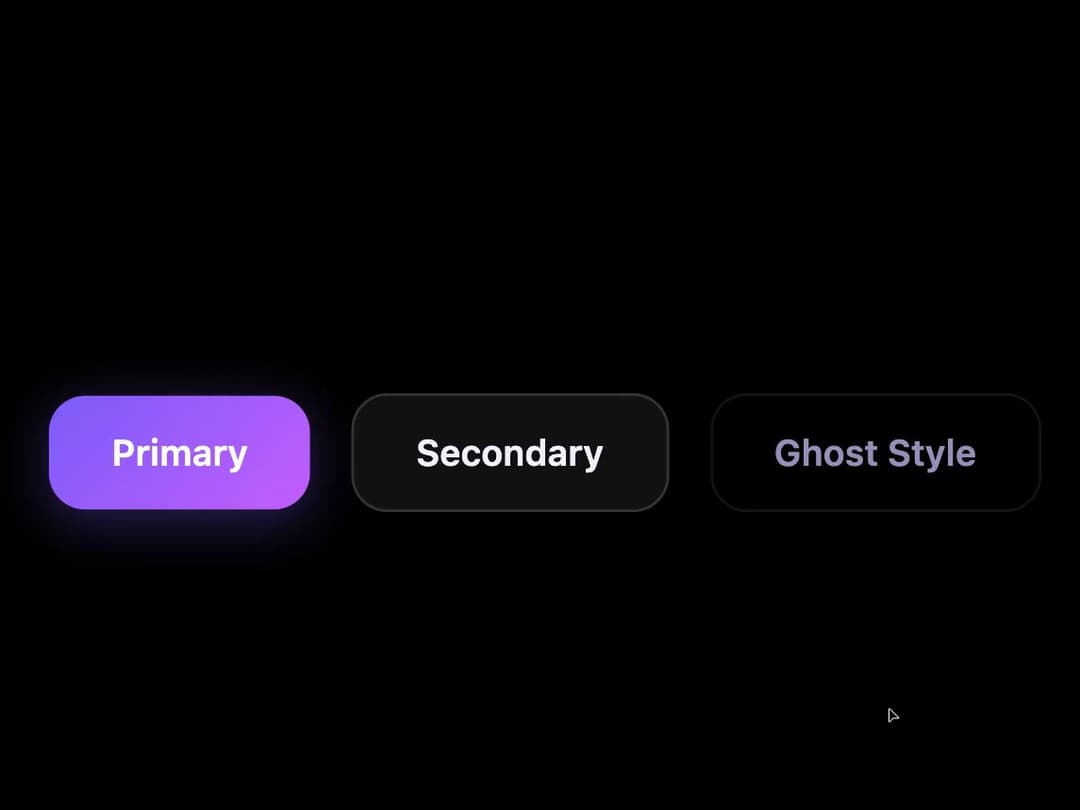
A custom cursor effect that creates a glowing ring around the pointer and pulls nearby marked DOM elements toward it with spring/gravity physics, snapping them back when the cursor moves away.
Built with React and Tailwind. Copy the prompt and paste it into Claude Code, Cursor or Lovable: your agent adds Gravity Pull Cursor to your project and fits it to your theme.
Code
How Gravity Pull Cursor is used: the demo's code. The component's own source comes with a free account.
Usage.tsx
"use client";
import GravityPullCursor from "@/components/ui/gravity-pull-cursor";
import { useRef } from "react";

export default function GravityPullCursorDemo() {
  const containerRef = useRef(null);

  return (
    <div
      ref={containerRef}
      className="relative w-full h-screen overflow-hidden flex items-center justify-center gap-4 bg-black"
      style={{ cursor: "none" }}
    >
      <GravityPullCursor
        containerRef={containerRef}
        config={{
          color: "#5cf4fc",
          strength: 25000,
          radius: 220,
          damping: 0.84,
          pointerAnim: true,
          clickAnim: true,
        }}
      />

      <button
        data-gravity="true"
        className="px-6 py-3 rounded-xl font-semibold text-sm text-white"
        style={{
          background: "linear-gradient(135deg, #7c5cfc, #c45cfc)",
          boxShadow: "0 4px 20px rgba(124, 92, 252, 0.35)",
        }}
      >
        Primary
      </button>
      <button
        data-gravity="true"
        className="px-6 py-3 rounded-xl font-semibold text-sm"
        style={{
          background: "#111111",
          color: "#f0f0ff",
          border: "1px solid rgba(255,255,255,0.15)",
        }}
      >
        Secondary
      </button>
      <button
        data-gravity="true"
        className="px-6 py-3 rounded-xl font-semibold text-sm"
        style={{
          background: "transparent",
          color: "#9090b8",
          border: "1px solid rgba(255,255,255,0.08)",
        }}
      >
        Ghost Style
      </button>
    </div>
  );
}
More by felix-au
View all
Matrix Rain Cursor
13
Wind Stream Cursor
2
Constellation Cursor
2
DNA Helix Cursor
1
Bubble Float Cursor
1
Rainbow Comet Cursor
1
Clock Cursor
More in Buttons
View all
Button
9
Texture Button
101

Button
1

App Store Button
472
Native Button
12

Eclipse Button
3
Figma File Button
35

HeroUI Button Group
1


