
About
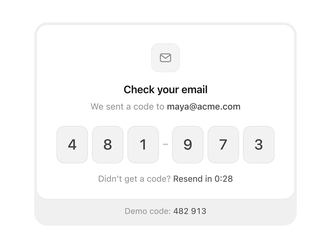
Verification code field with a gliding focus ring, paste and SMS autofill, a calm shake on errors. From affectUI (affectui.com).
Built with React and Tailwind. Copy the prompt and paste it into Claude Code, Cursor or Lovable: your agent adds OTP Input to your project and fits it to your theme.
Code
How OTP Input is used: the demo's code. The component's own source comes with a free account.
Usage.tsx
import { useEffect, useRef, useState } from "react";
import { OtpInput, type OtpStatus } from "@/components/ui/otp-input";

const CODE = "482913";
const WRONG = "481973";

const triesText = (n: number) => (n > 0 ? `That code didn't work. ${n} ${n === 1 ? "try" : "tries"} left.` : "That code didn't work. Request a new code.");

export default function Demo() {
  const [value, setValue] = useState("");
  const [status, setStatus] = useState<OtpStatus>("idle");
  const [tries, setTries] = useState(3);
  const timers = useRef<number[]>([]);
  const playing = useRef(true);

  const later = (ms: number, fn: () => void) => timers.current.push(window.setTimeout(fn, ms));
  const stop = () => {
    timers.current.forEach(clearTimeout);
    timers.current = [];
  };

  /** Checks a code like a server would – a short wait, then right or wrong */
  const verify = (code: string) => {
    setStatus("verifying");
    later(1000, () => {
      if (code === CODE) {
        setStatus("success");
        // Back to a fresh field after a while, so it can be tried again
        later(3200, () => {
          setValue("");
          setStatus("idle");
          setTries(3);
        });
      } else {
        setTries((t) => Math.max(0, t - 1));
        setStatus("error");
      }
    });
  };

  // Autoplay once: a wrong code, the shake, then the right one and the morph into "Verified"
  useEffect(() => {
    let t = 700;
    const type = (code: string) => {
      for (let i = 1; i <= code.length; i++) {
        const part = code.slice(0, i);
        later(t, () => setValue(part));
        t += 150;
      }
    };
    type(WRONG);
    later(t + 150, () => verify(WRONG));
    t += 150 + 1000 + 1700;
    // The message folds away as the next try starts
    later(t, () => setStatus("idle"));
    type(CODE);
    later(t + 150, () => {
      playing.current = false;
      verify(CODE);
    });
    return stop;
  }, []); // eslint-disable-line react-hooks/exhaustive-deps

  // Touching the field ends the autoplay right away
  const takeOver = () => {
    if (!playing.current) return;
    playing.current = false;
    stop();
    setValue("");
    setStatus("idle");
  };

  return (
    <div className="otp-demo" onPointerDownCapture={takeOver} onKeyDownCapture={takeOver} onFocusCapture={takeOver}>
      <style>{demoCss}</style>
      <div className="otp-demo__tray">
        <div className="otp-demo__card">
          <span className="otp-demo__icon" aria-hidden="true">
            <svg viewBox="0 0 24 24">
              <rect x="3.5" y="5.5" width="17" height="13" rx="2.5" />
              <path d="M4.5 7.5l7.5 5.5 7.5-5.5" />
            </svg>
          </span>
          <h3 className="otp-demo__title">Check your email</h3>
          <p className="otp-demo__text">
            We sent a code to <strong>maya@acme.com</strong>
          </p>
          <OtpInput
            className="otp-demo__otp"
            separator
            align="center"
            value={value}
            status={status}
            errorMessage={triesText(tries)}
            onChange={(code) => {
              setValue(code);
              if (status === "error" && code) setStatus("idle");
            }}
            onComplete={verify}
            onResend={() => setTries(3)}
            resendIn={30}
          />
        </div>
        <p className="otp-demo__hint">
          Demo code: <span>482{"\u00a0"}913</span>
        </p>
      </div>
    </div>
  );
}

const demoCss = `
.otp-demo {
  display: grid;
  grid-template-columns: minmax(0, 400px);
  place-content: center;
  width: 100%;
}
.otp-demo__tray {
  box-sizing: border-box;
  min-width: 0;
  padding: 4px;
  border-radius: 20px;
  background: #f0f0f0;
  font-family: "Inter", ui-sans-serif, system-ui, -apple-system, "Segoe UI", Roboto, sans-serif;
  -webkit-font-smoothing: antialiased;
}
.otp-demo__card {
  display: grid;
  justify-items: center;
  padding: 28px 24px 22px;
  border-radius: 16px;
  background: #fff;
  box-shadow: 0 0 0 1px #ececec, 0 1px 2px rgba(0, 0, 0, 0.04);
  text-align: center;
}
.otp-demo__icon {
  display: grid;
  place-items: center;
  width: 44px;
  height: 44px;
  margin-bottom: 14px;
  border-radius: 12px;
  background: #f4f4f5;
  box-shadow: inset 0 0 0 1px #ececec;
  color: #8f8f8f;
}
.otp-demo__icon svg { width: 22px; height: 22px; fill: none; stroke: currentColor; stroke-width: 1.7; stroke-linecap: round; stroke-linejoin: round; }
.otp-demo__title { margin: 0; font-size: 16px; font-weight: 600; letter-spacing: -0.01em; color: #171717; }
.otp-demo__text { margin: 4px 0 20px; font-size: 13.5px; color: #8f8f8f; overflow-wrap: anywhere; }
.otp-demo__text strong { font-weight: 500; color: #404040; }
.otp-demo__hint { margin: 0; padding: 10px 12px 8px; font-size: 12.5px; text-align: center; color: #8f8f8f; }
.otp-demo__hint span { font-variant-numeric: tabular-nums; color: #404040; }

:where(.dark, [data-theme="dark"]) .otp-demo__tray { background: #111113; }
:where(.dark, [data-theme="dark"]) .otp-demo__card { background: #19191b; box-shadow: 0 0 0 1px #2a2a2e, 0 1px 2px rgba(0, 0, 0, 0.2); }
:where(.dark, [data-theme="dark"]) .otp-demo__icon { background: #222225; box-shadow: inset 0 0 0 1px #2a2a2e; color: #8b8b92; }
:where(.dark, [data-theme="dark"]) .otp-demo__title { color: #ededed; }
:where(.dark, [data-theme="dark"]) .otp-demo__text, :where(.dark, [data-theme="dark"]) .otp-demo__hint { color: #8b8b92; }
:where(.dark, [data-theme="dark"]) .otp-demo__text strong, :where(.dark, [data-theme="dark"]) .otp-demo__hint span { color: #c8c8cc; }

/* Phones: a little less padding so the boxes keep their size */
@media (max-width: 420px) {
  .otp-demo__card { padding: 24px 12px 20px; }
}

/* Library cards are short – the whole card, smaller and centered below the category chip
   (with room for the error line that grows in during the autoplay) */
.card__preview .otp-demo {
  position: absolute;
  inset: 0;
  padding: 40px 0 6px;
  grid-template-columns: auto;
}
.card__preview .otp-demo__tray { width: 400px; zoom: 0.54; }

/* A fixed stage – the card sits in the middle and only grows by the error line */
.stage:has(.otp-demo) { height: 480px; padding: 48px 32px; }
@media (max-width: 760px) {
  .stage:has(.otp-demo) { height: 460px; padding: 52px 12px 16px; }
}
/* Narrow phones: the card spans the stage, so it starts below the round reset and theme buttons */
@media (max-width: 560px) {
  .stage:has(.otp-demo) { height: 450px; align-items: start; padding-top: 126px; }
}

/* Clean style: one white card – the demo-code hint is its last row */
.otp-democ {
  box-sizing: border-box;
  min-width: 0;
  overflow: hidden;
  border-radius: 10px;
  background: #fff;
  box-shadow: 0 0 0 0.5px rgba(0, 0, 0, 0.06), 0 1px 1px -1px rgba(0, 0, 0, 0.1), 0 1px 2px 0 rgba(0, 0, 0, 0.05);
  font-family: "Inter", "InterVariable", ui-sans-serif, system-ui, -apple-system, "Segoe UI", Roboto, sans-serif;
  -webkit-font-smoothing: antialiased;
}
.otp-democ__body { display: grid; justify-items: center; padding: 28px 24px 20px; text-align: center; }
.otp-democ__icon {
  display: grid;
  place-items: center;
  width: 36px;
  height: 36px;
  margin-bottom: 12px;
  border-radius: 8px;
  background: #fff;
  box-shadow: 0 0 0 0.5px rgba(0, 0, 0, 0.06), 0 1px 1px -1px rgba(0, 0, 0, 0.1), 0 1px 2px 0 rgba(0, 0, 0, 0.05);
  color: rgba(0, 0, 0, 0.447);
}
.otp-democ__icon svg { width: 16px; height: 16px; fill: none; stroke: currentColor; stroke-width: 1.1; stroke-linecap: round; stroke-linejoin: round; }
.otp-democ__title { margin: 0; font-size: 15px; line-height: 24px; font-weight: 500; color: #000; }
.otp-democ__text { margin: 2px 0 20px; font-size: 13px; line-height: 20px; color: rgba(0, 0, 0, 0.61); overflow-wrap: anywhere; }
.otp-democ__text strong { font-weight: 500; color: rgba(0, 0, 0, 0.88); }
.otp-democ__hint {
  margin: 0;
  padding: 10px 16px;
  border-top: 0.5px solid rgba(0, 0, 0, 0.06);
  font-size: 12px;
  line-height: 16px;
  text-align: center;
  color: rgba(0, 0, 0, 0.45);
}
.otp-democ__hint span { font-variant-numeric: tabular-nums; color: rgba(0, 0, 0, 0.88); }

:where(.dark, [data-theme="dark"]) .otp-democ,
:where(.dark, [data-theme="dark"]) .otp-democ__icon { background: #1c1c1e; box-shadow: 0 0 0 0.5px rgba(255, 255, 255, 0.1), 0 1px 2px rgba(0, 0, 0, 0.4); }
:where(.dark, [data-theme="dark"]) .otp-democ__icon { color: rgba(255, 255, 255, 0.5); }
:where(.dark, [data-theme="dark"]) .otp-democ__title { color: #fff; }
:where(.dark, [data-theme="dark"]) .otp-democ__text { color: rgba(255, 255, 255, 0.62); }
:where(.dark, [data-theme="dark"]) .otp-democ__text strong, :where(.dark, [data-theme="dark"]) .otp-democ__hint span { color: rgba(255, 255, 255, 0.9); }
:where(.dark, [data-theme="dark"]) .otp-democ__hint { border-top-color: rgba(255, 255, 255, 0.08); color: rgba(255, 255, 255, 0.46); }

@media (max-width: 420px) {
  .otp-democ__body { padding: 24px 12px 20px; }
}
.card__preview .otp-democ { width: 400px; zoom: 0.56; }
`;
More by flohoeller
View all
Thinking Loader
10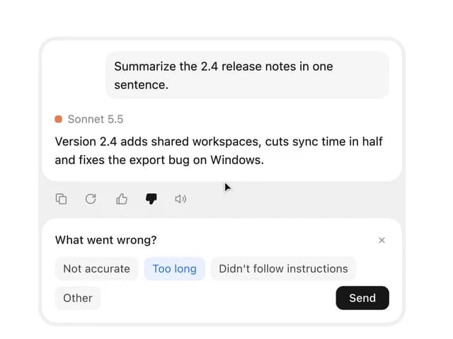
Message Actions
10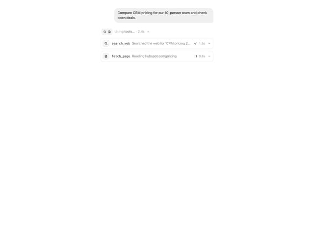
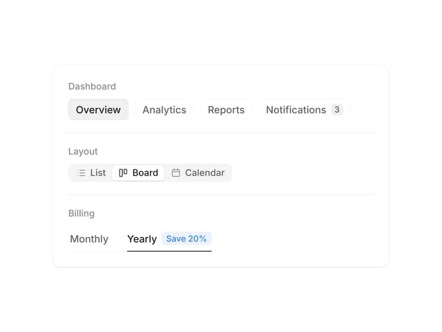
Tool Call Card
Segmented Control
More in Forms
View all

Premium Auth
520

Contact Card
1K

Form
16
Authentication Card
49

Book A Demo 1
72
Book A Demo 4
55
Login Card
26

Login Form
7

