
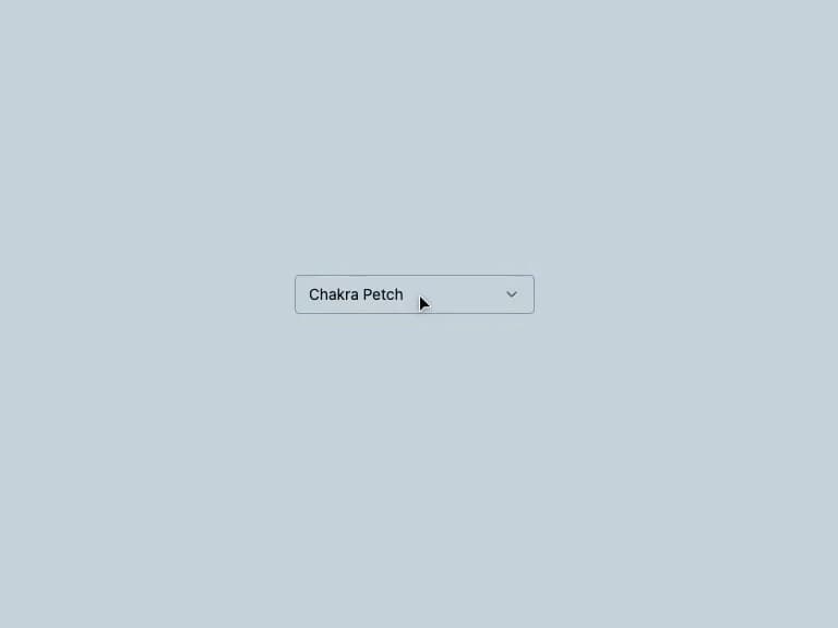
About
A dropdown select menu with a glassmorphic cyberpunk panel, neon focus glow and animated open/close transitions, built on Radix UI Select.
Built with React and Tailwind. Copy the prompt and paste it into Claude Code, Cursor or Lovable: your agent adds Neon Glass Select to your project and fits it to your theme.
Code
How Neon Glass Select is used: the demo's code. The component's own source comes with a free account.
Usage.tsx
import {
  Select,
  SelectContent,
  SelectGroup,
  SelectItem,
  SelectLabel,
  SelectTrigger,
  SelectValue,
} from "@/components/ui/select";

export default function SelectDemo() {
  return (
    <div className="flex min-h-[320px] w-full items-center justify-center bg-background p-10">
      <Select defaultValue="chakra">
        <SelectTrigger className="w-[220px]">
          <SelectValue placeholder="Pick a font" />
        </SelectTrigger>
        <SelectContent>
          <SelectGroup>
            <SelectLabel>Body font</SelectLabel>
            <SelectItem value="chakra">Chakra Petch</SelectItem>
            <SelectItem value="rajdhani">Rajdhani</SelectItem>
            <SelectItem value="inter">Inter</SelectItem>
            <SelectItem value="space-grotesk">Space Grotesk</SelectItem>
            <SelectItem value="orbitron">Orbitron</SelectItem>
            <SelectItem value="instrument-serif">Instrument Serif</SelectItem>
          </SelectGroup>
        </SelectContent>
      </Select>
    </div>
  );
}
Dependencies
More by ghaerdi
View all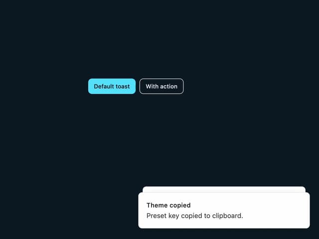
Toast Notification
3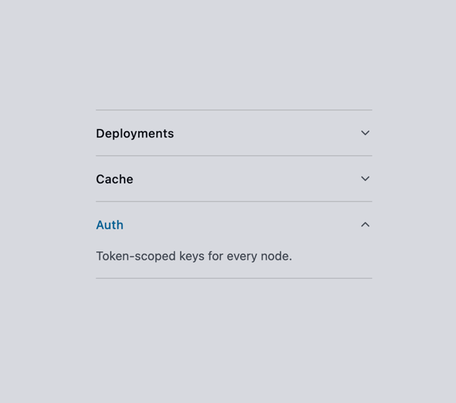
Accordion
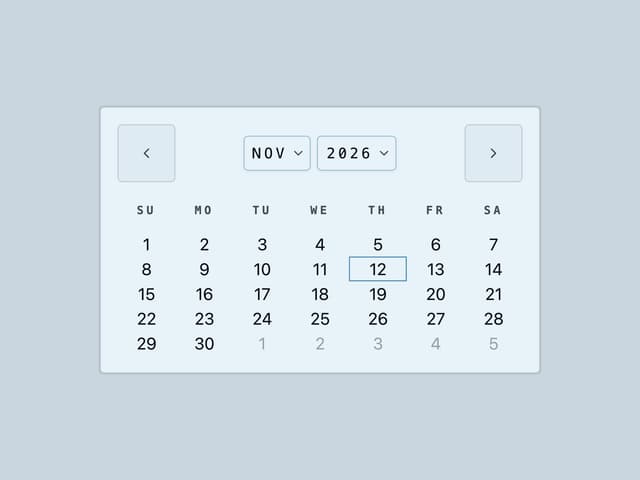
Calendar
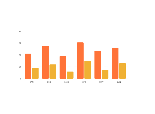
Chart
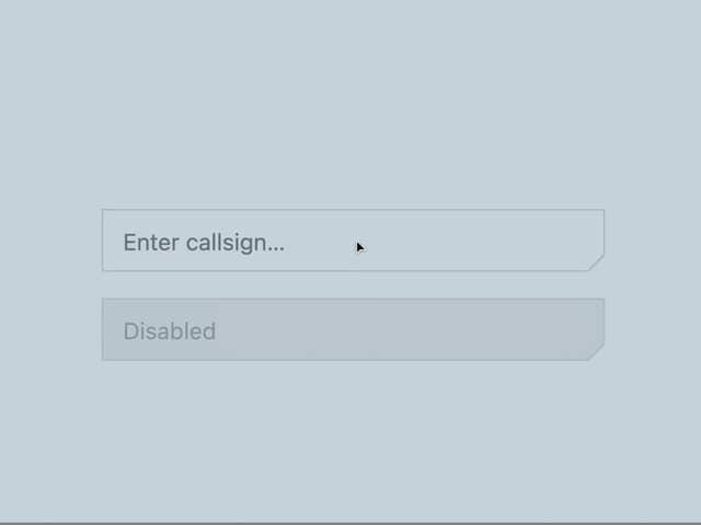
Carved Neon Input
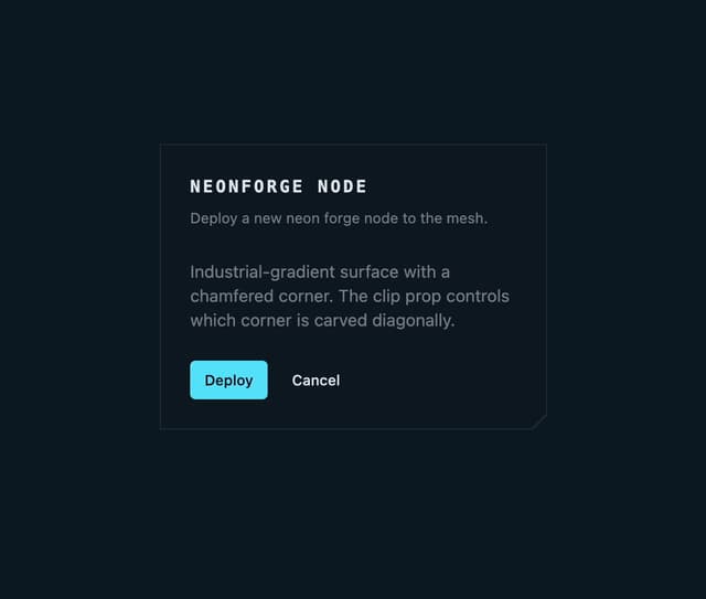
Chamfered Glass Card
More in Forms
View all

Login 1
63

Form
18

Premium Auth
570

Contact Card
1.1K

Card Studio
47

Book A Demo 1
91
Book A Demo 3
102

Login Card
35