
About
A searchable select input that opens a filterable list of options so a user can quickly find and pick one value by typing, with full keyboard navigation.
Built with React and Tailwind. Copy the prompt and paste it into Claude Code, Cursor or Lovable: your agent adds Combobox to your project and fits it to your theme.
Code
How Combobox is used: the demo's code. The component's own source comes with a free account.
Usage.tsx
"use client";

import Combobox, {
  tokens,
  motion,
  useThemeContext,
  usePal,
} from "@/components/ui/combobox";
import { useState } from "react";

function Text({
  children,
  size = "base",
  weight = "regular",
  color,
  mono,
  muted,
  secondary,
  align,
  truncate,
  theme: tp,
  style: sp,
  as: C = "span",
}) {
  const ctx = useThemeContext();
  const theme = tp || ctx;
  const pal = usePal(theme);
  let c = pal.text;
  if (color) c = color;
  else if (muted) c = pal.textMuted;
  else if (secondary) c = pal.textSecondary;

  return (
    <C
      style={{
        ...tokens.type[size],
        fontWeight: tokens.weight[weight],
        fontFamily: mono ? tokens.font.mono : tokens.font.sans,
        color: c,
        textAlign: align,
        transition: `color ${motion.smooth} ${motion.easeInOut}`,
        ...(truncate && {
          overflow: "hidden",
          textOverflow: "ellipsis",
          whiteSpace: "nowrap",
        }),
        ...sp,
      }}
    >
      {children}
    </C>
  );
}

function Stack({
  children,
  gap = "md",
  direction = "column",
  align,
  justify,
  wrap,
  style: sp,
}) {
  return (
    <div
      style={{
        display: "flex",
        flexDirection: direction === "row" ? "row" : "column",
        gap: tokens.space[gap] ?? gap,
        alignItems: align,
        justifyContent: justify,
        flexWrap: wrap ? "wrap" : undefined,
        ...sp,
      }}
    >
      {children}
    </div>
  );
}

export default function ComboboxControlledDemo() {
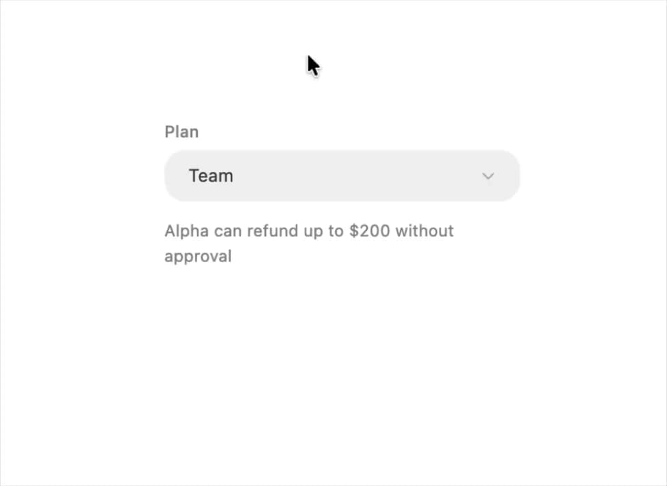
  const plans = [
    { value: "starter", label: "Starter", cap: "$50" },
    { value: "team", label: "Team", cap: "$200" },
    { value: "scale", label: "Scale", cap: "$500" },
  ];
  const [plan, setPlan] = useState("team");
  const current = plans.find((p) => p.value === plan);
  return (
    <Stack gap={12} style={{ width: 260, height: 280 }}>
      <Combobox label="Plan" value={plan} onChange={setPlan} options={plans} />
      <Text size="sm" secondary>
        Alpha can refund up to {current.cap} without approval
      </Text>
    </Stack>
  );
}
More by halaska-studio
View all
Dot Grid
41
Orb
20
Segmented Control
16
Choicebox
9
Input OTP
5
Switch
4
Dialog
4
Hover Card
4
More in Pricing
View all
Pricing Section
662

Pricing Section
192
Colorful-Pricing
87

Pricing Card
383

Pricing Cards
18
pricing section
170
Pricing Card With Features
179
Two-Plan Pricing Cards
39


