
About
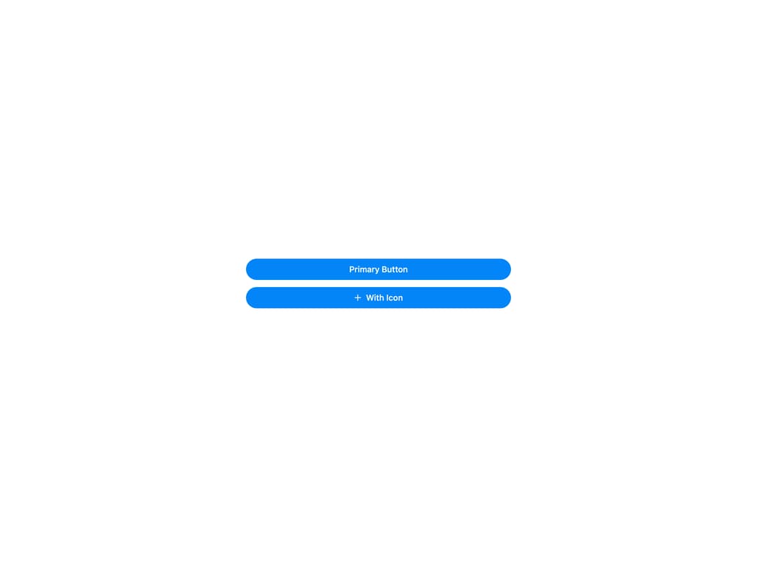
HeroUI Button with primary, secondary, tertiary, outline, ghost, danger and danger-soft variants, three sizes (sm/md/lg), icons and icon-only mode, pending/loading state, full-width, disabled state, social sign-in buttons and a render-prop children API. Works in both light and dark themes.
Built with React and Tailwind. Copy the prompt and paste it into Claude Code, Cursor or Lovable: your agent adds HeroUI Button to your project and fits it to your theme.
Code
How HeroUI Button is used: the demo's code. The component's own source comes with a free account.
Usage.tsx
import { Button } from "@/components/ui/heroui-button"
import { Plus } from "lucide-react"

export default function FullWidth() {
  return (
    <div className="flex min-h-screen w-full items-center justify-center p-8">
      <div className="flex w-full max-w-md flex-col gap-3">
        <Button variant="primary" fullWidth>Primary Button</Button>
        <Button variant="primary" fullWidth><Plus className="h-4 w-4" />With Icon</Button>
      </div>
    </div>
  )
}
Dependencies
More by Hero Ui
View all

DatePicker
473
Chip
449
The Pagination
367
HeroUI Table
123
HeroUI Color Picker
116
Skeleton
107
HeroUI Disclosure Group
98
HeroUI AlertDialog
85
More in Buttons
View all
Button
16
Texture Button
110

Button Group

Button
137

Button
37

Eclipse Button
44

Astryx Chat Send Button
3

Random Letter Swap CTA Buttons
62

