
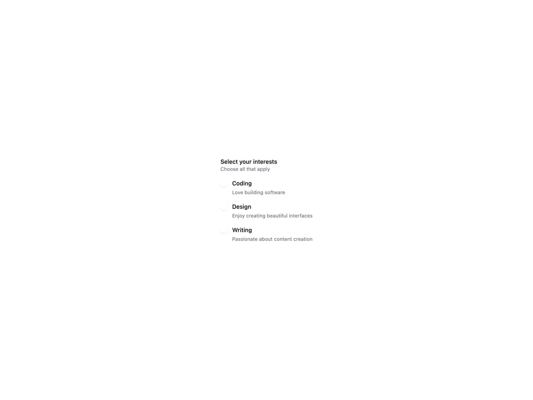
HeroUI v3 CheckboxGroup manages a set of related checkboxes as a single form field with a shared label, description and validation. Built on the real @heroui/react package with @heroui/styles, it supports controlled selection, an indeterminate "select all" parent, disabled state, required-field validation via Form/FieldError, a Surface variant, custom check indicators, a custom render function, and rich card-style add-on rows. A thin re-export of the upstream component so consumers install and render the genuine HeroUI primitive.
Built with React and Tailwind. Copy the prompt and paste it into Claude Code, Cursor or Lovable: your agent adds HeroUI Checkbox Group to your project and fits it to your theme.
Code
How HeroUI Checkbox Group is used: the demo's code. The component's own source comes with a free account.
Usage.tsx
"use client"

import { Checkbox, Description, Label } from "@heroui/react"
import { CheckboxGroup } from "@/components/ui/heroui-checkbox-group"

export function CustomRenderFunction() {
  return (
    <CheckboxGroup name="interests" render={(props) => <div {...props} data-custom="foo" />}>
      <Label>Select your interests</Label>
      <Description>Choose all that apply</Description>
      <Checkbox value="coding">
        <Checkbox.Content>
          <Checkbox.Control>
            <Checkbox.Indicator />
          </Checkbox.Control>
          Coding
        </Checkbox.Content>
        <Description>Love building software</Description>
      </Checkbox>
      <Checkbox value="design">
        <Checkbox.Content>
          <Checkbox.Control>
            <Checkbox.Indicator />
          </Checkbox.Control>
          Design
        </Checkbox.Content>
        <Description>Enjoy creating beautiful interfaces</Description>
      </Checkbox>
      <Checkbox value="writing">
        <Checkbox.Content>
          <Checkbox.Control>
            <Checkbox.Indicator />
          </Checkbox.Control>
          Writing
        </Checkbox.Content>
        <Description>Passionate about content creation</Description>
      </Checkbox>
    </CheckboxGroup>
  );
}

export default CustomRenderFunction
Dependencies
More by Hero Ui
View all

DatePicker
470
Chip
446
The Pagination
364
HeroUI Table
122
HeroUI Color Picker
112
Skeleton
105
HeroUI Disclosure Group
96
HeroUI AlertDialog
81
More in Forms
View all

Premium Auth
554

Book A Demo 1
87

Login 1
60

Contact Card
1.1K
Authentication Card
51

Form
137

Form
16

Modern & Stunning sign in
1.7K
