
About
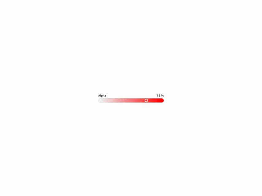
HeroUI v3 ColorSlider — slider for a single color channel (RGB/HSL/alpha), vertical, disabled, controlled and custom render.
Built with React and Tailwind. Copy the prompt and paste it into Claude Code, Cursor or Lovable: your agent adds HeroUI Color Slider to your project and fits it to your theme.
Code
How HeroUI Color Slider is used: the demo's code. The component's own source comes with a free account.
Usage.tsx
import { ColorSlider } from "@/components/ui/heroui-color-slider"
import { Label } from "@heroui/react"

export default function AlphaChannel() {
  return (
    <ColorSlider channel="alpha" className="w-full max-w-xs" defaultValue="hsla(0, 100%, 50%, 0.5)">
      <Label>Alpha</Label>
      <ColorSlider.Output />
      <ColorSlider.Track>
        <ColorSlider.Thumb />
      </ColorSlider.Track>
    </ColorSlider>
  )
}
Dependencies
More by Hero Ui
View all

DatePicker
468
Chip
446
The Pagination
364
HeroUI Table
118
HeroUI Color Picker
109
Skeleton
105
HeroUI Disclosure Group
95
HeroUI AlertDialog
81
More in Forms
View all

Contact Card
1K

Premium Auth
537

Login 2
10

Book A Demo 1
78

Form
17

Card Studio
45

Form
12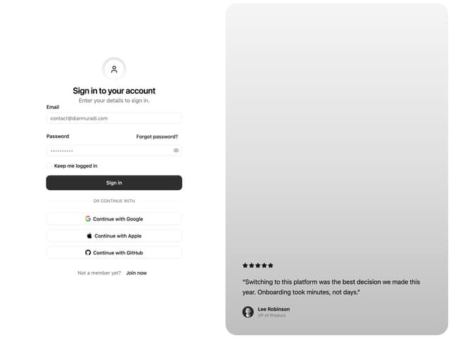

Split Sign In Form
84