"use client";

import BeamBorder, { type BeamBorderProps } from "@/components/ui/border-beam";

const settings = {
  size: "md",
  colorVariant: "colorful",
  theme: "auto",
  active: true,
  strength: 2,
  duration: 3.3,
  beamWidth: 2,
  backgroundColor: "#212121",
};

export default function BorderBeamDemo(props: Partial<typeof settings>) {
  const s = { ...settings, ...props };
  return (
    <main className="flex min-h-screen w-full items-center justify-center bg-background p-10">
      <BeamBorder
        size={s.size as BeamBorderProps["size"]}
        colorVariant={s.colorVariant as BeamBorderProps["colorVariant"]}
        theme={s.theme as BeamBorderProps["theme"]}
        active={s.active}
        strength={s.strength}
        duration={s.duration}
        beamWidth={s.beamWidth}
        className="w-full max-w-sm"
      >
        <div
          className="relative flex flex-col gap-4 rounded-2xl p-8 text-white"
          style={{ backgroundColor: s.backgroundColor }}
        >
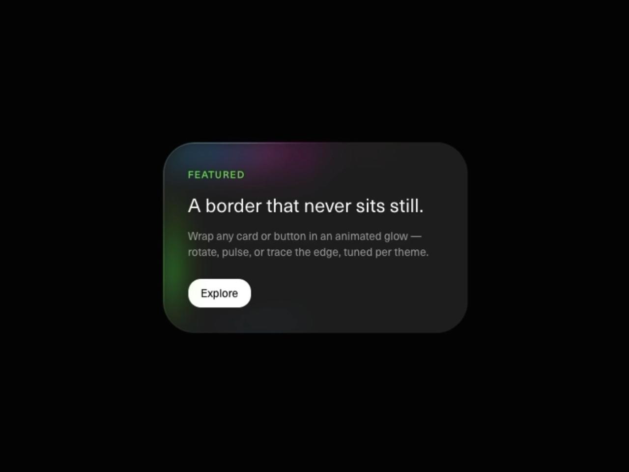
          <p className="text-xs font-bold uppercase tracking-[0.12em] text-[#66D933]">Featured</p>
          <h2 className="text-2xl font-medium leading-tight">A border that never sits still.</h2>
          <p className="text-sm text-white/60">
            Wrap any card or button in an animated glow — rotate, pulse, or trace the edge, tuned per theme.
          </p>
          <button
            type="button"
            className="mt-2 w-fit rounded-lg bg-white px-4 py-2 text-sm font-medium text-black transition-transform hover:scale-105 active:scale-95"
          >
            Explore
          </button>
        </div>
      </BeamBorder>
    </main>
  );
}