"use client";
import DirectionalMenu, { type DirectionalMenuItem } from "@/components/ui/directional-menu";
const settings = {
duration: 0.35,
distance: 100,
closeDelay: 80,
panelGap: 20,
activeColor: "#0a0a0a",
inactiveColor: "#737373",
};
const PRODUCT_LINKS = [
{ label: "Overview", href: "#" },
{ label: "Pricing", href: "#" },
{ label: "Integrations", href: "#" },
{ label: "Documentation", href: "#" },
];
const PREVIEW_IMAGES = [
{
alt: "Dashboard preview",
src: "https://cdn.21st.dev/assets/mirror/1e/1e4a66a9c43bf24af52e65fb43602d5c497beb96ffc40fa4ad7b1eeabb879812.jpg",
},
{
alt: "Product showcase",
src: "https://cdn.21st.dev/assets/mirror/ef/ef696854debc5d2d40cbe03ea0c3a04e29689529cf2f4bfe90c1c5978f00579a.jpg",
},
];
const SOLUTION_BLOCKS = [
{
title: "Startups",
description:
"Launch faster with flexible infrastructure, simple onboarding, and scalable workflows.",
href: "#",
},
{
title: "Enterprise",
description:
"Bring governance, performance, and operational control to complex digital systems.",
href: "#",
},
{
title: "Agencies",
description:
"Build repeatable client delivery with modular systems, collaboration, and speed.",
href: "#",
},
];
const LINK_GROUPS = [
{
heading: "Documentation",
links: ["API Reference", "Guides", "Examples"],
},
{
heading: "Resources",
links: ["Changelog", "Community", "Support"],
},
{
heading: "Company",
links: ["About", "Careers", "Contact"],
},
];
const linkClassName =
"rounded-lg outline-none transition-colors duration-200 focus-visible:ring-2 focus-visible:ring-ring motion-reduce:transition-none";
function ProductsPanel() {
return (
<div className="flex flex-col gap-6 @4xl:flex-row @4xl:justify-between @4xl:gap-8">
<div className="flex flex-col gap-5 @4xl:w-[65%]">
<div className="flex flex-col gap-2">
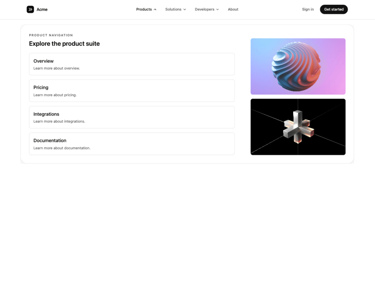
<p className="text-xs font-semibold uppercase tracking-[0.14em] text-muted-foreground">
Product navigation
</p>
<h3 className="text-xl font-semibold text-foreground @3xl:text-2xl">
Explore the product suite
</h3>
</div>
<div className="grid grid-cols-1 gap-3 @2xl:grid-cols-2 @4xl:grid-cols-1 @4xl:gap-4">
{PRODUCT_LINKS.map((item) => (
<a
key={item.label}
href={item.href}
className={`${linkClassName} flex flex-col gap-1 border border-border p-4 hover:bg-accent`}
>
<span className="text-base font-medium text-foreground @3xl:text-lg">
{item.label}
</span>
<span className="text-sm text-muted-foreground">
Learn more about {item.label.toLowerCase()}.
</span>
</a>
))}
</div>
</div>
<div className="hidden flex-col justify-end gap-4 @4xl:flex @4xl:w-[30%]">
{PREVIEW_IMAGES.map((image) => (
<div key={image.src} className="h-54 overflow-hidden rounded-lg">
<img
src={image.src}
alt={image.alt}
width={600}
height={400}
className="h-full w-full object-cover"
/>
</div>
))}
</div>
</div>
);
}
function SolutionsPanel() {
return (
<div className="flex flex-col gap-6">
<div className="flex flex-col gap-2">
<p className="text-xs font-semibold uppercase tracking-[0.14em] text-muted-foreground">
Solutions
</p>
<h3 className="text-xl font-semibold text-foreground @3xl:text-2xl">
Built for different teams
</h3>
</div>
<div className="grid grid-cols-1 gap-3 @2xl:grid-cols-3 @2xl:gap-6">
{SOLUTION_BLOCKS.map((block) => (
<a
key={block.title}
href={block.href}
className={`${linkClassName} flex flex-col gap-2 border border-border p-4 hover:bg-accent @2xl:gap-3 @2xl:p-6`}
>
<h4 className="text-base font-semibold text-foreground @3xl:text-lg">
{block.title}
</h4>
<p className="text-sm leading-6 text-muted-foreground">{block.description}</p>
</a>
))}
</div>
</div>
);
}
function DevelopersPanel() {
return (
<div className="grid grid-cols-3 gap-6 @3xl:gap-10">
{LINK_GROUPS.map((group) => (
<div key={group.heading} className="flex flex-col gap-4">
<h4 className="text-xs font-semibold uppercase tracking-[0.08em] text-foreground @3xl:text-sm">
{group.heading}
</h4>
<div className="flex flex-col gap-3">
{group.links.map((label) => (
<a
key={label}
href="#"
className={`${linkClassName} block text-sm font-medium text-muted-foreground hover:text-foreground`}
>
{label}
</a>
))}
</div>
</div>
))}
</div>
);
}
const items: DirectionalMenuItem[] = [
{ label: "Products", customContent: <ProductsPanel /> },
{ label: "Solutions", customContent: <SolutionsPanel /> },
{ label: "Developers", customContent: <DevelopersPanel /> },
{ label: "About", href: "#" },
];
const logo = (
<a
href="#"
aria-label="Acme home"
className="flex items-center gap-2.5 rounded-md outline-none focus-visible:ring-2 focus-visible:ring-ring"
>
<svg viewBox="0 0 28 28" className="h-7 w-7" aria-hidden="true">
<rect width="28" height="28" rx="8" className="fill-foreground" />
<path
d="M9 9l5 5-5 5M15 9l5 5-5 5"
fill="none"
strokeWidth="2"
strokeLinecap="round"
strokeLinejoin="round"
className="stroke-background"
/>
</svg>
<span className="hidden text-base font-semibold tracking-tight text-foreground @3xl:inline">
Acme
</span>
</a>
);
const actions = (
<>
<a
href="#"
className="rounded-full px-4 py-2 text-sm font-medium text-muted-foreground outline-none transition-colors hover:text-foreground focus-visible:ring-2 focus-visible:ring-ring"
>
Sign in
</a>
<a
href="#"
className="rounded-full bg-primary px-4 py-2 text-sm font-medium text-primary-foreground outline-none transition-opacity hover:opacity-90 focus-visible:ring-2 focus-visible:ring-ring focus-visible:ring-offset-2 focus-visible:ring-offset-background"
>
Get started
</a>
</>
);
export default function DirectionalMenuDemo(props: Partial<typeof settings>) {
const s = { ...settings, ...props };
// Hex keeps a color picker in the Controls panel; until a color is changed,
// the component's own theme-aware default is used.
const themed = (key: "activeColor" | "inactiveColor") =>
s[key] === settings[key] ? undefined : s[key];
return (
<div className="@container min-h-screen w-full bg-background text-foreground">
<DirectionalMenu
items={items}
logo={logo}
actions={actions}
duration={s.duration}
distance={s.distance}
closeDelay={s.closeDelay}
panelGap={s.panelGap}
activeColor={themed("activeColor")}
inactiveColor={themed("inactiveColor")}
/>
<main className="mx-auto flex max-w-3xl flex-col items-center gap-5 px-6 pb-24 pt-28 text-center @3xl:pt-40">
<span className="rounded-full border border-border px-3 py-1 text-xs font-medium text-muted-foreground">
Directional mega menu
</span>
<h1 className="text-4xl font-semibold leading-[1.05] tracking-tight @3xl:text-6xl">
Menus that move the way you do.
</h1>
<p className="max-w-md text-sm leading-relaxed text-muted-foreground @3xl:text-base">
Hover across Products, Solutions and Developers. Each panel slides in
from the side you're heading toward while the frame resizes to fit.
</p>
</main>
</div>
);
}