
About
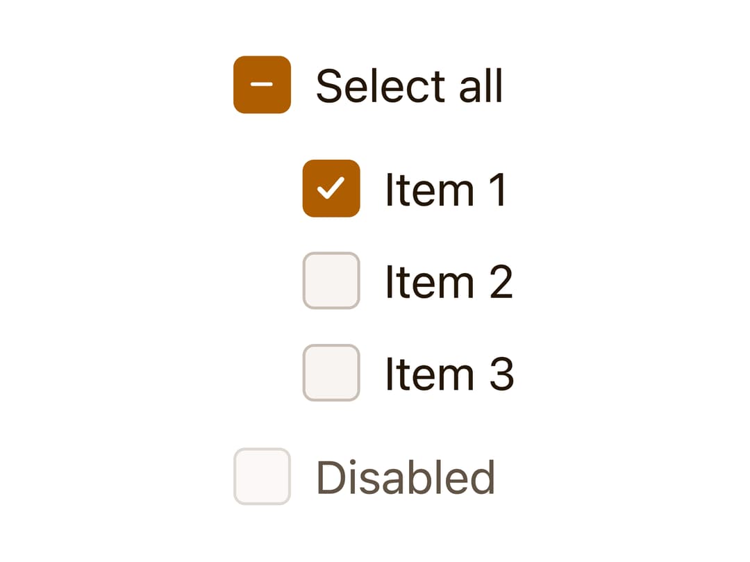
A checkbox control built on a real native input, with the visible box as a styled sibling element supporting checked, unchecked, and indeterminate states.
Built with React and Tailwind. Copy the prompt and paste it into Claude Code, Cursor or Lovable: your agent adds Checkbox to your project and fits it to your theme.
Code
How Checkbox is used: the demo's code. The component's own source comes with a free account.
Usage.tsx
import Checkbox from "@/components/ui/checkbox";
import { useState } from "react";

export default function CheckboxDemo() {
  const [values, setValues] = useState([true, false, false]);
  const allChecked = values.every(Boolean);
  const someChecked = values.some(Boolean);

  return (
    <div style={{ display: "flex", flexDirection: "column", gap: "0.75rem" }}>
      <Checkbox
        checked={allChecked}
        indeterminate={someChecked && !allChecked}
        onCheckedChange={(checked) => setValues(values.map(() => checked))}
      >
        Select all
      </Checkbox>
      <div
        style={{
          display: "flex",
          flexDirection: "column",
          gap: "0.5rem",
          paddingInlineStart: "1.5rem",
        }}
      >
        {values.map((checked, index) => (
          <Checkbox
            key={index}
            checked={checked}
            onCheckedChange={(next) =>
              setValues(values.map((v, i) => (i === index ? next : v)))
            }
          >
            Item {index + 1}
          </Checkbox>
        ))}
      </div>
      <Checkbox disabled>Disabled</Checkbox>
    </div>
  );
}
More by kemiljk
View all
Switch
1
Avatar
Scroll Area
Skeleton
More in Forms
View all

Premium Auth
546

Contact Card
1.1K

Form
137

Login 1
59

Card Studio
46

Login 2
10

Book A Demo 1
83

Form
3