
About
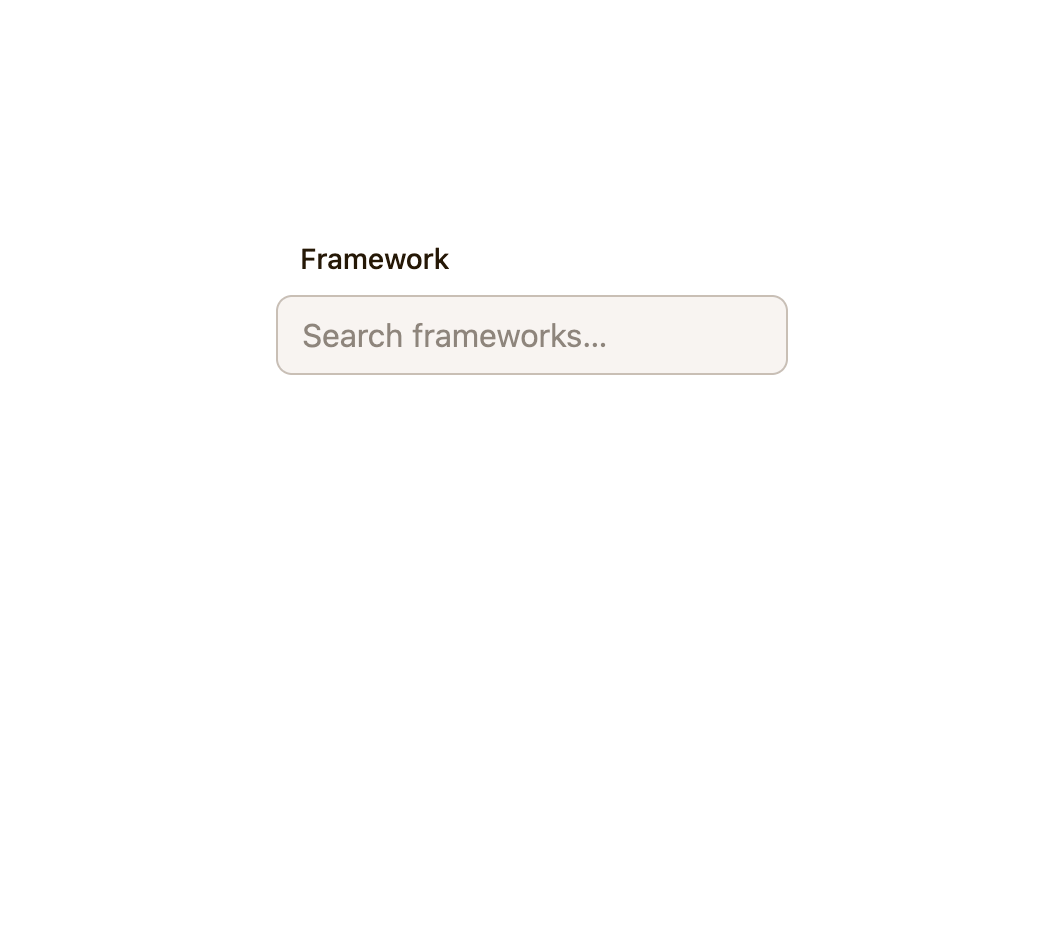
A searchable, filterable dropdown input that lets a user type to narrow a list of options and select one, built on the WAI-ARIA 1.2 combobox pattern with keyboard navigation and optional grouped results.
Built with React and Tailwind. Copy the prompt and paste it into Claude Code, Cursor or Lovable: your agent adds Combobox to your project and fits it to your theme.
Code
How Combobox is used: the demo's code. The component's own source comes with a free account.
Usage.tsx
import Combobox from "@/components/ui/combobox";
import type { ComboboxGroup, ComboboxOption } from "@/components/ui/combobox";

const groups: ComboboxGroup[] = [
  {
    id: "frontend",
    label: "Frontend",
    items: [
      { value: "astro", label: "Astro" },
      { value: "next", label: "Next.js" },
      { value: "remix", label: "Remix" },
    ],
  },
  {
    id: "backend",
    label: "Backend",
    items: [
      { value: "express", label: "Express" },
      { value: "fastify", label: "Fastify" },
    ],
  },
];

function renderOption(
  option: ComboboxOption,
  state: { active: boolean; selected: boolean },
) {
  return (
    <span
      style={{
        display: "flex",
        alignItems: "center",
        justifyContent: "space-between",
        inlineSize: "100%",
      }}
    >
      {option.label}
      {state.selected ? <span aria-hidden="true">✓</span> : null}
    </span>
  );
}

export default function ComboboxGroupsDemo() {
  return (
    <div style={{ inlineSize: "16rem" }}>
      <Combobox
        label="Framework"
        groups={groups}
        renderOption={renderOption}
        placeholder="Search frameworks…"
      />
    </div>
  );
}
More by kemiljk
View all
Switch
8
Color Picker
1
Progress
Navigation Menu

Toggle
Radio Group

Avatar
Checkbox