
About
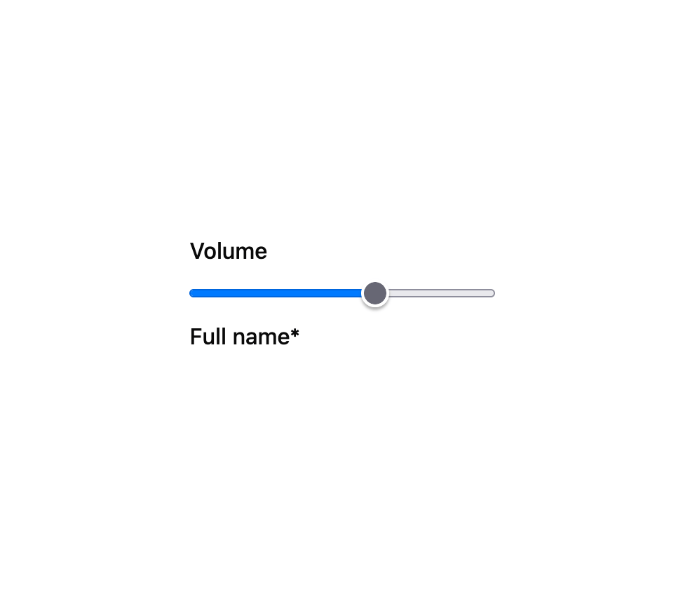
A standalone, accessible label element for composing custom form controls that don't render their own label, with an optional required-field asterisk.
Built with React and Tailwind. Copy the prompt and paste it into Claude Code, Cursor or Lovable: your agent adds Label to your project and fits it to your theme.
Code
How Label is used: the demo's code. The component's own source comes with a free account.
Usage.tsx
import { Label } from "@/components/ui/label";

export default function LabelDemo() {
  return (
    <div style={{ display: "flex", flexDirection: "column", gap: "0.5rem" }}>
      <Label htmlFor="demo-volume">Volume</Label>
      <input id="demo-volume" type="range" />
      <Label htmlFor="demo-name" required>
        Full name
      </Label>
      <input id="demo-name" type="text" />
    </div>
  );
}
More by kemiljk
View all
Switch
8
Color Picker
1
Combobox
Progress
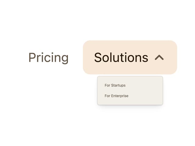
Navigation Menu
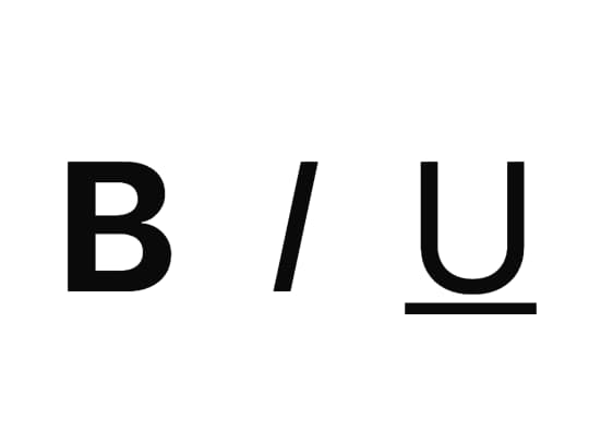
Toggle
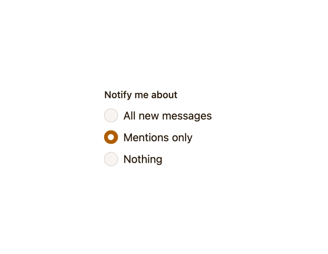
Radio Group
Avatar
More in Forms
View all

Form
18

Premium Auth
570

Login 1
63

Contact Card
1.1K

Book A Demo 1
91
Book A Demo 3
102

Card Studio
47

Login Card
35