
About
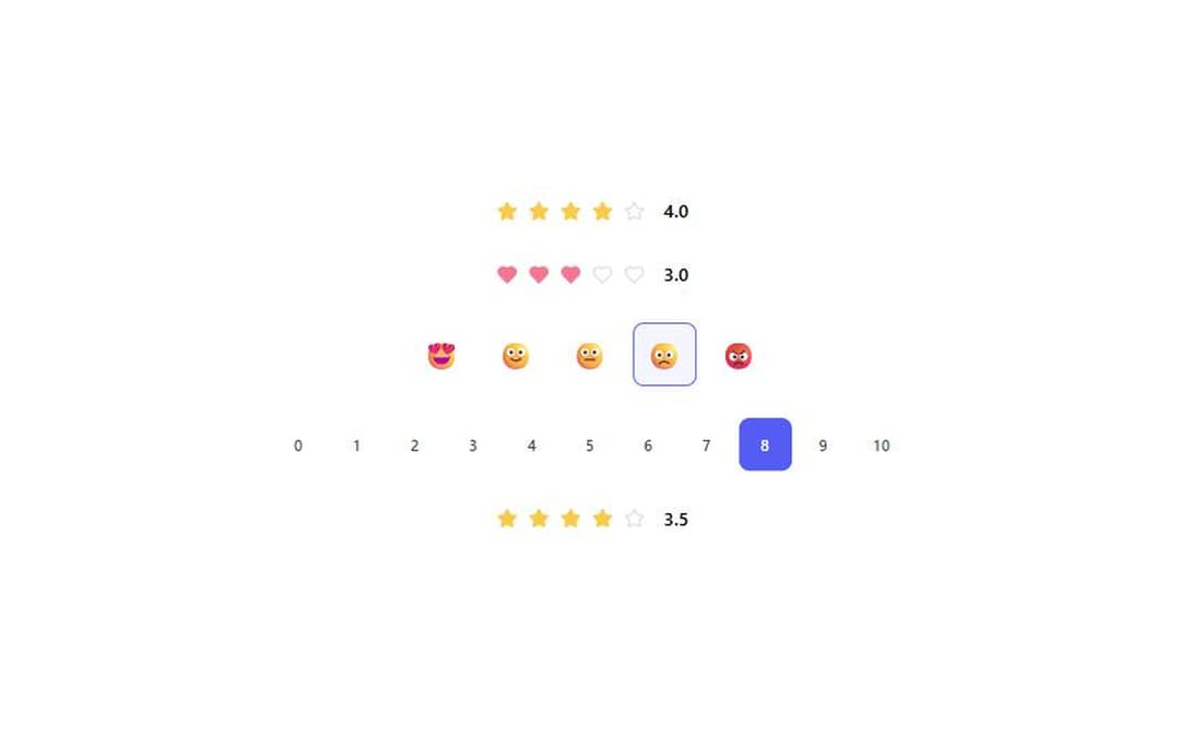
Interactive rating input in four styles (stars, hearts, emojis, scale) with hover preview, keyboard support and a read-only mode. From WunderUI, free, MIT.
Built with React and Tailwind. Copy the prompt and paste it into Claude Code, Cursor or Lovable: your agent adds Rating to your project and fits it to your theme.
Code
How Rating is used: the demo's code. The component's own source comes with a free account.
Usage.tsx
import { useState } from "react";
import { Rating } from "@/components/ui/rating";

export default function RatingDemo() {
  const [stars, setStars] = useState(4);
  const [hearts, setHearts] = useState(3);
  const [emoji, setEmoji] = useState(4);
  const [scale, setScale] = useState(8);
  return (
    <div className="flex min-h-72 flex-col items-center justify-center gap-6 p-8">
      <Rating
        value={stars}
        onValueChange={setStars}
        type="stars"
        label="right"
      />
      <Rating
        value={hearts}
        onValueChange={setHearts}
        type="hearts"
        label="right"
      />
      <Rating value={emoji} onValueChange={setEmoji} type="emojis" />
      <Rating value={scale} onValueChange={setScale} type="scale" />
      <Rating
        value={3.5}
        readOnly
        type="stars"
        label="right"
        aria-label="Average rating"
      />
    </div>
  );
}
Dependencies
More by WunderUI
View all

Trend Chip
Pull to Refresh
Holo Card
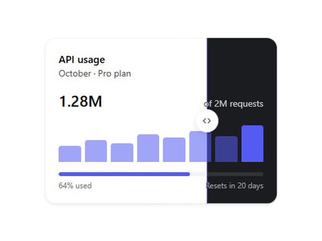
Theme Split

Logo Marquee
Deck Shuffle

Converge Spinner
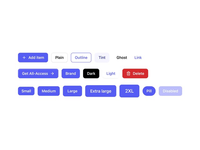
Button