
About
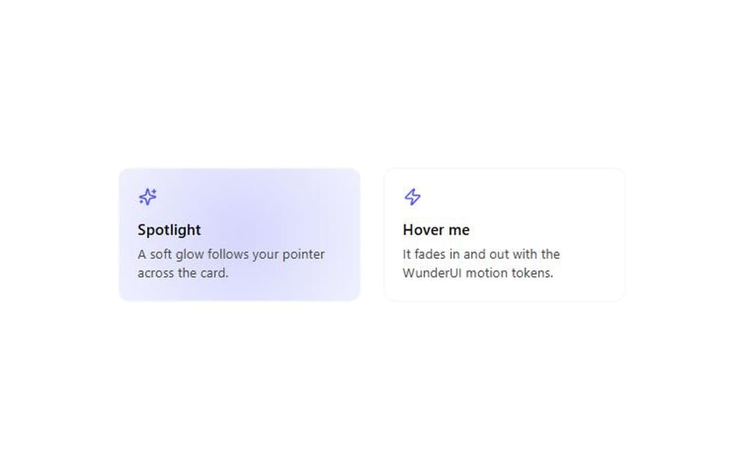
A card with a mouse-tracking spotlight: a soft glow in the primary colour follows the pointer and fades in and out with the WunderUI motion tokens. From WunderUI, free, MIT.
Built with React and Tailwind. Copy the prompt and paste it into Claude Code, Cursor or Lovable: your agent adds Holo Card to your project and fits it to your theme.
Code
How Holo Card is used: the demo's code. The component's own source comes with a free account.
Usage.tsx
import { HoloCard } from "@/components/ui/holo-card";
import { Sparkles, Zap } from "lucide-react";

export default function HoloCardDemo() {
  return (
    <div className="flex min-h-72 flex-wrap items-center justify-center gap-6 p-8">
      {/* The spotlight is forced on in the first card so the cover shows it; move the pointer over either card. */}
      <HoloCard className="w-64 [&>div:first-child]:opacity-100">
        <Sparkles className="mb-3 size-5 text-primary" />
        <p className="text-base font-semibold text-foreground">Spotlight</p>
        <p className="mt-1 text-sm text-text-secondary">
          A soft glow follows your pointer across the card.
        </p>
      </HoloCard>
      <HoloCard className="w-64">
        <Zap className="mb-3 size-5 text-primary" />
        <p className="text-base font-semibold text-foreground">Hover me</p>
        <p className="mt-1 text-sm text-text-secondary">
          It fades in and out with the WunderUI motion tokens.
        </p>
      </HoloCard>
    </div>
  );
}
Dependencies
More by WunderUI
View all

Trend Chip
Pull to Refresh
Rating
Theme Split
Logo Marquee
Deck Shuffle
Converge Spinner
Button