
About
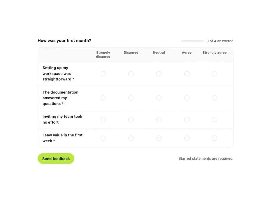
An accessible survey matrix component for rating multiple statements against the same agreement scale, with per-row required validation, a progress indicator, and a layout that collapses from a grid into stacked cards on narrow containers.
Built with React and Tailwind. Copy the prompt and paste it into Claude Code, Cursor or Lovable: your agent adds Likert Scale to your project and fits it to your theme.
Code
How Likert Scale is used: the demo's code. The component's own source comes with a free account.
Usage.tsx
"use client";

import LikertScale, {
  type LikertScaleStatement,
} from "@/components/ui/likert-scale";
import { useState } from "react";

const statements: LikertScaleStatement[] = [
  {
    id: "workspace",
    label: "Setting up my workspace was straightforward",
    required: true,
  },
  {
    id: "docs",
    label: "The documentation answered my questions",
    required: true,
  },
  { id: "invite", label: "Inviting my team took no effort" },
  { id: "value", label: "I saw value in the first week", required: true },
];

export default function LikertScaleDemo() {
  const [answers, setAnswers] = useState<Record<string, string>>({});
  const [submitted, setSubmitted] = useState(false);

  return (
    <div className="flex w-full items-center justify-center bg-background p-6 text-foreground">
      <form
        className="flex w-full max-w-2xl flex-col gap-5"
        onSubmit={(event) => {
          event.preventDefault();
          setSubmitted(true);
        }}
      >
        <LikertScale
          label="How was your first month?"
          statements={statements}
          value={answers}
          onValueChange={setAnswers}
          showErrors={submitted}
          name="onboarding"
        />
        <div className="flex flex-wrap items-center justify-between gap-2">
          <button
            type="submit"
            className="inline-flex h-9 items-center justify-center rounded-full bg-accent-strong px-4 text-[13px] font-semibold text-ink"
          >
            Send feedback
          </button>
          <span className="text-[12px] font-medium text-ink-faint">
            Starred statements are required.
          </span>
        </div>
      </form>
    </div>
  );
}
Dependencies
More by klyv-ui
View all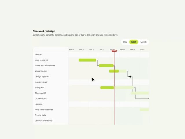
Gantt Chart
67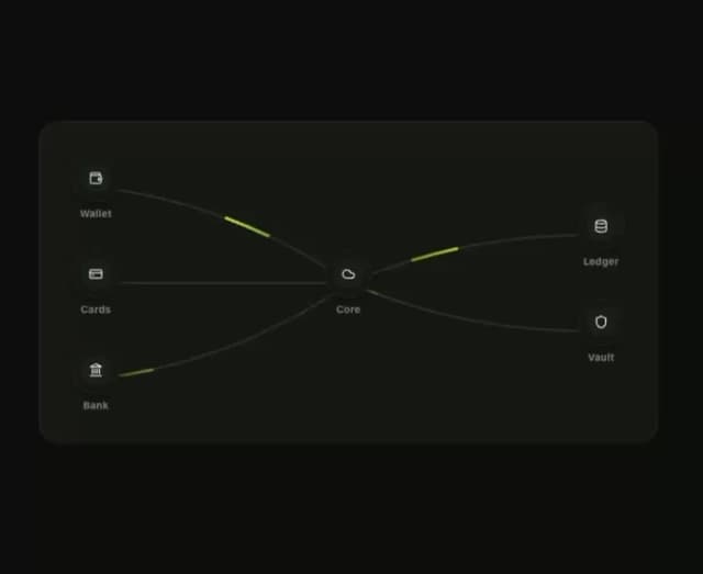
Klyv Animated Beam
54
Shader Canvas
52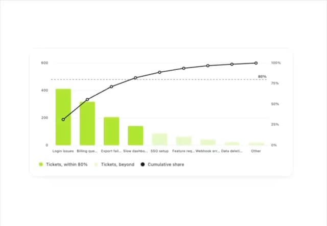
Pareto Chart
47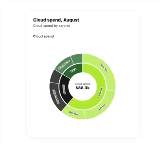
Sunburst Chart
27
Gooey Loader
25
Fluid Canvas
25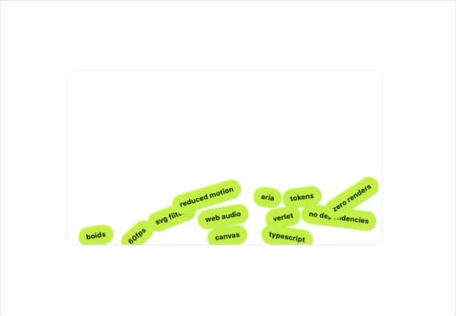
Gravity Tags
22
More in Forms
View all

Premium Auth
527

Contact Card
1K
Login Card
28

Book A Demo 1
75

Login 1
54

Login Card
33

Split Sign In Form
63

Modern & Stunning sign in
1.6K
