
About
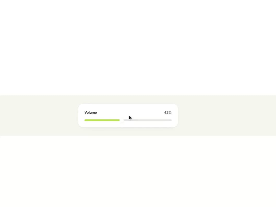
A native range input restyled with a gradient-filled track and rounded thumb, for picking a numeric value such as volume or zoom.
Built with React and Tailwind. Copy the prompt and paste it into Claude Code, Cursor or Lovable: your agent adds Slider to your project and fits it to your theme.
Code
How Slider is used: the demo's code. The component's own source comes with a free account.
Usage.tsx
import { Slider } from "@/components/ui/slider";
import { useState } from "react";

export default function SliderDemo() {
  const [volume, setVolume] = useState(42);

  return (
    <div className="flex w-full items-center justify-center bg-canvas p-8">
      <div className="flex w-full max-w-sm flex-col gap-4 rounded-[var(--radius-card)] border border-line bg-surface p-6 shadow-[var(--shadow-card)]">
        <div className="flex items-center justify-between">
          <span className="text-[13px] font-semibold text-ink">Volume</span>
          <span className="text-[13px] font-medium tabular-nums text-ink-faint">
            {volume}%
          </span>
        </div>
        <Slider
          aria-label="Volume"
          value={volume}
          min={0}
          max={100}
          onChange={(event) => setVolume(Number(event.target.value))}
        />
      </div>
    </div>
  );
}
More by klyv-ui
View all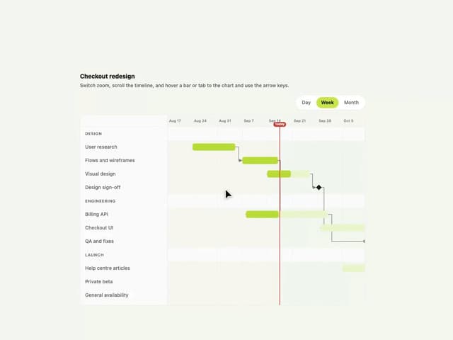
Gantt Chart
68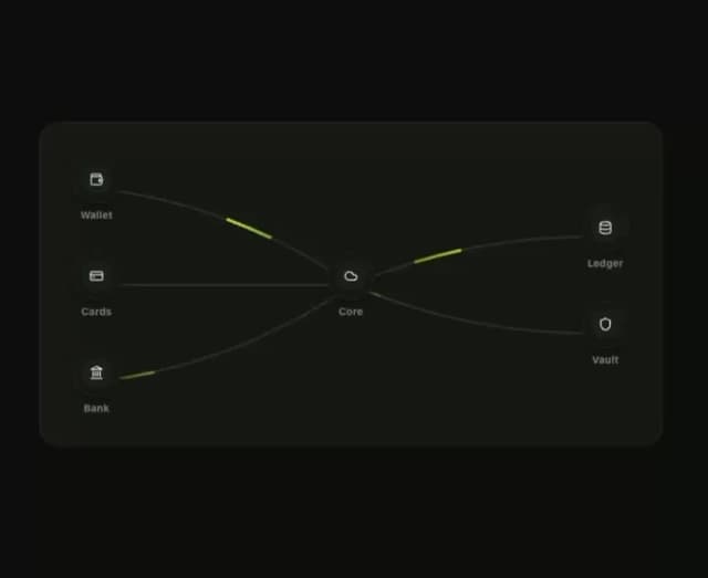
Klyv Animated Beam
55
Shader Canvas
54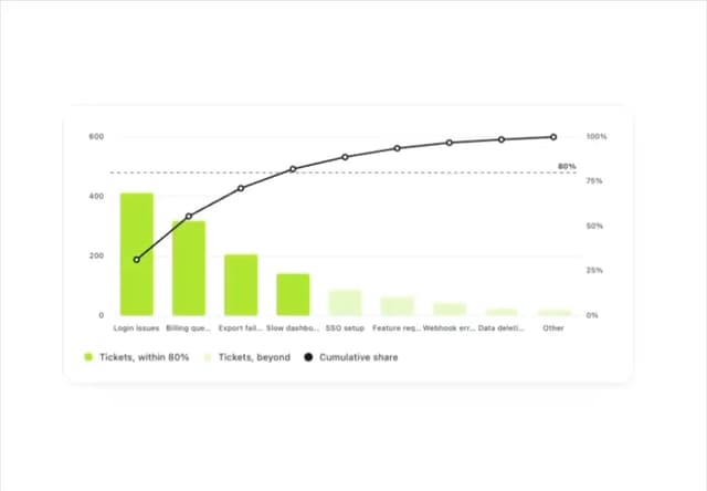
Pareto Chart
49
Sunburst Chart
28
Fluid Canvas
27
Gooey Loader
26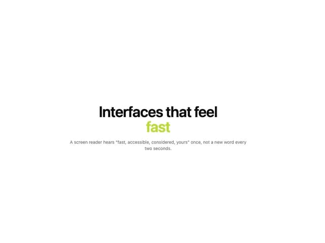
Morphing Text
23
More in Forms
View all

Premium Auth
532

Contact Card
1K

Book A Demo 1
77

Login 2
8

Card Studio
43
Login Card
29

Form
17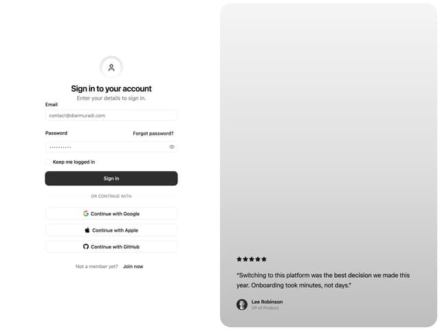

Split Sign In Form
76
