
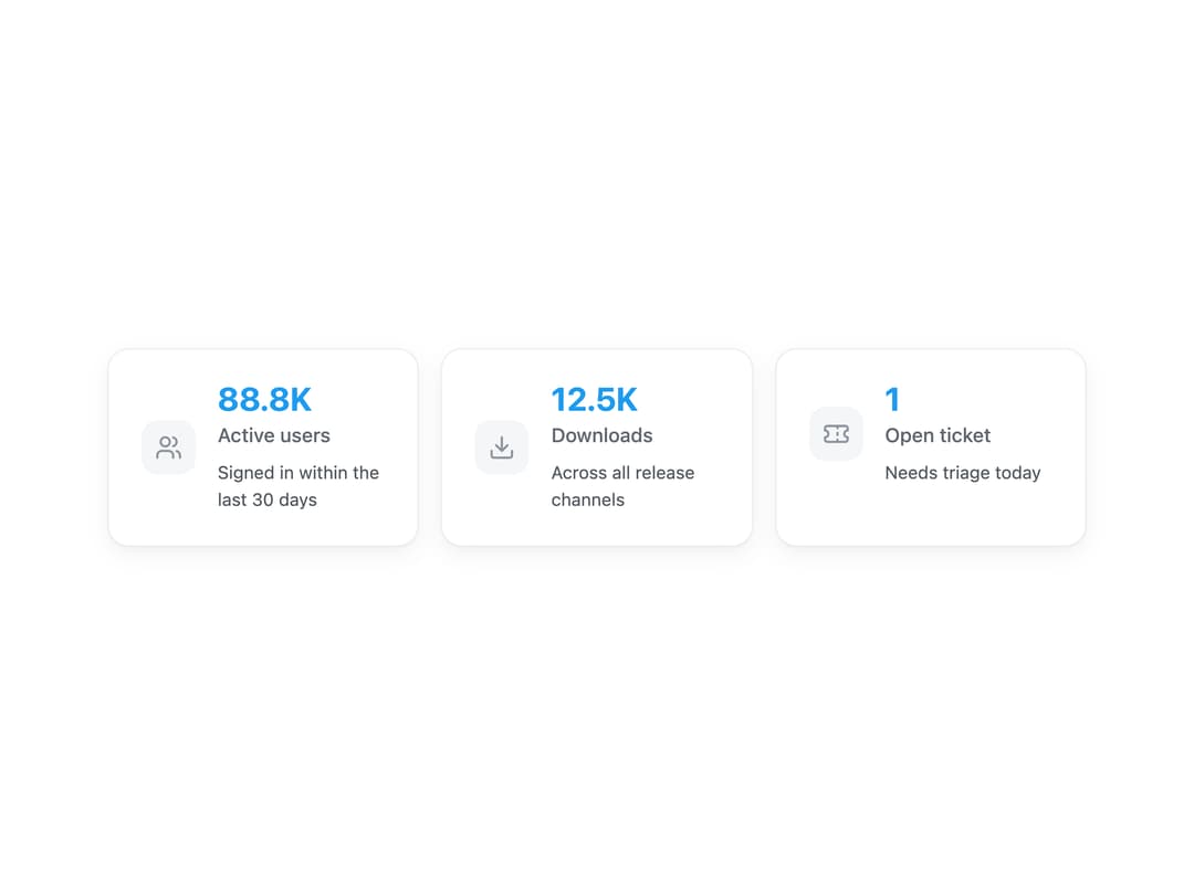
About
A compact stat card that pairs an icon with a formatted number, a pluralized label, and an optional caption, for dashboard and metrics summaries.
Built with React and Tailwind. Copy the prompt and paste it into Claude Code, Cursor or Lovable: your agent adds Data Card to your project and fits it to your theme.
Code
How Data Card is used: the demo's code. The component's own source comes with a free account.
Usage.tsx
import DataCard from "@/components/ui/data-card";

const compactNumber = new Intl.NumberFormat("en-US", {
  notation: "compact",
  maximumFractionDigits: 1,
});

export default function DataCardDemo() {
  return (
    <div className="grid w-full max-w-3xl grid-cols-1 gap-4 p-6 sm:grid-cols-3">
      <DataCard
        value={88800}
        label="Active user|Active users"
        icon="lucide:users"
        format={(value) => compactNumber.format(value)}
        description="Signed in within the last 30 days"
      />
      <DataCard
        value={12450}
        label="Download|Downloads"
        icon="lucide:download"
        format={(value) => compactNumber.format(value)}
        description="Across all release channels"
      />
      <DataCard
        value={1}
        label="Open ticket|Open tickets"
        icon="lucide:ticket"
        description="Needs triage today"
      />
    </div>
  );
}
More by lailai0916
View all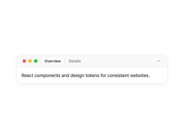
Window Panel
10
Share Card
2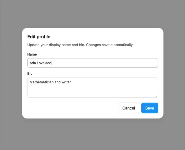
Dialog
1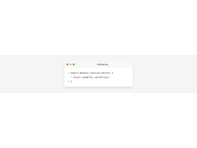
Window Bar
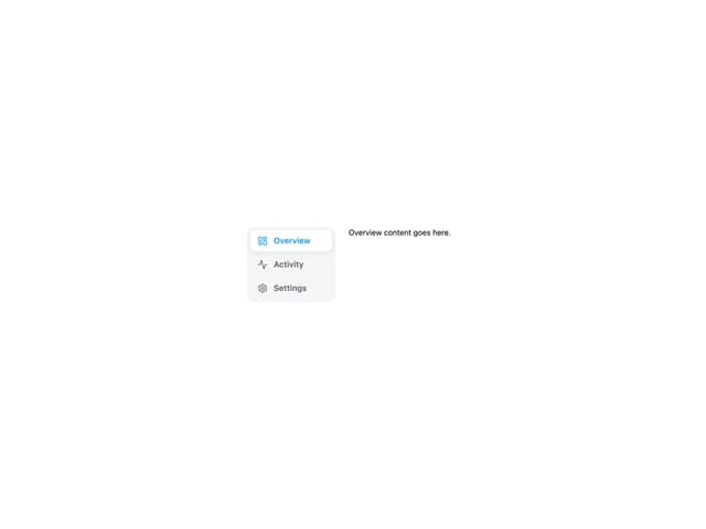
Tabs

Scrollable Data Table
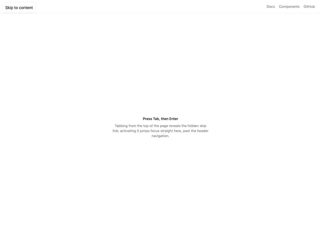
Skip Link

Site Header
More in Dashboards
View all
Dashboard with Collapsible Sidebar
2.6K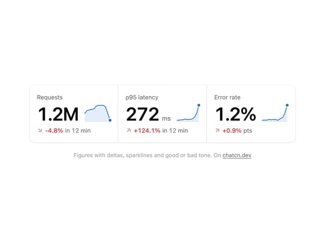
Stat Card
44

Sidebar
390

SaaS Template
2.7K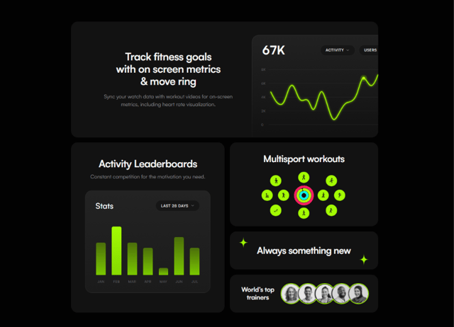

Fitness Bento Grid
40
Stats Bento
1.2K

Chart Component
9

Course Design Cards
1.3K


