
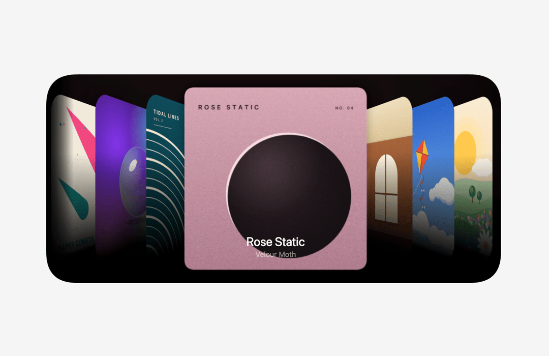
About
A cinematic cover flow on a rounded black stage: covers turn in perspective, fade into the floor and glide between positions with a soft spring. Drag, scroll, click or use the arrow keys; bring your own images or use the ten built-in covers drawn in code.
Built with React and Tailwind. Copy the prompt and paste it into Claude Code, Cursor or Lovable: your agent adds Cover Flow to your project and fits it to your theme.
Code
How Cover Flow is used: the demo's code. The component's own source comes with a free account.
Usage.tsx
"use client";

import * as React from "react";
import { CoverFlow } from "@/components/ui/cover-flow";

/** Cover Flow autoplaying through its built-in covers. Drag, scroll or use the arrow keys. */
export default function CoverFlowDemo() {
  return (
    <main className="relative h-screen min-h-[340px] w-full overflow-hidden" style={{ backgroundColor: "#f5f5f5" }}>
      <CoverFlow autoplay style={{ width: "100%", height: "100%" }} />
    </main>
  );
}
More by Louis Studios
View all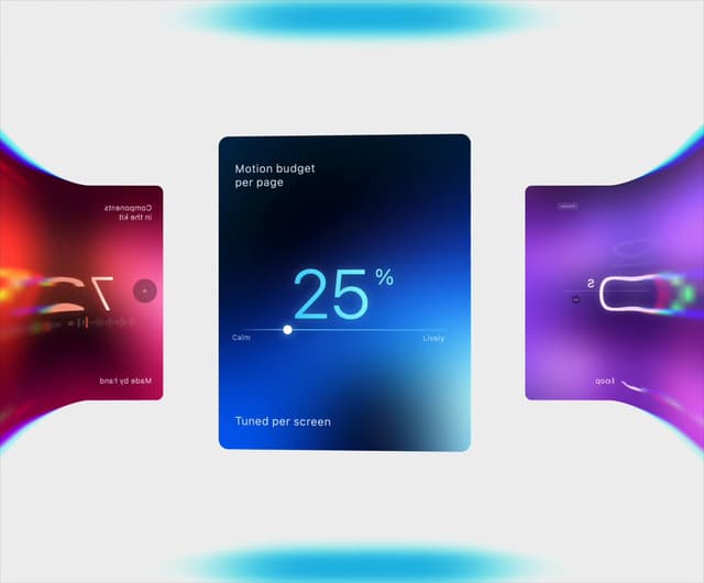

Warp Carousel
492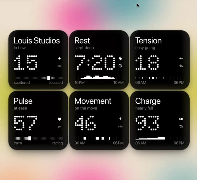
Dot Tiles
120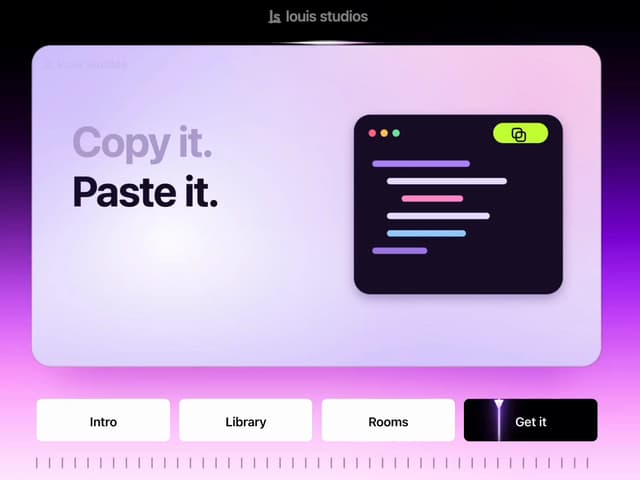
Chapter Player
73
LED Badges
57
Glow Rocker
51
Lens Clock
46
Chrome Arcs
44
Assistant Wall
39