
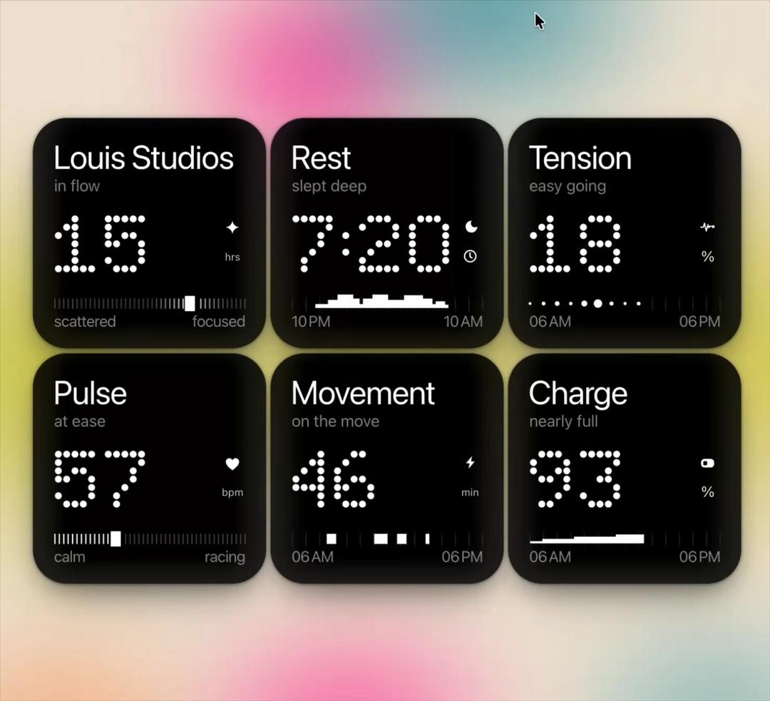
About
Black glass metric tiles with dot-matrix numerals that count up dot by dot, draw in their sliders, sleep steps and timelines, then drift gently live.
Built with React and Tailwind. Copy the prompt and paste it into Claude Code, Cursor or Lovable: your agent adds Dot Tiles to your project and fits it to your theme.
Code
How Dot Tiles is used: the demo's code. The component's own source comes with a free account.
Usage.tsx
"use client"

import * as React from "react"
import { DotTiles } from "@/components/ui/dot-tiles"

const blooms = [
  "radial-gradient(30% 24% at 60% 12%, rgba(30,138,156,.85), rgba(30,138,156,0) 70%)",
  "radial-gradient(22% 20% at 42% 20%, rgba(232,36,148,.9), rgba(232,36,148,0) 70%)",
  "radial-gradient(30% 34% at 14% 52%, rgba(200,196,52,.95), rgba(200,196,52,0) 72%)",
  "radial-gradient(30% 34% at 88% 50%, rgba(206,198,60,.9), rgba(206,198,60,0) 72%)",
  "radial-gradient(48% 30% at 50% 50%, rgba(196,190,64,.9), rgba(196,190,64,0) 72%)",
  "radial-gradient(26% 18% at 46% 90%, rgba(236,56,150,.85), rgba(236,56,150,0) 72%)",
  "radial-gradient(24% 20% at 16% 92%, rgba(238,132,64,.6), rgba(238,132,64,0) 72%)",
  "radial-gradient(24% 20% at 84% 90%, rgba(48,150,166,.55), rgba(48,150,166,0) 72%)",
].join(",")

export default function DotTilesDemo() {
  return (
    <div className="relative grid min-h-screen w-full place-items-center overflow-hidden p-6" style={{ background: "#efe4d4" }}>
      <div aria-hidden className="absolute -inset-[12%]" style={{ filter: "blur(40px) saturate(1.1)", background: blooms }} />
      <div className="relative w-full max-w-[680px]">
        <DotTiles />
      </div>
    </div>
  )
}
More by Louis Studios
View all

Melt Mark
14
Lens Clock
4
Brick Digits
3
Wave Type
3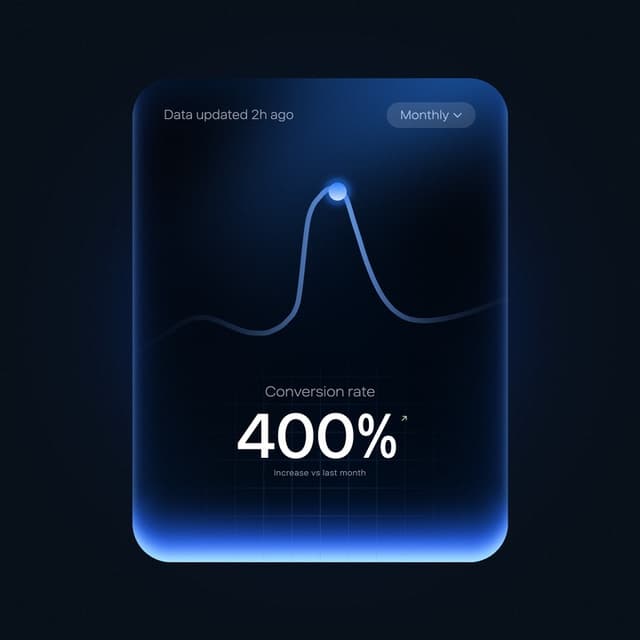
Peak Chart
1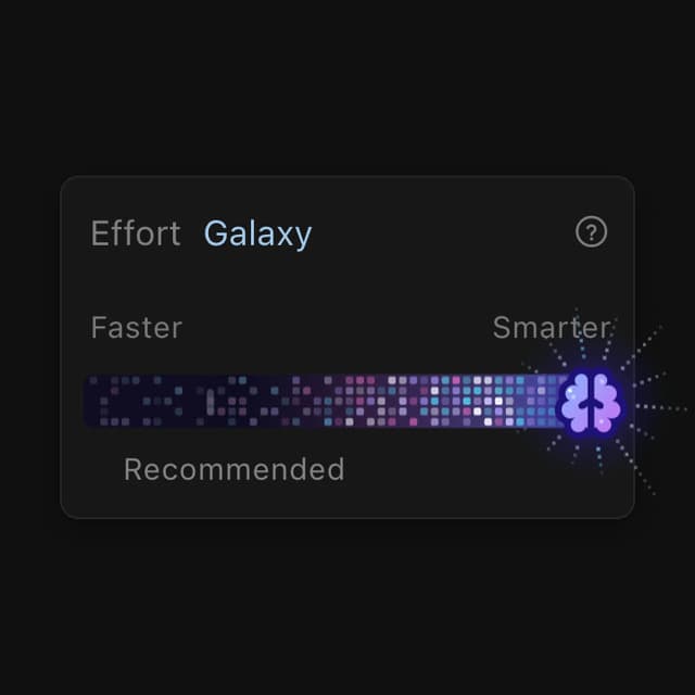
Effort Slider
1
Neon Pulse
Chrome Arcs
More in Cards
View all

Course Design Cards
1.2K

Interactive Tech Stack Bento Grid with Hover Effects
366

Card Studio
35
Stats cards with links
89
The Item one
3

Statistics Card 2
287
Card
57
Card with Grid Ellipsis Pattern
230

