
About
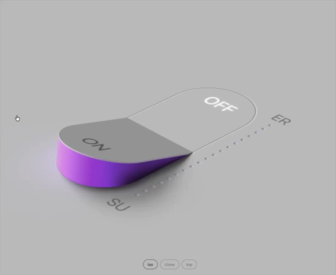
A raymarched 3D rocker switch that tips on its hinge, flips the whole scene from soft grey daylight to black, and spills violet light from under its lifted edge. Click it or press Space to rock it, and pick a camera view.
Built with React and Tailwind. Copy the prompt and paste it into Claude Code, Cursor or Lovable: your agent adds Glow Rocker to your project and fits it to your theme.
Code
How Glow Rocker is used: the demo's code. The component's own source comes with a free account.
Usage.tsx
"use client"

import * as React from "react"
import { GlowRocker, type GlowRockerView } from "@/components/ui/glow-rocker"

const VIEWS: GlowRockerView[] = ["iso", "close", "top"]

export default function GlowRockerDemo() {
  const [on, setOn] = React.useState(false)
  const [view, setView] = React.useState<GlowRockerView>("iso")
  const ink = on ? "#f2f2f2" : "#3a3a3a"

  return (
    <main className="relative h-screen min-h-[560px] w-full overflow-hidden">
      <GlowRocker className="h-full w-full" checked={on} onChange={setOn} view={view} topLabel="ER" bottomLabel="SU" />
      <div
        style={{
          position: "absolute",
          left: 0,
          right: 0,
          bottom: 28,
          display: "flex",
          justifyContent: "center",
          gap: 8,
          font: '500 13px -apple-system, BlinkMacSystemFont, "SF Pro Text", "Helvetica Neue", Arial, sans-serif',
        }}
      >
        {VIEWS.map((v) => (
          <button
            key={v}
            type="button"
            onClick={() => setView(v)}
            aria-pressed={view === v}
            style={{
              padding: "7px 14px",
              borderRadius: 999,
              border: `1px solid ${ink}`,
              background: "transparent",
              color: ink,
              opacity: view === v ? 1 : 0.5,
              cursor: "pointer",
              transition: "color 0.4s, border-color 0.4s, opacity 0.2s",
            }}
          >
            {v}
          </button>
        ))}
      </div>
    </main>
  )
}
More by Louis Studios
View all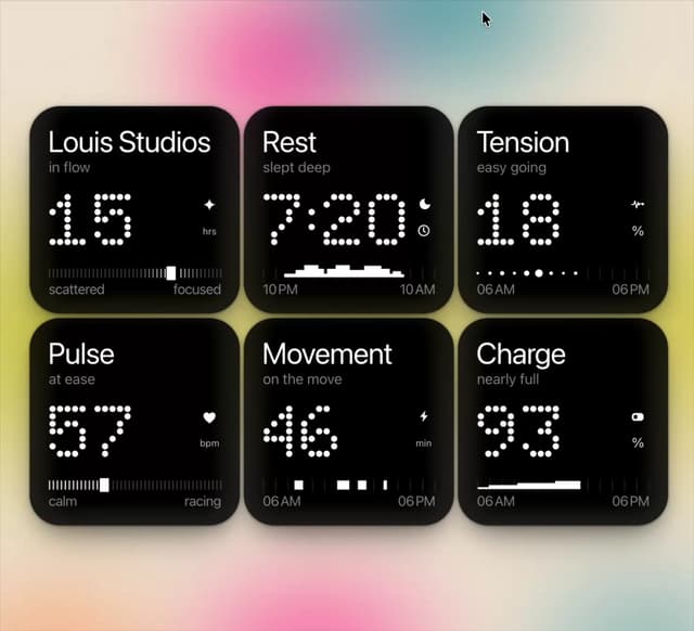

Dot Tiles
98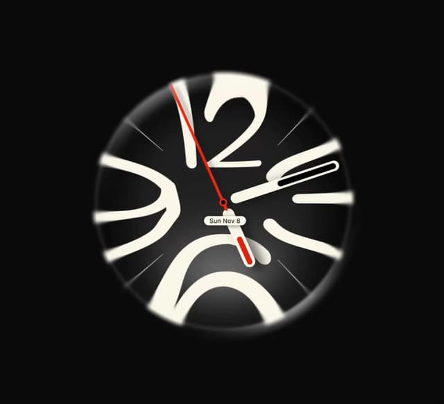
Lens Clock
36
Melt Mark
28
LED Badges
22
Wave Type
20
Neon Loop
17
Brick Digits
14
Chrome Arcs
12
More in Shaders
View all
Glass Fold
392

Shader Animation
3.8K
Wave
708

Illos Webhook Setup
16
Shader Lines
2.4K
Stripe like gradient-shader
271
didar


Paper design shader Background
689

