
About
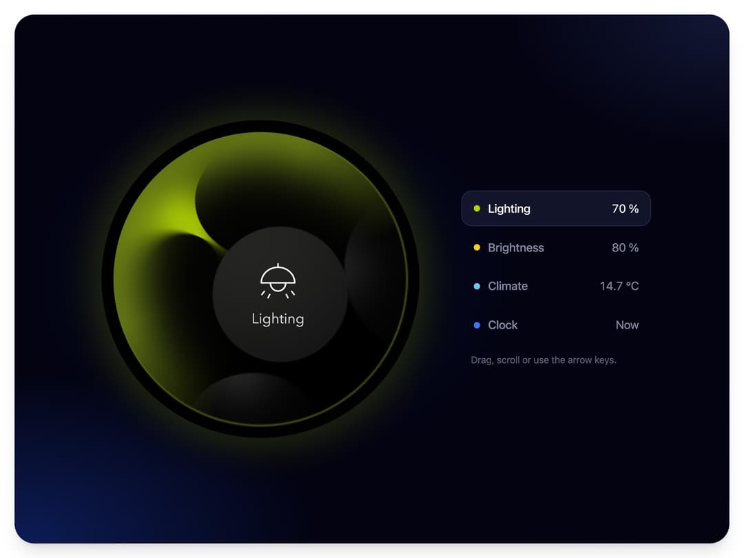
A fluid smart-home dial in four variants: dark fluid lobes drift over coloured light, razor cusps open and close, and turning it swirls the fluid. Drag, scroll or use the arrow keys; value, range, labels and colours are props.
Built with React and Tailwind. Copy the prompt and paste it into Claude Code, Cursor or Lovable: your agent adds Fluid Dial to your project and fits it to your theme.
Code
How Fluid Dial is used: the demo's code. The component's own source comes with a free account.
Usage.tsx
"use client";

import * as React from "react";
import { FluidDial, type FluidDialVariant } from "@/components/ui/fluid-dial";

type Mode = {
  variant: FluidDialVariant;
  name: string;
  dot: string;
  start: number;
  read: (value: number) => string;
};

const MODES: Mode[] = [
  { variant: "lighting", name: "Lighting", dot: "#b4d100", start: 70, read: (v) => `${Math.round(v)} %` },
  { variant: "brightness", name: "Brightness", dot: "#f2cf1d", start: 80, read: (v) => `${Math.round(v)} %` },
  { variant: "climate", name: "Climate", dot: "#6cc4f5", start: 14.7, read: (v) => `${v.toFixed(1)} °C` },
  {
    variant: "clock",
    name: "Clock",
    dot: "#3b74ff",
    start: 0,
    read: (v) => (Math.round(v) === 0 ? "Now" : `${v > 0 ? "+" : "-"}${Math.abs(Math.round(v))} min`),
  },
];

// The dial is a lit object, so it sits on its own night panel. The page around it follows the theme.
const NIGHT = [
  "radial-gradient(60% 46% at 0% 100%, rgba(18, 44, 128, 0.62), rgba(18, 44, 128, 0) 70%)",
  "radial-gradient(44% 36% at 100% 0%, rgba(40, 52, 104, 0.42), rgba(40, 52, 104, 0) 70%)",
  "radial-gradient(48% 48% at 36% 50%, rgba(10, 22, 64, 0.5), rgba(10, 22, 64, 0) 72%)",
].join(", ");

/**
 * One dial, four variants. Pick a row to swap the variant, then drag the dial round, scroll over
 * it or use the arrow keys. The value is controlled from here and each variant keeps its own.
 */
export default function FluidDialDemo() {
  const [active, setActive] = React.useState(0);
  const [values, setValues] = React.useState(() => MODES.map((mode) => mode.start));
  const mode = MODES[active];

  return (
    <main className="relative min-h-screen w-full bg-background">
      <section
        className="absolute flex flex-wrap items-center justify-center overflow-hidden shadow-xl"
        style={{
          inset: "clamp(10px, 2.6vmin, 26px)",
          gap: "clamp(18px, 6vmin, 72px)",
          padding: "clamp(22px, 7vmin, 64px)",
          borderRadius: "clamp(18px, 4.5vmin, 34px)",
          border: "1px solid rgba(160, 180, 255, 0.1)",
          backgroundColor: "#030312",
          backgroundImage: NIGHT,
        }}
      >
        <div style={{ width: "min(60vmin, 640px)", minWidth: 180 }}>
          <FluidDial
            key={mode.variant}
            variant={mode.variant}
            value={values[active]}
            onChange={(next) => setValues((all) => all.map((v, i) => (i === active ? next : v)))}
            aria-label={mode.name}
          />
        </div>
        <div style={{ display: "flex", flexDirection: "column", gap: 6, width: "clamp(196px, 34vmin, 360px)", fontSize: "clamp(13px, 2.1vmin, 20px)" }}>
          {MODES.map((item, i) => {
            const on = i === active;
            return (
              <button
                key={item.variant}
                type="button"
                onClick={() => setActive(i)}
                aria-pressed={on}
                style={{
                  display: "flex",
                  alignItems: "center",
                  justifyContent: "space-between",
                  padding: "0.72em 1em",
                  borderRadius: "0.9em",
                  border: `1px solid ${on ? "rgba(180, 196, 255, 0.16)" : "transparent"}`,
                  background: on ? "rgba(150, 170, 255, 0.1)" : "transparent",
                  color: on ? "#f4f6ff" : "rgba(214, 222, 255, 0.6)",
                  font: "inherit",
                  textAlign: "left",
                  cursor: "pointer",
                  transition: "background 160ms ease, color 160ms ease, border-color 160ms ease",
                }}
              >
                <span style={{ display: "flex", alignItems: "center", gap: "0.7em", fontWeight: 500 }}>
                  <span aria-hidden style={{ width: "0.55em", height: "0.55em", borderRadius: "50%", background: item.dot }} />
                  {item.name}
                </span>
                <span style={{ fontVariantNumeric: "tabular-nums" }}>{item.read(values[i])}</span>
              </button>
            );
          })}
          <p style={{ margin: 0, padding: "0.7em 1em 0", fontSize: "0.82em", color: "rgba(214, 222, 255, 0.42)" }}>
            Drag, scroll or use the arrow keys.
          </p>
        </div>
      </section>
    </main>
  );
}
More by Louis Studios
View all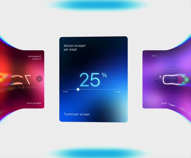

Warp Carousel
684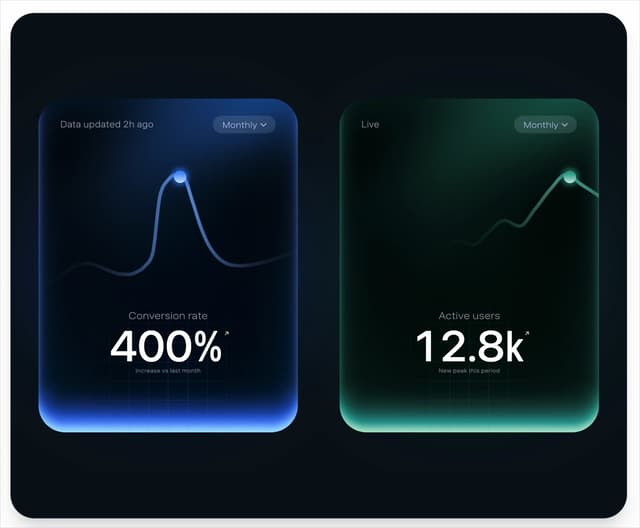
Peak Chart
166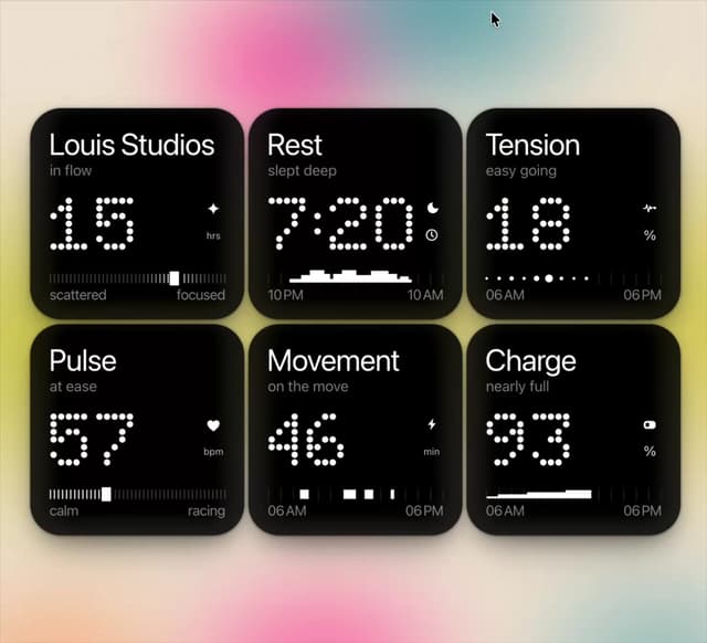
Dot Tiles
136
Chapter Player
91
Glow Rocker
75
LED Badges
68
Chrome Arcs
57
Lens Clock
51
More in Shaders
View all
Glass Fold
435

Shader Animation
3.8K

Illos Knowledge Sources
43
Wave
715

Phosphor 30
308
Black Hole
41

Paper design shader Background
696

Line Shader Homlu UI
52
