
About
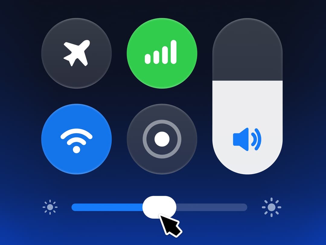
A control centre on a deep blue glow, with round toggles that swell into lit glass under your finger and a brightness knob that turns into a glass lens. More like this, plus a designer your coding agent can use, at studios.lou15.com/?ref=21st
Built with React and Tailwind. Copy the prompt and paste it into Claude Code, Cursor or Lovable: your agent adds Quick Panel to your project and fits it to your theme.
Code
How Quick Panel is used: the demo's code. The component's own source comes with a free account.
Usage.tsx
"use client";

import * as React from "react";
import { QuickPanel } from "@/components/ui/quick-panel";

/** A control centre on a deep blue glow: round toggles swell into lit glass under your finger and the brightness knob turns into a glass lens. The tour loops until you take over. */
export default function QuickPanelDemo() {
  return (
    <main className="relative h-screen min-h-[340px] w-full overflow-hidden" style={{ backgroundColor: "#050914" }}>
      <QuickPanel tour style={{ width: "100%", height: "100%", minHeight: 0 }} />
    </main>
  );
}
More by Louis Studios
View all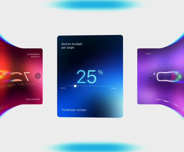

Warp Carousel
677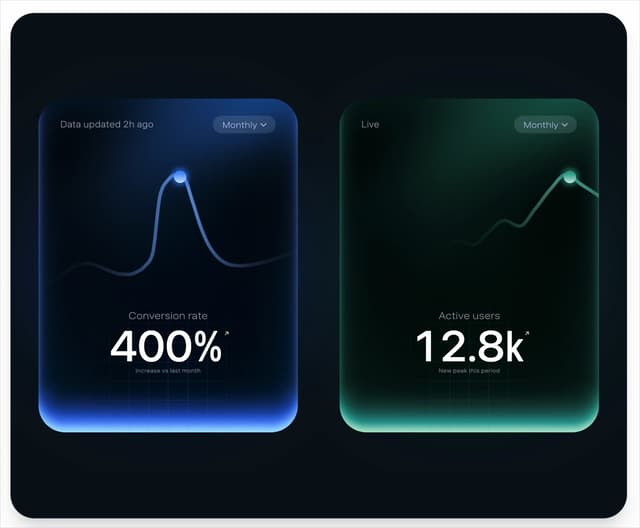
Peak Chart
153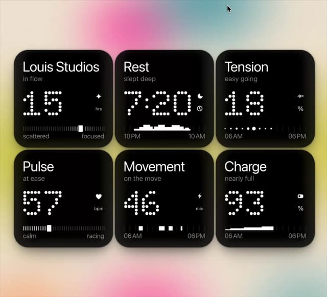
Dot Tiles
136
Chapter Player
89
Glow Rocker
71
LED Badges
67
Chrome Arcs
55
Lens Clock
51