About
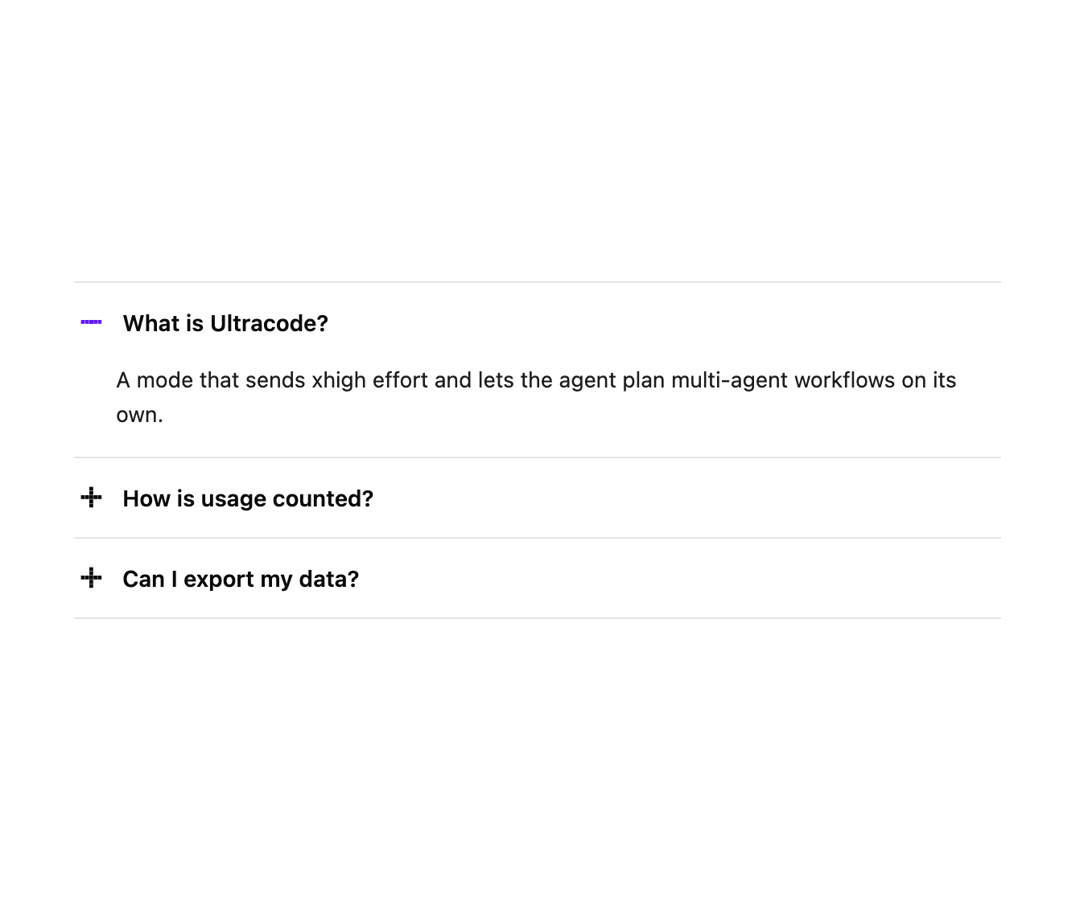
An accordion whose small pixel plus-sign icons fold into minus signs as panels open smoothly, for FAQs and collapsible content sections that allow one or several items open at once.
Built with React and Tailwind. Copy the prompt and paste it into Claude Code, Cursor or Lovable: your agent adds Pixel Accordion to your project and fits it to your theme.
Code
How Pixel Accordion is used: the demo's code. The component's own source comes with a free account.
Usage.tsx
import PxAccordion from "@/components/ui/px-accordion";

export default function PxAccordionDemo() {
  return (
    <div className="w-full max-w-xl">
      <PxAccordion
        defaultValue={["What is Ultracode?"]}
        items={[
          {
            title: "What is Ultracode?",
            content:
              "A mode that sends xhigh effort and lets the agent plan multi-agent workflows on its own.",
          },
          {
            title: "How is usage counted?",
            content:
              "Usage resets weekly. Longer reasoning and more agents use more of it.",
          },
          {
            title: "Can I export my data?",
            content:
              "Yes. Settings has an export that includes chats, projects and files.",
          },
        ]}
      />
    </div>
  );
}
More by lumesec
View all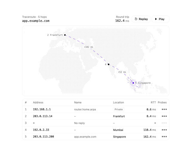

Geo Traceroute
56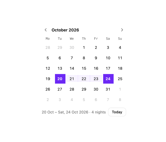
Date Picker
7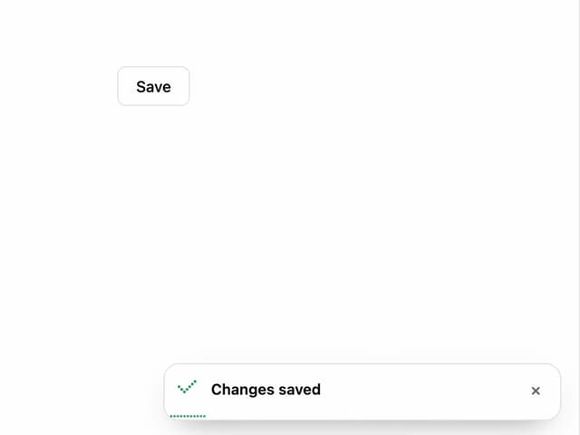
Pixel Toaster
6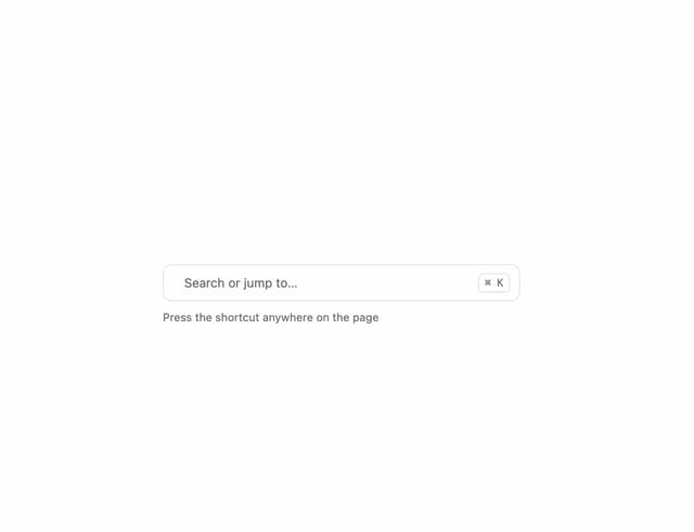
Command Palette
4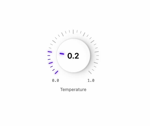
Rotary Dial
1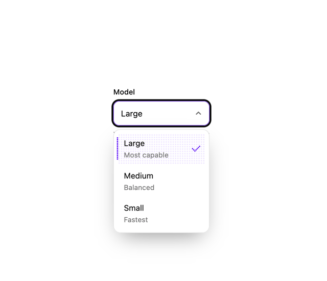
Pixel Select
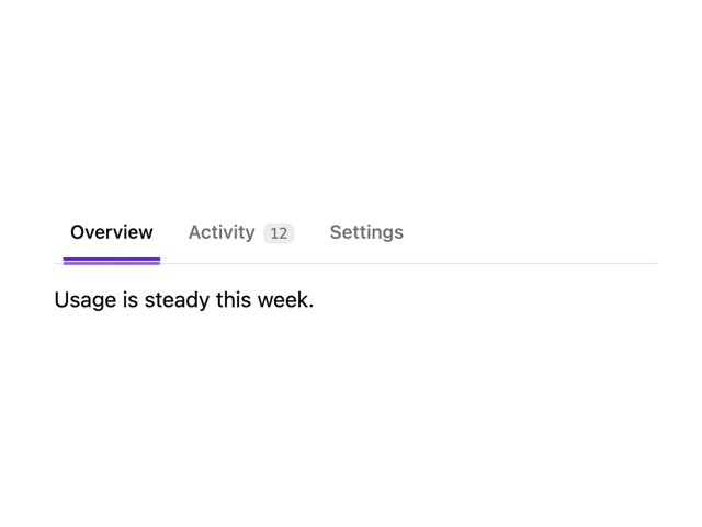
Pixel Tabs
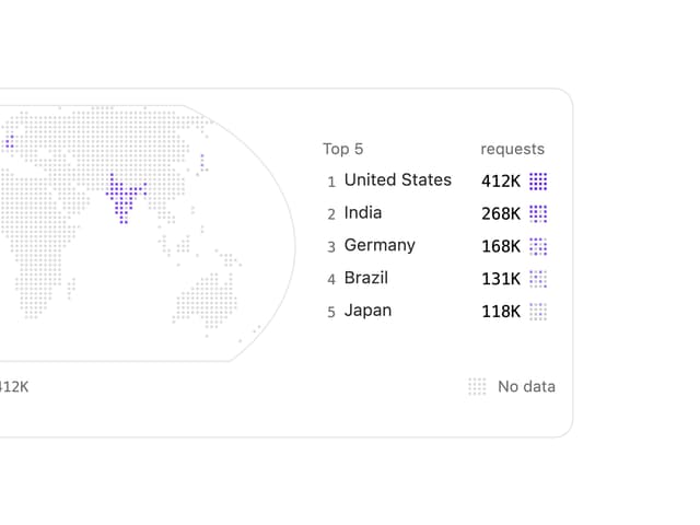
Choropleth Map