
About
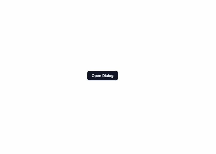
A modal dialog overlay with an accessible focus trap, scroll lock, and Escape-to-close behavior for confirmations and forms.
Built with React and Tailwind. Copy the prompt and paste it into Claude Code, Cursor or Lovable: your agent adds Dialog to your project and fits it to your theme.
Code
How Dialog is used: the demo's code. The component's own source comes with a free account.
Usage.tsx
import {
  Dialog,
  DialogHeader,
  DialogTitle,
  DialogDescription,
  DialogFooter,
} from "@/components/ui/dialog";
import { useState } from "react";

export default function Example() {
  const [open, setOpen] = useState(false);
  return (
    <>
      <button
        className="mcpe-btn mcpe-btn-primary mcpe-btn-md"
        onClick={() => setOpen(true)}
      >
        Open Dialog
      </button>
      <Dialog open={open} onOpenChange={setOpen}>
        <DialogHeader>
          <DialogTitle>Are you sure?</DialogTitle>
          <DialogDescription>
            This action cannot be undone. This will permanently delete your
            account and remove your data from our servers.
          </DialogDescription>
        </DialogHeader>
        <DialogFooter>
          <button
            className="mcpe-btn mcpe-btn-outline mcpe-btn-md"
            onClick={() => setOpen(false)}
          >
            Cancel
          </button>
          <button
            className="mcpe-btn mcpe-btn-destructive mcpe-btn-md"
            onClick={() => setOpen(false)}
          >
            Confirm
          </button>
        </DialogFooter>
      </Dialog>
    </>
  );
}
Dependencies
More by mayurrawte
View all
MCP Scope Inspector
2
Feedback Buttons
2
Tooltip
2
Skeleton
2
Streaming Text
1
Accordion
1
MCP Tool Call Card
MCP Resource Browser