
About
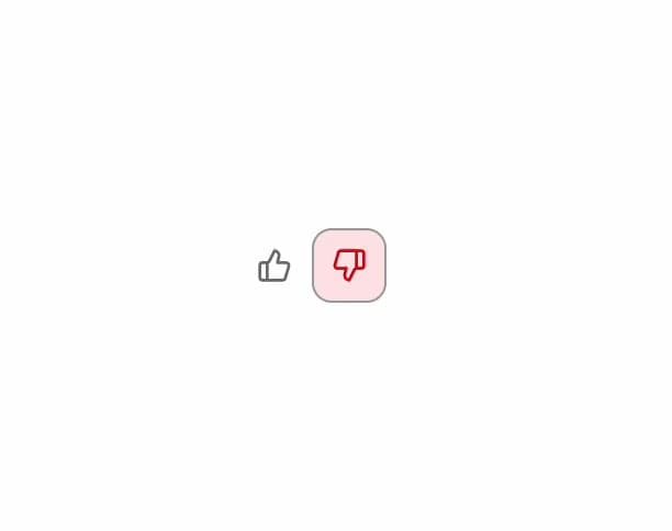
A thumbs up/down feedback widget with an optional comment form, used to collect quick user reactions and freeform feedback on AI responses or content.
Built with React and Tailwind. Copy the prompt and paste it into Claude Code, Cursor or Lovable: your agent adds Feedback Buttons to your project and fits it to your theme.
Code
How Feedback Buttons is used: the demo's code. The component's own source comes with a free account.
Usage.tsx
import { Feedback, FeedbackButton } from "@/components/ui/feedback";
import { useState } from "react";

export default function Example() {
  const [sel, setSel] = useState<"up" | "down" | null>(null);
  return (
    <Feedback>
      <FeedbackButton
        type="up"
        selected={sel === "up"}
        onClick={() => setSel("up")}
        aria-label="Thumbs up"
      />
      <FeedbackButton
        type="down"
        selected={sel === "down"}
        onClick={() => setSel("down")}
        aria-label="Thumbs down"
      />
    </Feedback>
  );
}
More by mayurrawte
View all
Skeleton
2
MCP Scope Inspector
MCP Resource Browser
Tooltip
MCP App Frame
Accordion
Counter
Dropdown Menu
More in AI chats
View all

AI Actions
350
Agent Chat
19

Aquarium Prompt
104

Message With Header And Delivery Status
59
Color Picker
197
System Notice

Chat Bubble
204

Illos Knowledge Sources
52


