
About
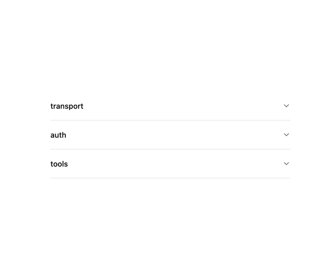
A headless, render-prop accordion for building collapsible content sections like FAQs or settings panels, with keyboard navigation and single or multiple expand modes.
Built with React and Tailwind. Copy the prompt and paste it into Claude Code, Cursor or Lovable: your agent adds Accordion to your project and fits it to your theme.
Code
How Accordion is used: the demo's code. The component's own source comes with a free account.
Usage.tsx
import {
  Accordion,
  AccordionItem,
  AccordionTrigger,
  AccordionContent,
} from "@/components/ui/accordion";

const items = [{ value: "transport" }, { value: "auth" }, { value: "tools" }];

const descriptions: Record<string, string> = {
  transport:
    "mcp-elements speaks both stdio and streamable HTTP. The client negotiates the transport during the initialize handshake.",
  auth: "OAuth 2.1 with PKCE is supported out of the box. Tokens are scoped per-server and refreshed automatically.",
  tools:
    "Tools are listed via tools/list and invoked with tools/call. Schemas are validated against the advertised JSON Schema.",
};

export default function AccordionDemo() {
  return (
    <Accordion items={items} collapsible className="w-full max-w-md">
      {({ expandedValues, getTriggerProps, getContentProps }) => (
        <>
          {items.map((item) => (
            <AccordionItem key={item.value}>
              <AccordionTrigger
                {...getTriggerProps(item.value, expandedValues)}
                isExpanded={expandedValues.includes(item.value)}
              >
                {item.value}
              </AccordionTrigger>
              <AccordionContent
                {...getContentProps(item.value, expandedValues)}
              >
                {descriptions[item.value]}
              </AccordionContent>
            </AccordionItem>
          ))}
        </>
      )}
    </Accordion>
  );
}
Dependencies
More by mayurrawte
View all
Skeleton
1
Counter
Dropdown Menu

Avatar
Textarea
Loader
Separator
More in Navigation
View all

Sidebar
347
Tabs like bookmark
75

Pagination
101
Oversized 404 Numeral
69
Navbar with Theme Toggle
57

Tabs
67
Stacked Circular Footer
444
Dorpdown Navigation
235


