
About
A simple container card with configurable padding, elevation shadow, and element tag, ported from the Millai UI Vue library's MCard component.
Built with React and Tailwind. Copy the prompt and paste it into Claude Code, Cursor or Lovable: your agent adds MCard to your project and fits it to your theme.
Code
How MCard is used: the demo's code. The component's own source comes with a free account.
Usage.tsx
import MCard from "@/components/ui/mcard";

export default function MCardDemo() {
  return (
    <div className="w-full max-w-sm p-6">
      <MCard>
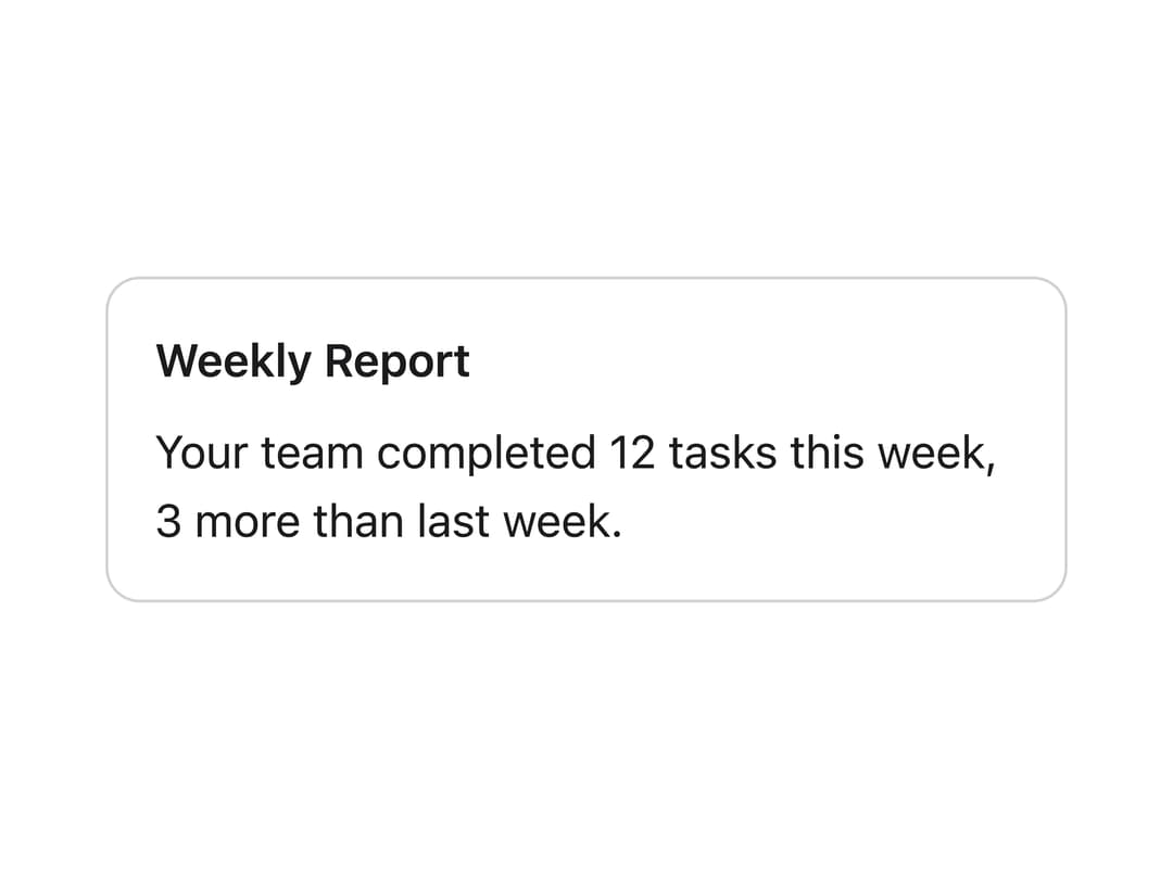
        <h3 style={{ margin: 0, fontWeight: 600 }}>Weekly Report</h3>
        <p style={{ marginTop: 8, marginBottom: 0 }}>
          Your team completed 12 tasks this week, 3 more than last week.
        </p>
      </MCard>
    </div>
  );
}
More by millaistudio
View all
M Switch
3
Tab Bar Item
2
MCheckbox
2
MListItem
1
Segmented Control
1
M Button
MBadge
Side Panel Item
More in Cards
View all

Course Design Cards
1.3K
Stats cards with links
37

Statistics Card 2
302

Interactive Tech Stack Bento Grid with Hover Effects
593

Card Studio
14
Statistics Card 7
323
Statistics Card 10
293
The Item one
3
