
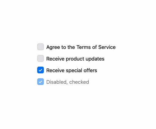
About
A labeled checkbox input that supports a plain boolean state or a shared array value for checkbox groups, plus an indeterminate visual state; ported to React from the Millai UI Vue component by MillaiStudio.
Built with React and Tailwind. Copy the prompt and paste it into Claude Code, Cursor or Lovable: your agent adds MCheckbox to your project and fits it to your theme.
Code
How MCheckbox is used: the demo's code. The component's own source comes with a free account.
Usage.tsx
"use client";

import * as React from "react";
import MCheckbox from "@/components/ui/mcheckbox";

export default function MCheckboxDemo() {
  const [accepted, setAccepted] = React.useState(false);
  const [selectedIds, setSelectedIds] = React.useState<Array<string | number>>([
    "news",
  ]);

  return (
    <div className="flex flex-col gap-4 p-6">
      <MCheckbox
        checked={accepted}
        onCheckedChange={(next) => setAccepted(next as boolean)}
      >
        Agree to the Terms of Service
      </MCheckbox>
      <MCheckbox
        checked={selectedIds}
        onCheckedChange={(next) =>
          setSelectedIds(next as Array<string | number>)
        }
        value="news"
      >
        Receive product updates
      </MCheckbox>
      <MCheckbox
        checked={selectedIds}
        onCheckedChange={(next) =>
          setSelectedIds(next as Array<string | number>)
        }
        value="offers"
      >
        Receive special offers
      </MCheckbox>
      <MCheckbox checked={true} onCheckedChange={() => {}} disabled>
        Disabled, checked
      </MCheckbox>
    </div>
  );
}
More by millaistudio
View all
M Button
MListItem
MBadge
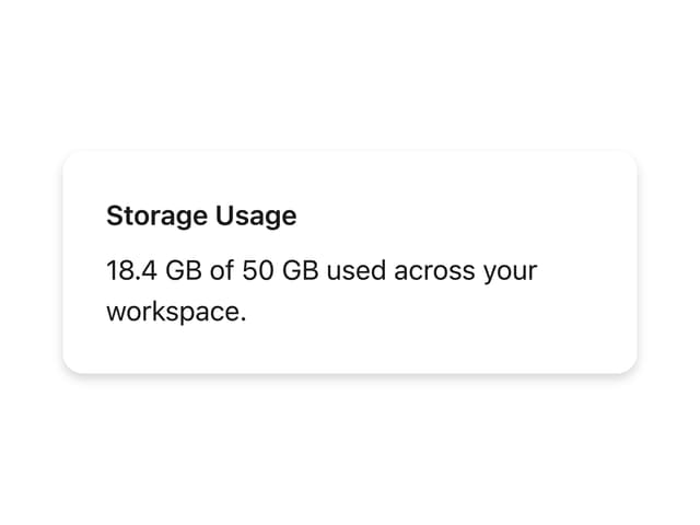
MCard
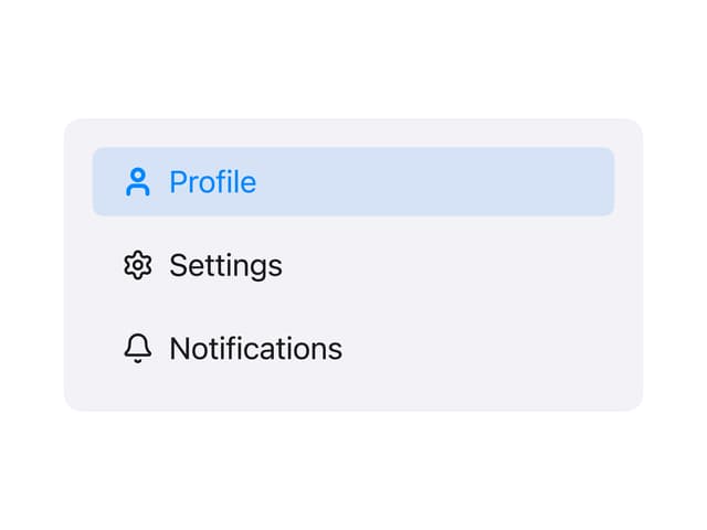
Side Panel Item
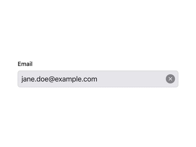
MText Input
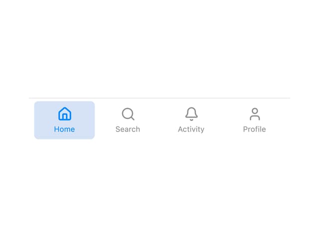
Tab Bar Item
Navigation View
More in Forms
View all

Premium Auth
518

Contact Card
1K

Book A Demo 1
72

Login 1
52
Authentication Card
48

Form
16
Login Card
6

Modern & Stunning sign in
1.6K

