
About
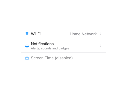
A tappable or linkable row for grouped settings-style lists, with an optional leading icon, title, description, trailing content and disclosure chevron; ported faithfully to React from Millai UI's Vue MListItem component.
Built with React and Tailwind. Copy the prompt and paste it into Claude Code, Cursor or Lovable: your agent adds MListItem to your project and fits it to your theme.
Code
How MListItem is used: the demo's code. The component's own source comes with a free account.
Usage.tsx
import MListItem from "@/components/ui/mlist-item";
import { Wifi, Bell, Lock } from "lucide-react";

export default function MListItemLeadingTrailingDemo() {
  return (
    <div className="flex w-full justify-center p-10">
      <ul
        className="m-list m-list--grouped"
        role="list"
        style={{ width: "100%", maxWidth: 360 }}
      >
        <MListItem
          chevron
          href="/wifi"
          leading={<Wifi size={18} />}
          trailing={<span>Home Network</span>}
        >
          Wi-Fi
        </MListItem>
        <MListItem
          chevron
          href="/notifications"
          leading={<Bell size={18} />}
          description="Alerts, sounds and badges"
        >
          Notifications
        </MListItem>
        <MListItem leading={<Lock size={18} />} disabled interactive>
          Screen Time (disabled)
        </MListItem>
      </ul>
    </div>
  );
}
Dependencies
More by millaistudio
View all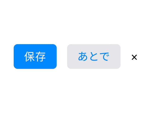
M Button
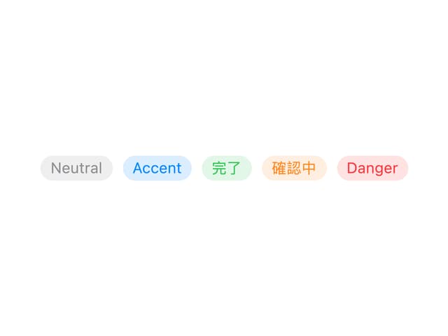
MBadge
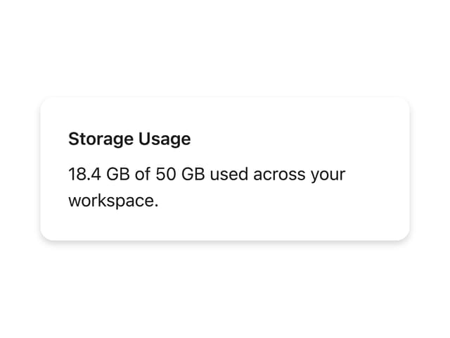
MCard