
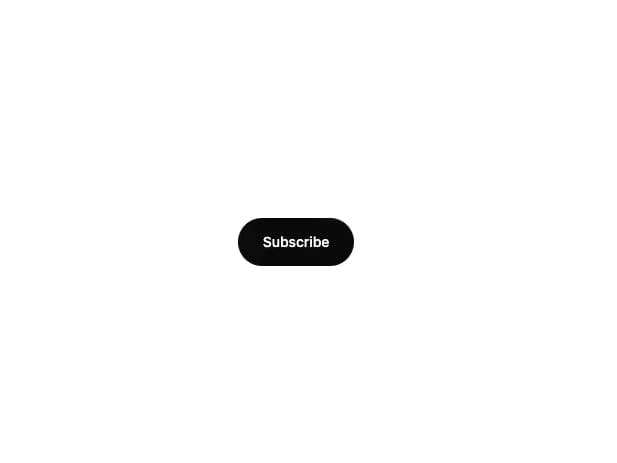
About
An animated pill-shaped subscribe button that expands into an email input, shows a loading spinner on submit, then a drawn checkmark on success.
Built with React and Tailwind. Copy the prompt and paste it into Claude Code, Cursor or Lovable: your agent adds Expand Input to your project and fits it to your theme.
Code
How Expand Input is used: the demo's code. The component's own source comes with a free account.
Usage.tsx
import { ExpandInput } from "@/components/ui/expand-input";

export default function ExpandInputDemo() {
  return (
    <div className="flex min-h-[400px] w-full items-center justify-center bg-background p-10">
      <ExpandInput
        label="Subscribe"
        placeholder="you@example.com"
        successLabel="You're in!"
        onSubmit={(email) => new Promise((resolve) => setTimeout(resolve, 800))}
      />
    </div>
  );
}
Dependencies
More by mirukullacode
View all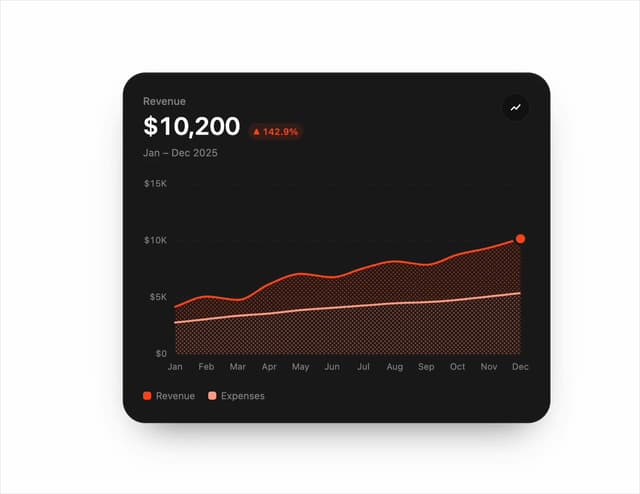
Chart Line
105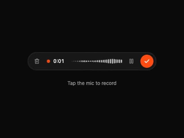
Tweenly AI Recorder
74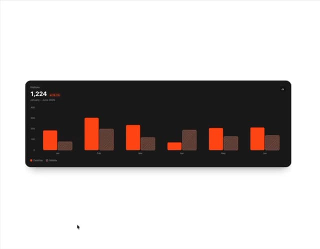
Animated Bar Chart
53
Tweenly Hero Background
36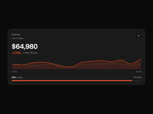
Tweenly Chart KPI
32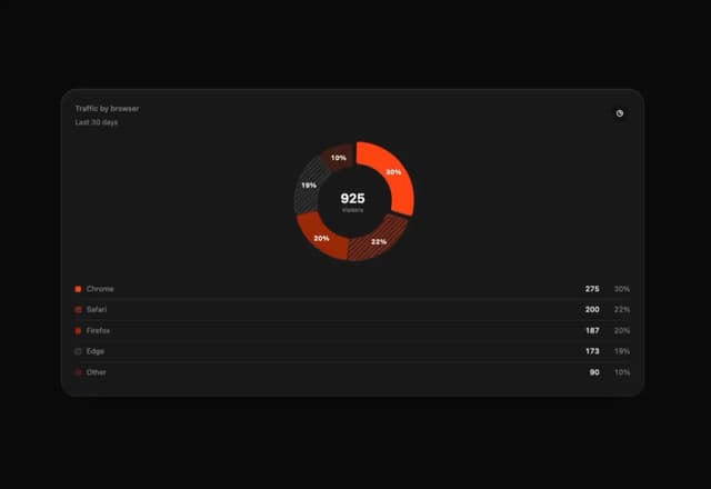
Tweenly Chart Radial
30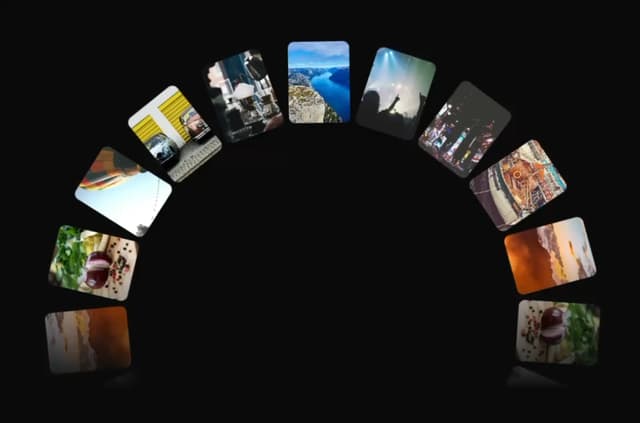
Tweenly Image Arc
25
Tweenly Curved Carousel
20
More in Buttons
View all
Button
74

Button
1
Button
7
Native Button
27
Texture Button
101

Button
66

HeroUI Button Group
1
Base Button
1


