
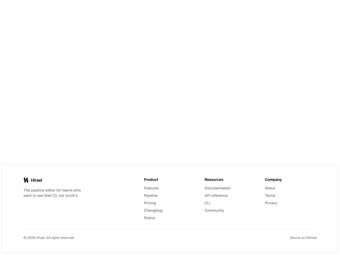
About
Floating card footer inset from the page edge: a brand block with mark and tagline, three link columns, and a hairline-divided legal row with copyright and a sign-off line.
Built with React and Tailwind. Copy the prompt and paste it into Claude Code, Cursor or Lovable: your agent adds Floating Card Footer to your project and fits it to your theme.
Code
How Floating Card Footer is used: the demo's code. The component's own source comes with a free account.
Usage.tsx
import Footer05 from "@/components/ui/footer-05";

export default function Footer05Demo() {
  return (
    <div className="w-full min-h-screen bg-background flex flex-col items-stretch justify-end">
      <Footer05 />
    </div>
  );
}
More by Mohammad Shehadeh
View all
Feature Problem Cards
94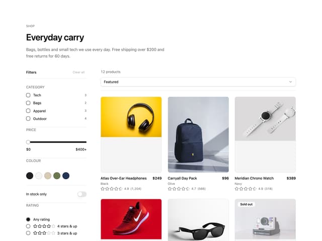
Ecommerce Category Page
83
Feature Grid Spotlight Cards
83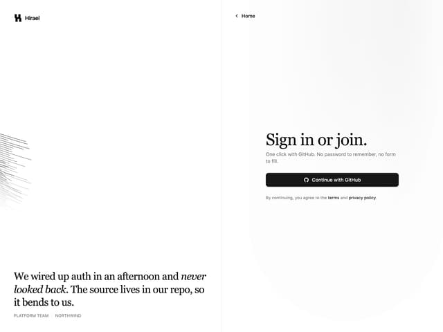
Split Login
76
Comparison Section
71
FAQ Two Column
71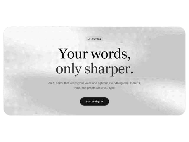
Dithered Shader CTA
70
Comparison Table
66
More in Navigation
View all

Sidebar
343

Pagination
101
Tabs like bookmark
73
Navbar with Theme Toggle
57
Oversized 404 Numeral
69
Stacked Circular Footer
444

Tabs
67
Dorpdown Navigation
235


