
About
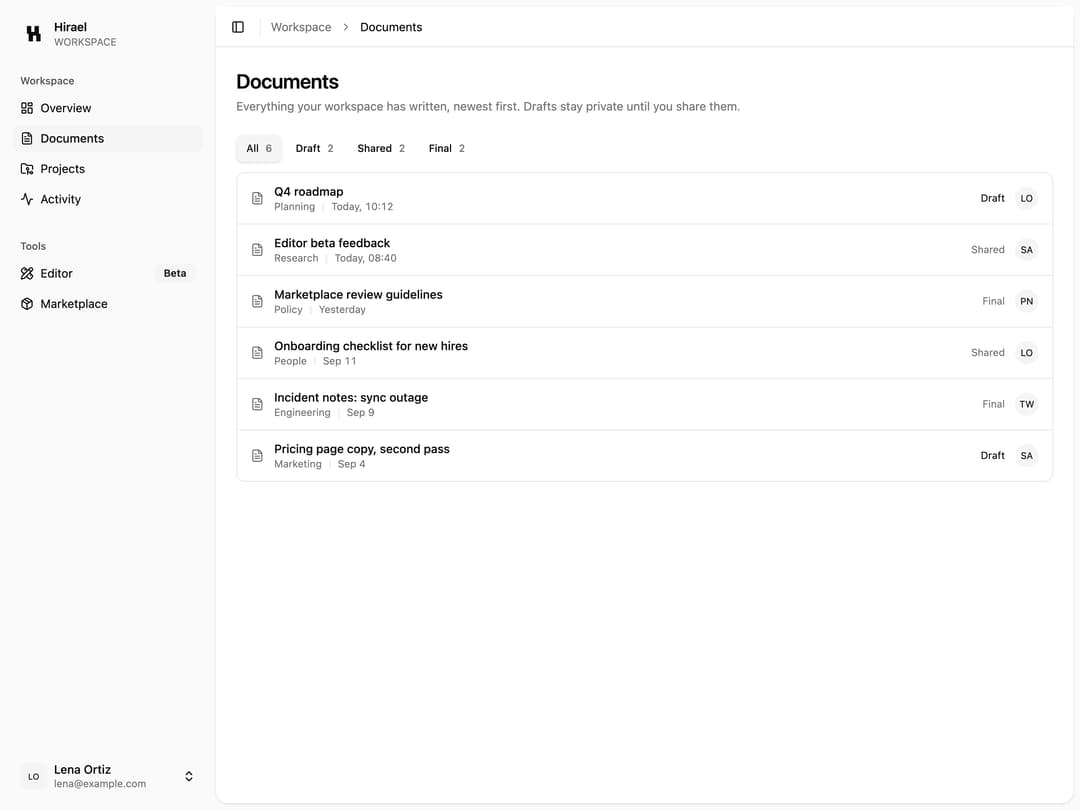
Inset sidebar app shell: a collapsible icon sidebar with a brand header, grouped Workspace and Tools nav (with a Beta badge), and an account menu in the footer, paired with a sticky header carrying the sidebar toggle and a breadcrumb. The inset holds a documents list with status filters that actually filter.
Built with React and Tailwind. Copy the prompt and paste it into Claude Code, Cursor or Lovable: your agent adds App Shell with Documents to your project and fits it to your theme.
Code
How App Shell with Documents is used: the demo's code. The component's own source comes with a free account.
Usage.tsx
import AppShell05 from "@/components/ui/app-shell-05";

export default function AppShell05Demo() {
  return (
    <div className="h-screen w-full overflow-hidden">
      <AppShell05 />
    </div>
  );
}
Dependencies
More by Mohammad Shehadeh
View all
Feature Problem Cards
93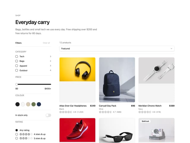
Ecommerce Category Page
81
Feature Grid Spotlight Cards
80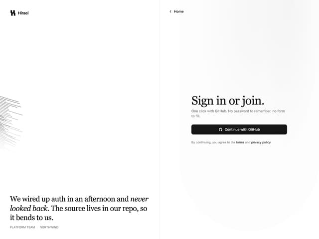
Split Login
74
Comparison Section
70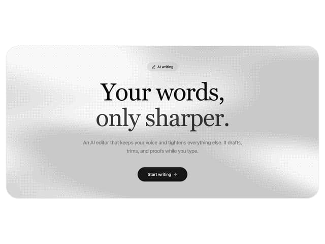
Dithered Shader CTA
69
FAQ Two Column
67
Comparison Table
66
More in Navigation
View all

Sidebar
331
Navbar with Theme Toggle
53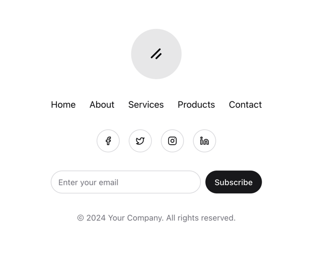
Stacked Circular Footer
440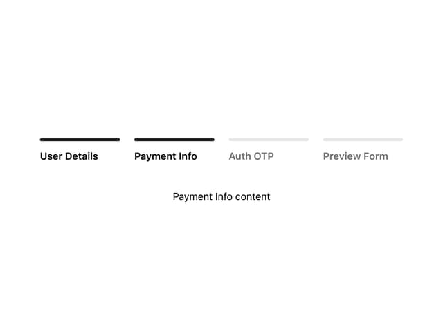

Progress Bar Stepper
53

Pagination
97
Dorpdown Navigation
234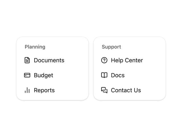
Nav List Card
38
Tabs
65


