About
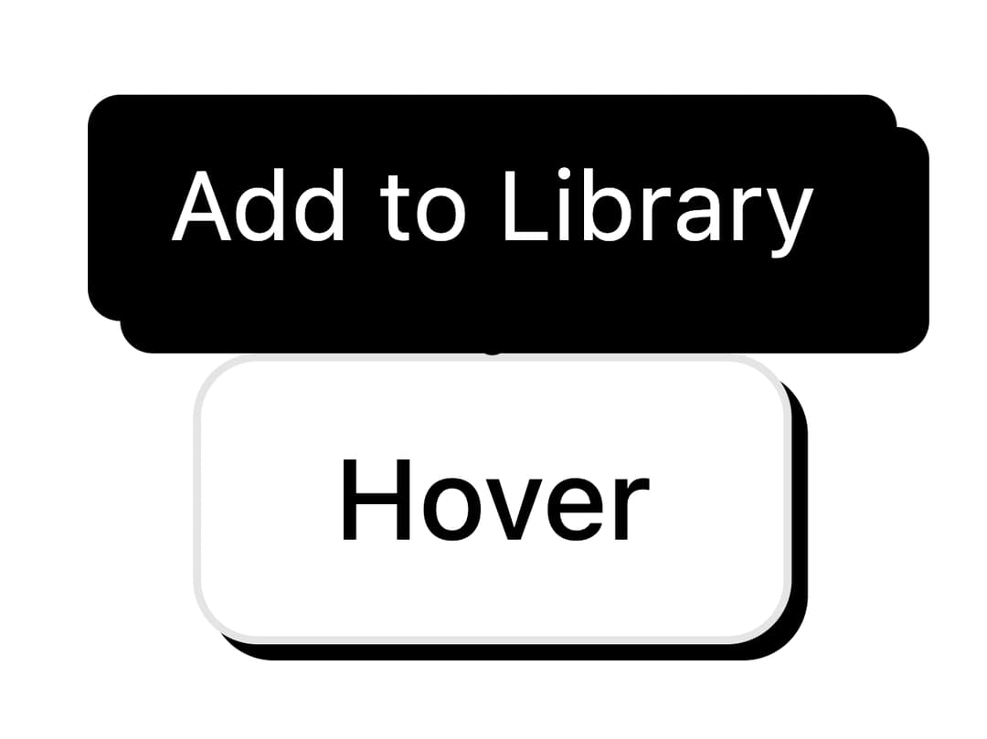
A neobrutalist tooltip that shows a short hint on hover or keyboard focus, built on Base UI with default, primary, and solid style variants.
Built with React and Tailwind. Copy the prompt and paste it into Claude Code, Cursor or Lovable: your agent adds Tooltip to your project and fits it to your theme.
Code
How Tooltip is used: the demo's code. The component's own source comes with a free account.
Usage.tsx
"use client";

import { Button } from "@/components/ui/button";
import { Tooltip } from "@/components/ui/tooltip";

export default function TooltipStyleDefault() {
  return (
    <Tooltip.Provider>
      <Tooltip>
        <Tooltip.Trigger>
          <Button variant="outline">Hover</Button>
        </Tooltip.Trigger>
        <Tooltip.Content variant="default">Add to Library</Tooltip.Content>
      </Tooltip>
    </Tooltip.Provider>
  );
}
Dependencies
More by retroui
View all

Menu
23
Table
14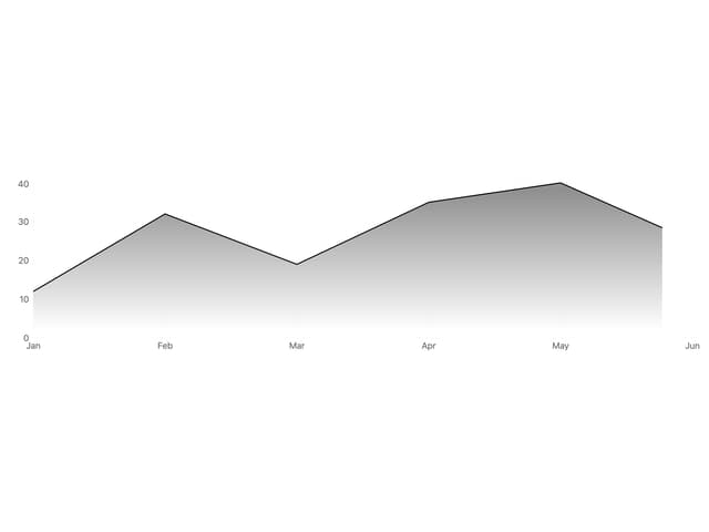
Area Chart
9
Popover
8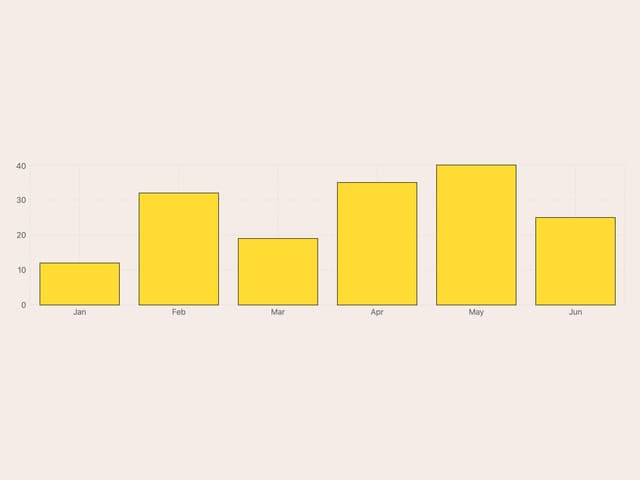
Bar Chart
1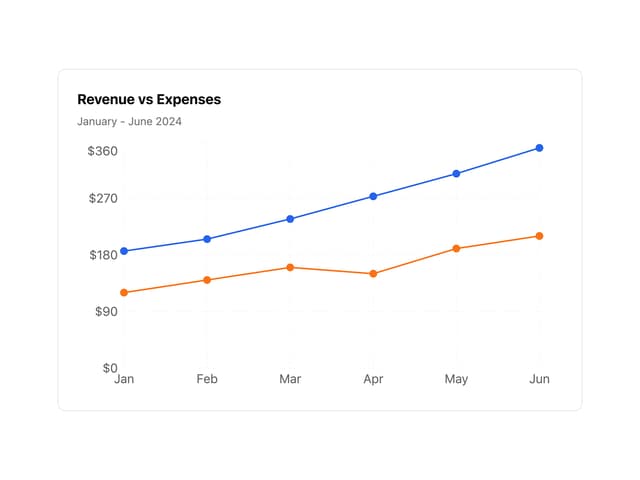
Line Chart
Badge
Toggle Group
More in Buttons
View all

Button
1
Button
7

App Store Button
471

Button
34
Button
74

Button
53
Native Button
2
Figma File Button
33


