About
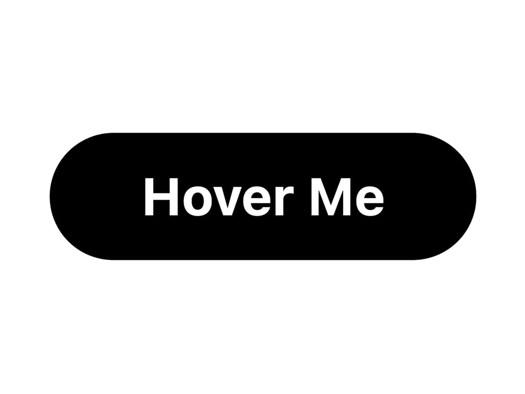
A rounded button that morphs its background color and a floating dot on hover, with reversible animation direction.
Built with React and Tailwind. Copy the prompt and paste it into Claude Code, Cursor or Lovable: your agent adds Morphy Button to your project and fits it to your theme.
Code
How Morphy Button is used: the demo's code. The component's own source comes with a free account.
Usage.tsx
import { MorphyButton } from "@/components/ui/morphy-button";

export default function MorphyButtonDemo() {
  return (
    <div className="flex min-h-[300px] w-full items-center justify-center">
      <MorphyButton>Hover Me</MorphyButton>
    </div>
  );
}
Dependencies
More by scrollxui
View all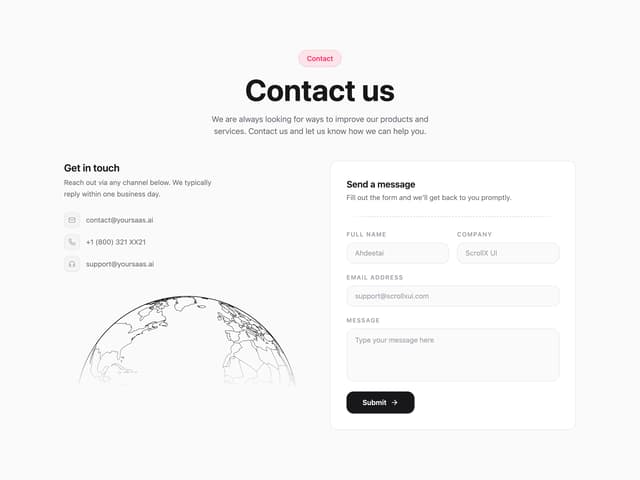

Contact with Globe
396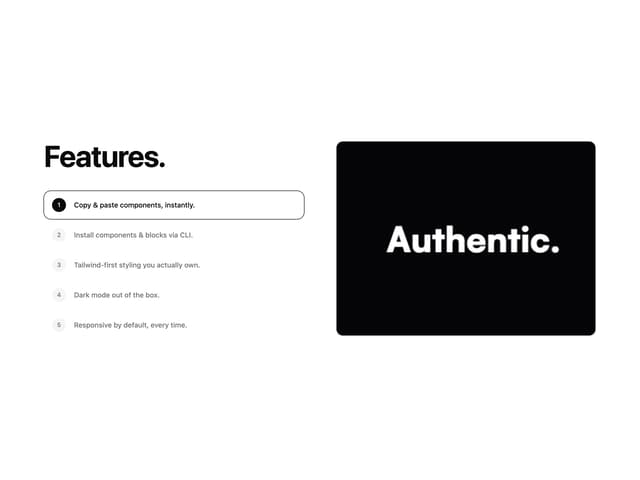
Features With Panel
376
Hero Section with Cards
180
FAQ Accordion
167
Logo Cloud Marquee
162
Particles
100
Hero With Pixel Background
92
Testimonials Marquee
88
More in Buttons
View all
Button
74

Button
1
Button
7
Texture Button
101

Button
66
Base Button
1
Native Button
27

HeroUI Button Group
1


