import {
  HoverCard,
  HoverCardContent,
  HoverCardTrigger,
} from "@/components/ui/hover-card";

function HoverCardDemo() {
  return (
    <div className="max-w-md text-sm">
      <HoverCard>
        <HoverCardTrigger asChild>
          <a className="flex size-16 overflow-hidden rounded-lg" href="#">
            <img
              className="h-full w-full object-cover"
              src="https://cdn.21st.dev/assets/localized/8fe2431dd7f736ec677bd1a3216ab6d9a4e08d9a1d38d50fc96ad62e69ba738b.png"
              width={382}
              height={216}
              alt="Content image"
            />
          </a>
        </HoverCardTrigger>
        <HoverCardContent
          className="w-[320px] shadow-lg shadow-black/5"
          showArrow
        >
          <div className="space-y-3">
            <div className="space-y-1">
              <h2 className="font-semibold">
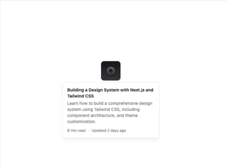
                Building a Design System with Next.js and Tailwind CSS
              </h2>
              <p className="text-sm text-muted-foreground">
                Learn how to build a comprehensive design system using Tailwind
                CSS, including component architecture, and theme customization.
              </p>
            </div>
            <div className="flex items-center gap-2 text-xs text-muted-foreground">
              <span>8 min read</span>
              <span>·</span>
              <span>Updated 2 days ago</span>
            </div>
          </div>
        </HoverCardContent>
      </HoverCard>
    </div>
  );
}

export { HoverCardDemo };

export default HoverCardDemo;