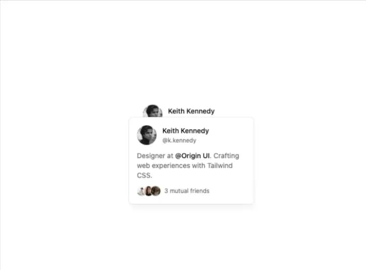
import { Button } from "@/components/ui/button";
import {
  HoverCard,
  HoverCardContent,
  HoverCardTrigger,
} from "@/components/ui/hover-card";

function HoverCardDemo() {
  return (
    <HoverCard>
      <HoverCardTrigger asChild>
        <Button
          className="size-auto overflow-hidden rounded-full bg-transparent p-0 hover:bg-transparent"
          aria-label="My profile"
          asChild
        >
          <a href="#">
            <img
              src="https://cdn.21st.dev/assets/localized/02e3960ca36ad437b60cfc21e144aeb48bc0c481190380f3e33bf2f0c74f5f17.jpg"
              width={40}
              height={40}
              alt="Avatar"
            />
          </a>
        </Button>
      </HoverCardTrigger>
      <HoverCardContent className="w-[340px] shadow-lg shadow-black/5">
        <div className="flex items-start gap-3">
          <img
            className="shrink-0 rounded-full"
            src="https://cdn.21st.dev/assets/localized/02e3960ca36ad437b60cfc21e144aeb48bc0c481190380f3e33bf2f0c74f5f17.jpg"
            width={40}
            height={40}
            alt="Avatar"
          />
          <div className="space-y-1">
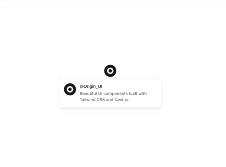
            <p className="text-sm font-medium">@Origin_UI</p>
            <p className="text-sm text-muted-foreground">
              Beautiful UI components built with Tailwind CSS and Next.js.
            </p>
          </div>
        </div>
      </HoverCardContent>
    </HoverCard>
  );
}

export { HoverCardDemo };

export default HoverCardDemo;