
About
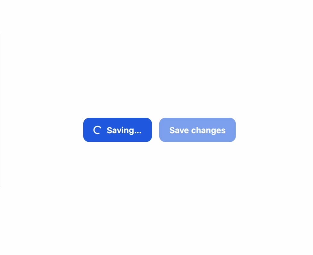
A button for triggering actions with primary, secondary, ghost and danger variants, three sizes, start/end icons, a loading state, and full-width stretch.
Built with React and Tailwind. Copy the prompt and paste it into Claude Code, Cursor or Lovable: your agent adds Button to your project and fits it to your theme.
Code
How Button is used: the demo's code. The component's own source comes with a free account.
Usage.tsx
import { Button } from "@/components/ui/button";

export default function ButtonStatesDemo() {
  return (
    <div
      className="flex min-h-[200px] w-full flex-wrap items-center justify-center gap-3 p-6"
      style={{
        background: "var(--fp-color-bg)",
        color: "var(--fp-color-text)",
      }}
    >
      <Button loading>Saving…</Button>
      <Button disabled>Save changes</Button>
    </div>
  );
}
More by sudharshanpanidev
View all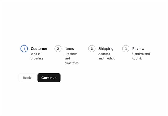
Stepper
5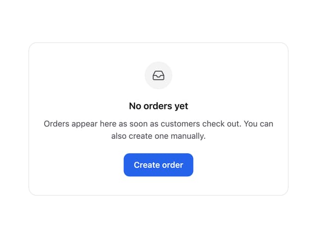
Empty State
3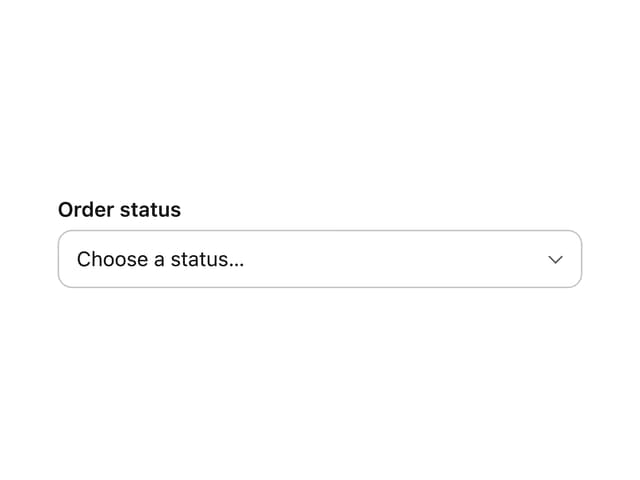
Select
2
Status Badge
Checkbox
More in Buttons
View all
Button
16
Texture Button
110

Astryx Button Group
27

Button
135

Button
36

HeroUI Button Group
2

Eclipse Button
9
HeroUI Toggle Button
2

