
About
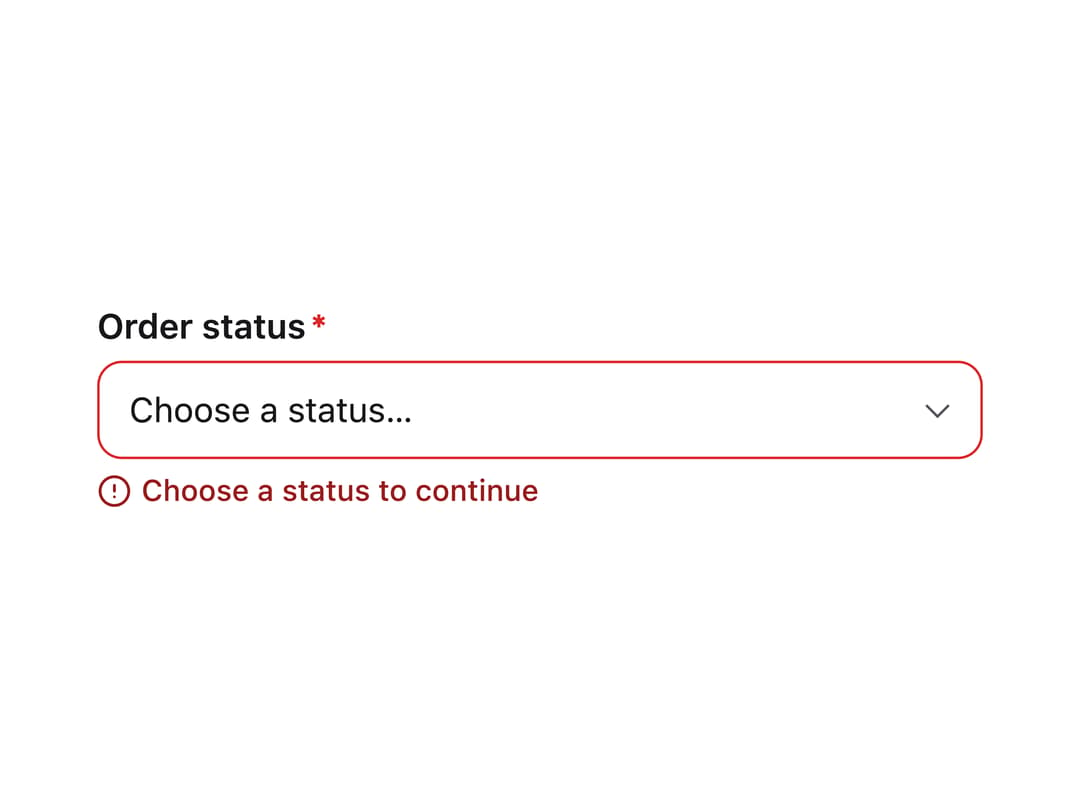
A styled native HTML select dropdown with a label, optional placeholder, description text, and validation error message for forms.
Built with React and Tailwind. Copy the prompt and paste it into Claude Code, Cursor or Lovable: your agent adds Select to your project and fits it to your theme.
Code
How Select is used: the demo's code. The component's own source comes with a free account.
Usage.tsx
import { Select } from "@/components/ui/select";

export default function SelectWithErrorDemo() {
  return (
    <div className="w-full max-w-[360px]">
      <Select
        label="Order status"
        placeholder="Choose a status…"
        required
        error="Choose a status to continue"
        options={[
          { value: "pending", label: "Pending" },
          { value: "paid", label: "Paid" },
          { value: "shipped", label: "Shipped" },
          { value: "refunded", label: "Refunded", disabled: true },
        ]}
      />
    </div>
  );
}
More by sudharshanpanidev
View all
Status Badge
Button
Empty State
Stepper
Checkbox
More in Forms
View all

Premium Auth
504

Book A Demo 3
84
Book A Demo 1
70

Login 1
52
Authentication Card
47

Contact Card
1K

Form
136
Book A Demo 4
52
