
About
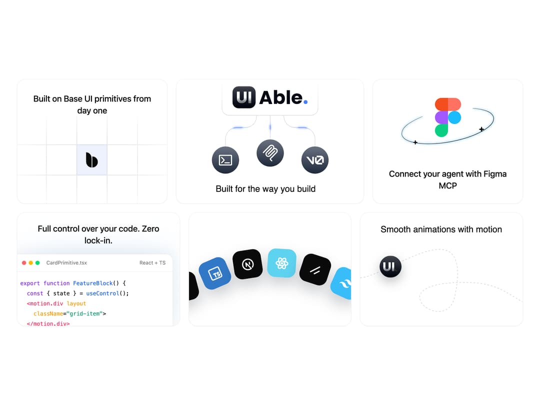
A landing-page feature section that showcases a product's capabilities across a grid of animated illustrated cards, such as a UI-primitives grid, a build diagram, a Figma integration orbit, a code preview and a tech-stack belt.
Built with React and Tailwind. Copy the prompt and paste it into Claude Code, Cursor or Lovable: your agent adds Feature Highlights Grid to your project and fits it to your theme.
Code
How Feature Highlights Grid is used: the demo's code. The component's own source comes with a free account.
Usage.tsx
import Feature from "@/components/ui/block-feature";

export default function FeatureDemo() {
  return <Feature />;
}
Dependencies
More by uiable
View all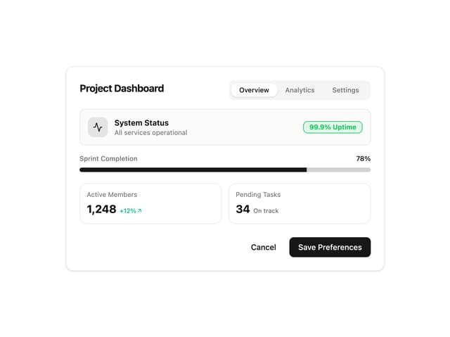

Card Tabs
144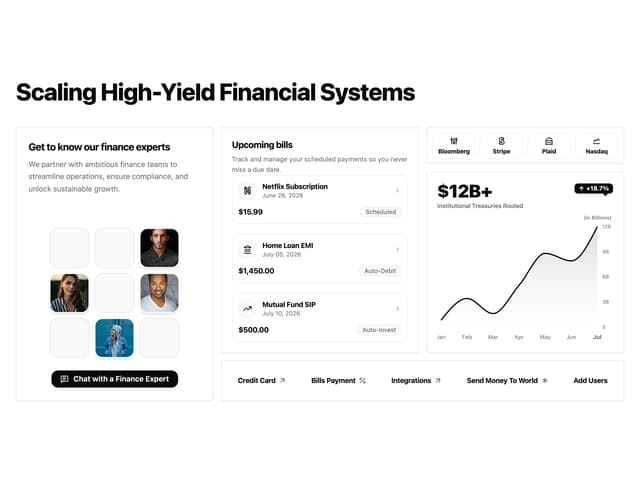
Financial Bento Grid
132
Marketing Hero Section
92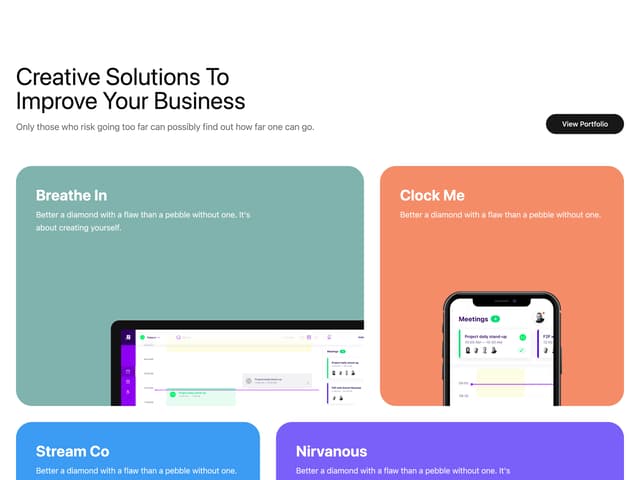
Portfolio Showcase Grid
91
Chart Tooltip
90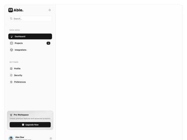
Sidebar with Search and Profile
82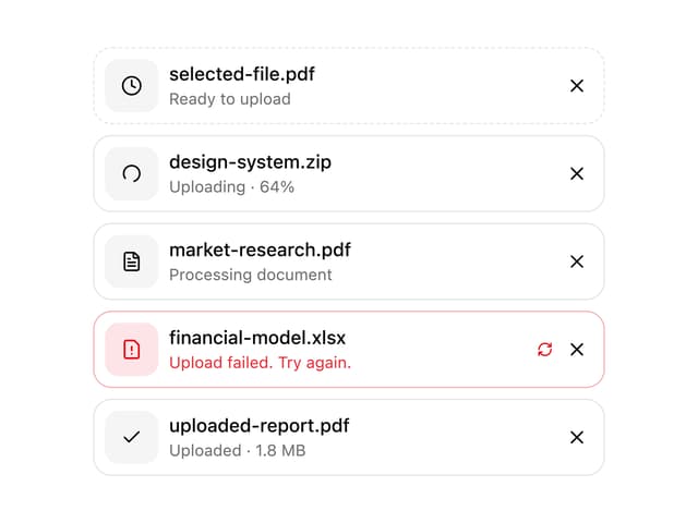
Attachment States
60
Welcome Banner
55
More in Heroes
View all
Agency Hero Section
1K

Responsive Hero Banner
2.2K

SaaS Template
2.7K

Hero Section
446
Centered Hero with Image Fan
1.1K

Hero
1.3K

Hero Section 01
47

Facts Hero
1
