
About
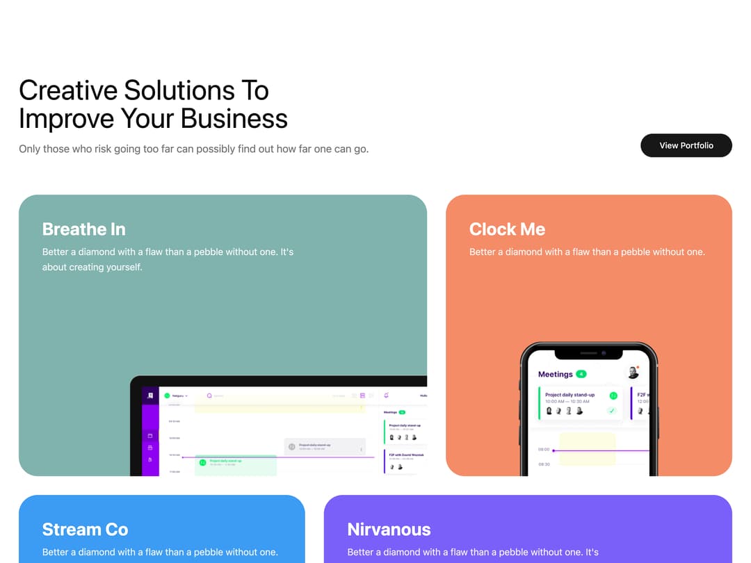
A colorful portfolio section with a heading, call-to-action button, and an asymmetric grid of project cards each showing a title, description, and mockup image.
Built with React and Tailwind. Copy the prompt and paste it into Claude Code, Cursor or Lovable: your agent adds Portfolio Showcase Grid to your project and fits it to your theme.
Code
How Portfolio Showcase Grid is used: the demo's code. The component's own source comes with a free account.
Usage.tsx
import Portfolio9 from "@/components/ui/block-portfolio-9";

export default function Preview() {
  return <Portfolio9 />;
}