
About
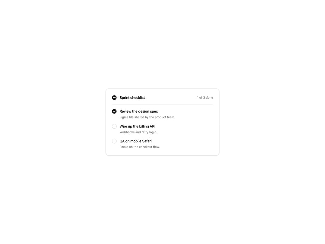
An animated checkbox with a drawn check mark, an indeterminate state for select all, labels and descriptions, and classic or soft styles. Themed with shadcn tokens.
Built with React and Tailwind. Copy the prompt and paste it into Claude Code, Cursor or Lovable: your agent adds Checkbox to your project and fits it to your theme.
Code
How Checkbox is used: the demo's code. The component's own source comes with a free account.
Usage.tsx
"use client";

import * as React from "react";
import { Checkbox, type CheckboxCheckedState } from "@/components/ui/checkbox";

const settings = {
  variant: "classic",
  checkboxSize: "md",
};

const TASKS = [
  { id: "design", label: "Review the design spec", description: "Figma file shared by the product team." },
  { id: "api", label: "Wire up the billing API", description: "Webhooks and retry logic." },
  { id: "qa", label: "QA on mobile Safari", description: "Focus on the checkout flow." },
];

export default function CheckboxDemo(props: Partial<typeof settings>) {
  const s = { ...settings, ...props };
  const variant = s.variant as "classic" | "soft";
  const size = s.checkboxSize as "sm" | "md" | "lg";
  const [done, setDone] = React.useState<Record<string, boolean>>({ design: true });

  const count = TASKS.filter((t) => done[t.id]).length;
  const all: CheckboxCheckedState =
    count === TASKS.length ? true : count === 0 ? false : "indeterminate";

  return (
    <div className="flex min-h-[420px] w-full items-center justify-center bg-background p-6">
      <div className="w-full max-w-md rounded-xl border border-border bg-card p-6 text-card-foreground shadow-sm">
        <div className="flex items-center justify-between border-b border-border pb-4">
          <Checkbox
            variant={variant}
            checkboxSize={size}
            checked={all}
            onCheckedChange={(next) =>
              setDone(Object.fromEntries(TASKS.map((t) => [t.id, next === true])))
            }
            label="Sprint checklist"
            fullWidth={false}
          />
          <span className="shrink-0 whitespace-nowrap text-xs text-muted-foreground">
            {count} of {TASKS.length} done
          </span>
        </div>
        <div className="space-y-4 pt-4">
          {TASKS.map((task) => (
            <Checkbox
              key={task.id}
              variant={variant}
              checkboxSize={size}
              checked={!!done[task.id]}
              onCheckedChange={(next) => setDone((d) => ({ ...d, [task.id]: next === true }))}
              label={task.label}
              description={task.description}
            />
          ))}
        </div>
      </div>
    </div>
  );
}
Dependencies
More by Wensity Labs
View all

Sidebar
363
Calendar
259
Button
116
Color Picker
92
Image Comparison Slider
79
AI Prompt Input
74
Text Morphing
54
Carousel
50
More in Forms
View all

Premium Auth
555

Form
17

Contact Card
1.1K
Authentication Card
51

Book A Demo 1
87

Login 1
61
SignInPage
736

Login Card
33

